Round 3, Challenge 6, Results!
So I screwed up :) I should have posted these a week ago but I thought it was already done. Now that Challenge 7 voting is already posted, it's not really fair to eliminate someone after they've already entered. So no one will be eliminated. Considering there were only three participants, that's probably for the best.
So, Voters Choice goes to (the first icon of):


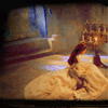
sjlnechnaia
Total = -1 +1 +1 = +1
. too much red hue. Christine looks like she has red eye that sometime shows up when you take a picture with a camera. It distracts from the icon.
. the icon is a bit oversharpened, but it is very emotional and has a nice colouring.
. The colors don't look great and the crop is not interesting.
. I love the picture and the coloring!


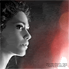
leggomahgreggo_ Congrats on Mods Choice for your first icon!
Total = -3 +0 (-1 +1) +0 (-2 +2) = -4
. it's too sharpen, brush & light texture look don't well
. the icon is oversharpened, tiny text and light texture doesn't fit the icon.
. The textures on the side don't seem to add effect to the icon
. i like crop, coloring and texture, very harmonious pic
. sharp, crop isn't well, I don't see idea to use light texture
. the image looks oversharpened and the texture does not fit.
. it's lovely. Crystal clear, nice colours, unique minor character, and the sparkly above is wonderfully situated.
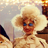
amber_km
Total = -2 -5 -2 (-3 +1) = -9
. the coloring is overwhelming
. I like the concept and I like the picture used, but the coloring is off. It's almost too muted but too red at the same time.
. The picture is out of focus, though I like the picture choice.
. the icon is somewhat fuzzy
. Blurry, and the shadows on the left do nothing.
. The icon looks too plain- the crop is not really interesting and looks blurry
. the icon is oversharpened, tiny text and light texture doesn't fit the icon.
. pic looks wash away
. incredibly blurred, lackluster colouring, I have to look closely to make out what's going on.
. the icon is fuzzy
. I like the doubling of the different perspectives within the icon, but the coloring is washed out and my eye is drawn more to the black line in the middle, rather than the pictures.
And remember, everyone must vote Here! for Challenge 7!