Challenge 03 Round 12 Results
Мне очень жаль, но, увы, нам придется проститься с некоторыми участниками.
Here are our results. I'm so sorry, but we have to say "goodbye" to some participants.
Eсли вы хотите, чтобы я перевела вам комментарии по вашему пику, пожалуйста, оставьте комментарий к этому посту с номером вашей работы, а я переведу вам комментарии. Не бойтесь спрашивать! Все в порядке.
Please, let me know, if you need my translation. Don't be afraid! Just leave your icon number and ask to translate your comments. I'll do it! Sure! Just ask me!
Исключены | Eliminated:
kirssy with 2 votes
llean with 2 votes
Приз Зрительских симпатий | People's Choice:

ira_seregina with 2 votes | BANNER

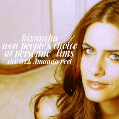
kisuncha with 2 votes | BANNER
Забыли номер своего пика? Пожалуйста, посмотрите его ЗДЕСЬ
Did you forget your icon number? You can find it HERE
Голоса распределились следующим образом | People Voting:
01| -1+1= 0
02| -3+1= -2
03| +2
04| -3+1= -2
05| +2
Голоса "ЗА" | Favourite icons
001 - I like the colouring and texures using
002 - Beautiful use of textures, looks really complete.
3 - потрясающие цвета, очень теплые и приятные глазу
003 - отличный калоринг и кроп
4 - хорошие цвета и оригинальный стиль пика. Шрифт хорошо сюда лег и подходит по цвету.
5 - amazing crop and coloring
5 - the neatest coloring among the entries, although not without fault, either. I like the light texture, though.
Голоса "ПРОТИВ" | Lesser quality icons
1 - дальний кроп смотрелся бы неплохо, если бы не перешарп
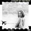
2 - изображение нечеткое, лицо совершенно не видно, непонятна вставка в самолетиком.
002 - неплохая идея, но зашарпенная рамка и её детали портит всё впечатление
002 - The background looks weird and the small plane too.
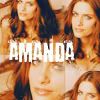
4 - too many faces of amanda and quality of them are not very good, plus text distracts everything
4 - very poor font choice, the coloring is unattractively bleak on her skin, black is rather weak, overall, despite good intentions in composition, the icon seems less then others.
004 - This coloring doesn't look very appealing, too orange/brownish. Font-choice and text-placement/size doesn't fit in.
Here are our results. I'm so sorry, but we have to say "goodbye" to some participants.
Eсли вы хотите, чтобы я перевела вам комментарии по вашему пику, пожалуйста, оставьте комментарий к этому посту с номером вашей работы, а я переведу вам комментарии. Не бойтесь спрашивать! Все в порядке.
Please, let me know, if you need my translation. Don't be afraid! Just leave your icon number and ask to translate your comments. I'll do it! Sure! Just ask me!
Исключены | Eliminated:
kirssy with 2 votes
llean with 2 votes
Приз Зрительских симпатий | People's Choice:
ira_seregina with 2 votes | BANNER
kisuncha with 2 votes | BANNER
Забыли номер своего пика? Пожалуйста, посмотрите его ЗДЕСЬ
Did you forget your icon number? You can find it HERE
Голоса распределились следующим образом | People Voting:
01| -1+1= 0
02| -3+1= -2
03| +2
04| -3+1= -2
05| +2
Голоса "ЗА" | Favourite icons
001 - I like the colouring and texures using
002 - Beautiful use of textures, looks really complete.
3 - потрясающие цвета, очень теплые и приятные глазу
003 - отличный калоринг и кроп
4 - хорошие цвета и оригинальный стиль пика. Шрифт хорошо сюда лег и подходит по цвету.
5 - amazing crop and coloring
5 - the neatest coloring among the entries, although not without fault, either. I like the light texture, though.
Голоса "ПРОТИВ" | Lesser quality icons
1 - дальний кроп смотрелся бы неплохо, если бы не перешарп
2 - изображение нечеткое, лицо совершенно не видно, непонятна вставка в самолетиком.
002 - неплохая идея, но зашарпенная рамка и её детали портит всё впечатление
002 - The background looks weird and the small plane too.
4 - too many faces of amanda and quality of them are not very good, plus text distracts everything
4 - very poor font choice, the coloring is unattractively bleak on her skin, black is rather weak, overall, despite good intentions in composition, the icon seems less then others.
004 - This coloring doesn't look very appealing, too orange/brownish. Font-choice and text-placement/size doesn't fit in.