And another..

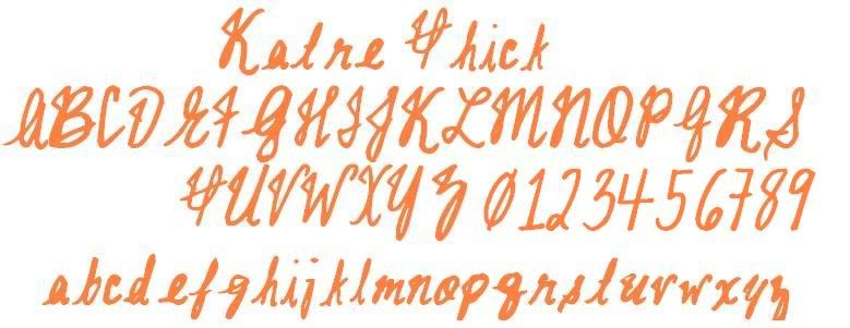
now a few notes about this font...
some letters may appear far away from others...this is due to the differeing sizes of letters... for example a "t" beside an "r" may look far away..however if the "t" was beside an "l" it looks normal.
The reason this is so late even after i got better is because i played around trying to fix the spacing problem and really couldn't..