For My Taste, A Bit Premature
Okay, folks, you want political correctness*? I've got political correctness.

You've undoubtedly seen this, haven't you? Good. Everyone now knows that this icon is a symbol designated by the international community to indicate wheelchair accessability (as defined by international parameters). Internationally recognized iconography is, in my most un-humble opinion, of paramount importance for encouraging the exchange of people and their ideas across the face of this fine oblate spheriod.
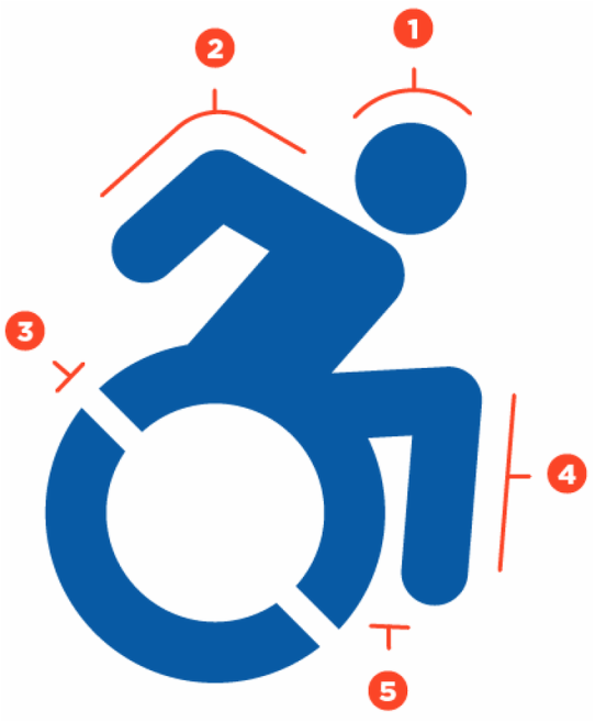
Others, though, regard this international-ness to be inconsistent with changing whims and fancies, and have taken it upon themselves to alter iconography to be more consistent with their personal fanciful whimsy. Observe the product of their labors.

Going to their website gives you the numbered bullet points they wish to make about the icon's differences.
Can anyone spot the internal inconsistency of their argument? For me, two points jump out:
First, "Having just one version of the logo keeps things more consistent and allows viewers to more clearly understand intended message." Er, isn't changing an internationally recognized icon to suit your aesthetic whims about how those confined to wheelchairs should be represented creating "another version of the logo"?!?
Second, wouldn't the above point "lead to confusion," the very sort you hope to avoid?!?
Look, I'm not completely hard hearted. You point out obvious ways the old icon fails to honor the sense of changing positivity, the zeitgeist of how those bound to wheelchairs should be appreciated, not merely, er, confined to older, restrictive images that, again er, bind them to a device not one of their choosing. All well and good.
But, really. Is leveling an accusing finger at the shortcomings of a historically revolutionary icon-up to an including acts of vandalism-any way to honor the universality of the original symbol?
Universal symbols should be first and foremost universal. Fitting the icon to every niche opinion in every country where wheelchairs are to be found is shaking up a can of whoop-ass that cannot end well.
*"Political Correctness" is an oxymoron. A "political" decision is necessarily a compromise between opposing points of interest and involvement in any given subject, while a "correct" decision can only be accurate, not accommodating.
X-Posted to talk_politics.

You've undoubtedly seen this, haven't you? Good. Everyone now knows that this icon is a symbol designated by the international community to indicate wheelchair accessability (as defined by international parameters). Internationally recognized iconography is, in my most un-humble opinion, of paramount importance for encouraging the exchange of people and their ideas across the face of this fine oblate spheriod.
Others, though, regard this international-ness to be inconsistent with changing whims and fancies, and have taken it upon themselves to alter iconography to be more consistent with their personal fanciful whimsy. Observe the product of their labors.

Going to their website gives you the numbered bullet points they wish to make about the icon's differences.
- Head Position - Head is forward to indicate the forward motion of the person through space. Here the person is the "driver" or decision maker about her mobility.
- Arm Angle - Arm is pointing backward to suggest the dynamic mobility of a chair user, regardless of whether or not she uses her arms. Depicting the body in motion represents the symbolically active status of navigating the world.
- Wheel Cutouts - By including white angled knockouts the symbol presents the wheel as being in motion. These knockouts also work for creating stencils used in spray paint application of the icon. Having just one version of the logo keeps things more consistent and allows viewers to more clearly understand intended message.
- Limb Rendition - The human depiction in this icon is consistent with other body representations found in the ISO 7001 - DOT Pictograms. Using a different portrayal of the human body would clash with these established and widely used icons and could lead to confusion.
- Leg Position - The leg has been moved forward to allow for more space between it and the wheel which allows for better readability and cleaner application of icon as a stencil.
Can anyone spot the internal inconsistency of their argument? For me, two points jump out:
First, "Having just one version of the logo keeps things more consistent and allows viewers to more clearly understand intended message." Er, isn't changing an internationally recognized icon to suit your aesthetic whims about how those confined to wheelchairs should be represented creating "another version of the logo"?!?
Second, wouldn't the above point "lead to confusion," the very sort you hope to avoid?!?
Look, I'm not completely hard hearted. You point out obvious ways the old icon fails to honor the sense of changing positivity, the zeitgeist of how those bound to wheelchairs should be appreciated, not merely, er, confined to older, restrictive images that, again er, bind them to a device not one of their choosing. All well and good.
But, really. Is leveling an accusing finger at the shortcomings of a historically revolutionary icon-up to an including acts of vandalism-any way to honor the universality of the original symbol?
Universal symbols should be first and foremost universal. Fitting the icon to every niche opinion in every country where wheelchairs are to be found is shaking up a can of whoop-ass that cannot end well.
*"Political Correctness" is an oxymoron. A "political" decision is necessarily a compromise between opposing points of interest and involvement in any given subject, while a "correct" decision can only be accurate, not accommodating.
X-Posted to talk_politics.