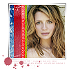
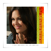
First Tutorials for icons 14 and 16 of my last post.
I was asked by purpleseahorse to do my first tutorials for icons, so let's see how this goes, shall we?
Tutorials for these icons behind the cut:

and
[NOTE: I use Paint Shop Pro and those who use Adobe Photoshop may find a few differences in some things that I am doing. Hopefully though most of these translate over to Photoshop]
Tutorial #1:
We are creating this icon:

Step 1:
I took this picture of Mischa Barton:

Then I resized it and cropped it and then resized it again to 73x73 so that I had this:
Then I sharpened the photo once. To get this:
Step 2:
I took this base:
(created by ewanism) and cropped it a little bit so that it would be the right 100x100 size. (the original is 110x110).
Step 3:
I took the frame base and had to colorize it (Adjust ---> Hue & Saturation ---> Colorize) because it's grayscale. Then after that I desaturated it. (It sounds strange, but if you don't do it, the picture that's placed on top it's black and white.
Step 4:
I then took the what I had now of the Mischa picture, copied it and pasted it over the frame base. I placed it directly in the center of the frame to get this:
Step 5:
I took these textures:
,
,
and selected different parts of them and copied and pasted over the icon and put them side by side at the left to look like this:

Step 6:
I then erased the top and the bottom of the pieces that I added so that they were just covering the photo to get this:

Step 7:
I simply pulled a color from the picture (#BA4658) and chose this brush:
by bittenicons and put it onto the icon below the picture. to get the finished result.

(the result from the tutrial is a little different then the orignal because I had to go back through all of my steps so it's not exaclty the same, but very, very close)
Tutorial #2
Making this icon:

Initially the same as the first tutorial, but with a different base, textures and brush. I'll go through all the steps just so y'all get it. :)
Step 1:
I took this picture:

I cropped out just Rachel Bilson and then resized the photo to 73x73 and got this:
and then sharpened it once to get this:
Step 2:
I took this base:
by 77words and copied and pasted the picture of Rachel Bilson over the icon to fit into the black space and get this:
Step 3:
I took this texture:
and took three different parts of it and put it over the picture to get this:
Step 4:
I then erased the top and the bottom of the pieces that I added so that they were just covering the photo to get this:

Step 5:
I simply took this tiny text brush:
in black and put it right under the photo of Rachel Bilson to get the finished product:

And as the first tutorial, the result from the tutrial is a little different then the orignal because I had to go back through all of my steps so it's not exaclty the same, but very, very close.
Hope this was useful to everyone or anyone and made any sense. I've never written a tutorial before. Let me know if anything isn't clear and I'll try to explain it further to you. :)
Tutorials for these icons behind the cut:
and
[NOTE: I use Paint Shop Pro and those who use Adobe Photoshop may find a few differences in some things that I am doing. Hopefully though most of these translate over to Photoshop]
Tutorial #1:
We are creating this icon:
Step 1:
I took this picture of Mischa Barton:

Then I resized it and cropped it and then resized it again to 73x73 so that I had this:

Then I sharpened the photo once. To get this:

Step 2:
I took this base:

(created by ewanism) and cropped it a little bit so that it would be the right 100x100 size. (the original is 110x110).
Step 3:
I took the frame base and had to colorize it (Adjust ---> Hue & Saturation ---> Colorize) because it's grayscale. Then after that I desaturated it. (It sounds strange, but if you don't do it, the picture that's placed on top it's black and white.
Step 4:
I then took the what I had now of the Mischa picture, copied it and pasted it over the frame base. I placed it directly in the center of the frame to get this:

Step 5:
I took these textures:

,

,

and selected different parts of them and copied and pasted over the icon and put them side by side at the left to look like this:

Step 6:
I then erased the top and the bottom of the pieces that I added so that they were just covering the photo to get this:

Step 7:
I simply pulled a color from the picture (#BA4658) and chose this brush:

by bittenicons and put it onto the icon below the picture. to get the finished result.

(the result from the tutrial is a little different then the orignal because I had to go back through all of my steps so it's not exaclty the same, but very, very close)
Tutorial #2
Making this icon:
Initially the same as the first tutorial, but with a different base, textures and brush. I'll go through all the steps just so y'all get it. :)
Step 1:
I took this picture:

I cropped out just Rachel Bilson and then resized the photo to 73x73 and got this:

and then sharpened it once to get this:

Step 2:
I took this base:

by 77words and copied and pasted the picture of Rachel Bilson over the icon to fit into the black space and get this:

Step 3:
I took this texture:

and took three different parts of it and put it over the picture to get this:

Step 4:
I then erased the top and the bottom of the pieces that I added so that they were just covering the photo to get this:

Step 5:
I simply took this tiny text brush:

in black and put it right under the photo of Rachel Bilson to get the finished product:

And as the first tutorial, the result from the tutrial is a little different then the orignal because I had to go back through all of my steps so it's not exaclty the same, but very, very close.
Hope this was useful to everyone or anyone and made any sense. I've never written a tutorial before. Let me know if anything isn't clear and I'll try to explain it further to you. :)