Manga Icon Tutorial
Someone asked how I do manga icons SO HERE.
We're gonna do this. The bottom panel of Negi, specifically. It's simple and pretty easy. The reason I'm using a Negima scan is because it works best with the method I use because it's already shaded (though I still shade things even if they're not already).
I'm using Photoshop CS3, but there's nothing too specific that wouldn't make this easy to do in other programs (though the end result might look a little different).
First let's crop this bitch. Granted Negi will be on the side considering how it's drawn but even if he wasn't, I usually always put things on the side. Centering images doesn't look good most of the time. There are a few times where it works, but YOU KNOW I'M RAMBLING.

This is what we've got. The first thing I do is blacken the darker areas, because as you can see, they're not pure black, they're kind of gray. The finished result won't look as good if it's kept like this so: Go to Image > Adjustments > Brightness/Contrast. Before you move anything, make sure you check Use Legacy. Now, move the contrast bar up a bit until the gray areas become solid black, there's no specific number I can give you because it differs from image to image. But if your scan is good quality, it shouldn't go higher than 20.
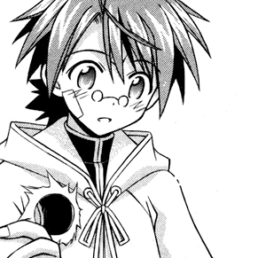
THAT LOOKS MUCH NICER NOW DOESN'T IT. Oh yeah, make sure you clean that word bubble up. The surprise lines are up to you, I personally didn't want them there. >8l
Now onto the real show. Create a new layer and set it to Multiply. Start coloring with whatever you want, I always start with the hair. One thing I should mention, I'm not going to provide any colors you can use. I use the given color swatches and just play with the color bars. Though I will say this: Use dull colors. Why? You'll see later.
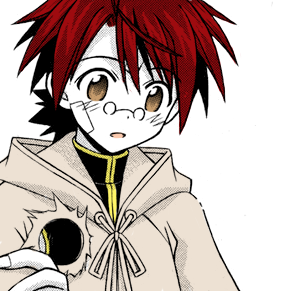
Here's what we have now. Pretty simple, right? If you want, you can use a different layer for every color, but I just do everything on the same layer (that isn't skin) because I color with a tablet. But anyway, here's the thing I do so that the manga's shading doesn't look dull on the finished result: See the shading on the robe? Use a darker tone of the robe, and color over those areas, and we'll have this:
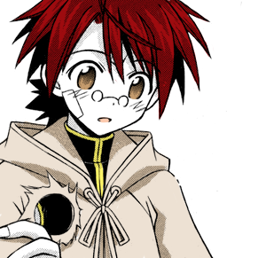
Doing this will make the colors and details pop out more. And in some magical cases make things look like they were already colored. Next is the skin, do the exact same thing as you did with the robe. And we'll have this:
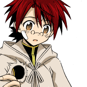
Here's a neat thing to do with his glasses. Select white, turn down the opacity of the brush (not the layer) to around 20-30%, and color in the glasses, and you'll have this:
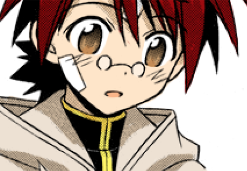
Subtle, probably unnecessary, but the end result is nice. Time for the blush on his face. Create a new layer, set it to Lighten. Color the lines red, etc. Then, create another layer and set this to Multiply. Still using red (or pink if you prefer), use a soft brush and turn down the brush opacity to around 10~20%-- brush over the lines and you'll end up with this:

Done with the coloring! Now, create a new layer ON TOP of the original scan layer. Set it to Soft Light and cover the entire layer with a light brown, and you should get this nice effect:

RESIIIIIIZE
Also, I recommend flattening all the layers at this point. It'll make the next few steps easier.
Now, go to Image > Adjustments > Hue/Saturation. Crank up the saturation to whatever floats your boat. Like the brightness/contrast, it differs from image to image. Usually for manga icons I go up to 20 or 30. This is why I said to use dull colors. If you use already-bright ones, your icon will end up looking radioactive.
Next, duplicate the layer, and set it to Soft Light. It's going to be waaay too bright, so bring the opacity down to whatever you like, I ended up going down to 20-something. Here's what you'll end up with:

We're not done yet. Create a new layer and set it to Lighten. Fill the layer with a dark blue. It might not look good at first, which is why you need to play with the opacity until you're satisfied with how it looks. I brought it down to around 80. Here's the result:

Now for the final step: the background! Okay so. You can use WHATEVER you want for a background. A solid color, a texture, or a gradient, which is what I use. I know PS has a gradient tool, but it's shit and I don't like it. So I fill the layer with several tones of the same color and use gaussian blur. Oh, and make sure it's UNDER the dark blue layer so that the effect works with the background, too.
SO HERE IS OUR FINAL RESULT:

If you're not satisfied with how the color turned out, you can go play with it in either Hue/Saturation or Color Balance. And yes you can take that icon.
We're gonna do this. The bottom panel of Negi, specifically. It's simple and pretty easy. The reason I'm using a Negima scan is because it works best with the method I use because it's already shaded (though I still shade things even if they're not already).
I'm using Photoshop CS3, but there's nothing too specific that wouldn't make this easy to do in other programs (though the end result might look a little different).
First let's crop this bitch. Granted Negi will be on the side considering how it's drawn but even if he wasn't, I usually always put things on the side. Centering images doesn't look good most of the time. There are a few times where it works, but YOU KNOW I'M RAMBLING.

This is what we've got. The first thing I do is blacken the darker areas, because as you can see, they're not pure black, they're kind of gray. The finished result won't look as good if it's kept like this so: Go to Image > Adjustments > Brightness/Contrast. Before you move anything, make sure you check Use Legacy. Now, move the contrast bar up a bit until the gray areas become solid black, there's no specific number I can give you because it differs from image to image. But if your scan is good quality, it shouldn't go higher than 20.

THAT LOOKS MUCH NICER NOW DOESN'T IT. Oh yeah, make sure you clean that word bubble up. The surprise lines are up to you, I personally didn't want them there. >8l
Now onto the real show. Create a new layer and set it to Multiply. Start coloring with whatever you want, I always start with the hair. One thing I should mention, I'm not going to provide any colors you can use. I use the given color swatches and just play with the color bars. Though I will say this: Use dull colors. Why? You'll see later.

Here's what we have now. Pretty simple, right? If you want, you can use a different layer for every color, but I just do everything on the same layer (that isn't skin) because I color with a tablet. But anyway, here's the thing I do so that the manga's shading doesn't look dull on the finished result: See the shading on the robe? Use a darker tone of the robe, and color over those areas, and we'll have this:

Doing this will make the colors and details pop out more. And in some magical cases make things look like they were already colored. Next is the skin, do the exact same thing as you did with the robe. And we'll have this:

Here's a neat thing to do with his glasses. Select white, turn down the opacity of the brush (not the layer) to around 20-30%, and color in the glasses, and you'll have this:

Subtle, probably unnecessary, but the end result is nice. Time for the blush on his face. Create a new layer, set it to Lighten. Color the lines red, etc. Then, create another layer and set this to Multiply. Still using red (or pink if you prefer), use a soft brush and turn down the brush opacity to around 10~20%-- brush over the lines and you'll end up with this:

Done with the coloring! Now, create a new layer ON TOP of the original scan layer. Set it to Soft Light and cover the entire layer with a light brown, and you should get this nice effect:

RESIIIIIIZE
Also, I recommend flattening all the layers at this point. It'll make the next few steps easier.
Now, go to Image > Adjustments > Hue/Saturation. Crank up the saturation to whatever floats your boat. Like the brightness/contrast, it differs from image to image. Usually for manga icons I go up to 20 or 30. This is why I said to use dull colors. If you use already-bright ones, your icon will end up looking radioactive.
Next, duplicate the layer, and set it to Soft Light. It's going to be waaay too bright, so bring the opacity down to whatever you like, I ended up going down to 20-something. Here's what you'll end up with:

We're not done yet. Create a new layer and set it to Lighten. Fill the layer with a dark blue. It might not look good at first, which is why you need to play with the opacity until you're satisfied with how it looks. I brought it down to around 80. Here's the result:

Now for the final step: the background! Okay so. You can use WHATEVER you want for a background. A solid color, a texture, or a gradient, which is what I use. I know PS has a gradient tool, but it's shit and I don't like it. So I fill the layer with several tones of the same color and use gaussian blur. Oh, and make sure it's UNDER the dark blue layer so that the effect works with the background, too.
SO HERE IS OUR FINAL RESULT:

If you're not satisfied with how the color turned out, you can go play with it in either Hue/Saturation or Color Balance. And yes you can take that icon.