006/ tutorial 002
From my last icon post, x_insurrection asked for a tutorial about the coloring I used on my Kris Allen icons. I apoligize for taking so long to get this written out but, alas! I have it.
From
to
For: Photoshop 7.0
Difficulty: Depending on your comfortability with curves but relatively easy.
Translatable: Not really, there's a selective color that you could skip but it won't turn out quite the same.
#0
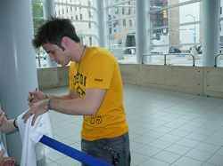
I chose my image of Kris that I got from ontd_ai in a flickrspam. I had a lot of trouble finding a crop for this picture because of the way he was standing and hunching over but I decided to use his face, because it was the main focal point, and also a little bit of his shoulder because it helped carry your eyes throughout the whole image instead of settling on the the drab background.

#1
Create a new layer and fill it with #FFFFFF. Set to softlight and leave at 100% opacity. If you want your icon to be darker, lower the opacity. Although my image was already fairly light, I wanted to make it even lighter. I played around with a screen of my base but settled on this because it gave a white overcoat.

#2
Add another new layer and fill it with a dark brown, I used #4C1A00. Again, set to softlight and lower the opacity to around 85-90. The icon was looking washed out after lightening it so I used this step to add brown to the image to give his skin a more natural look.

#3
Add a selective color layer.
Reds -23, 0, 8, -11
I used a selective color to make the brownish hue darker and to give it some depth.

#4
Add a curves layer.
RGB input: 98 output: 152
Finally, I used curves to brighten the image while keeping the brown. This also added some reds to his face which he needed.

What I re-created:
Original icon:
Pretty close! Not perfect but, this was as close as I could remember. Hope this helps somebody!
No PSD this time guys, sorry!
From

to

For: Photoshop 7.0
Difficulty: Depending on your comfortability with curves but relatively easy.
Translatable: Not really, there's a selective color that you could skip but it won't turn out quite the same.
#0
I chose my image of Kris that I got from ontd_ai in a flickrspam. I had a lot of trouble finding a crop for this picture because of the way he was standing and hunching over but I decided to use his face, because it was the main focal point, and also a little bit of his shoulder because it helped carry your eyes throughout the whole image instead of settling on the the drab background.

#1
Create a new layer and fill it with #FFFFFF. Set to softlight and leave at 100% opacity. If you want your icon to be darker, lower the opacity. Although my image was already fairly light, I wanted to make it even lighter. I played around with a screen of my base but settled on this because it gave a white overcoat.

#2
Add another new layer and fill it with a dark brown, I used #4C1A00. Again, set to softlight and lower the opacity to around 85-90. The icon was looking washed out after lightening it so I used this step to add brown to the image to give his skin a more natural look.

#3
Add a selective color layer.
Reds -23, 0, 8, -11
I used a selective color to make the brownish hue darker and to give it some depth.

#4
Add a curves layer.
RGB input: 98 output: 152
Finally, I used curves to brighten the image while keeping the brown. This also added some reds to his face which he needed.

What I re-created:

Original icon:

Pretty close! Not perfect but, this was as close as I could remember. Hope this helps somebody!
No PSD this time guys, sorry!