(no subject)
MY MAGICAL LAZY CHEATING METHOD OF MAKING AND COLOURING ICONS: A STEP-BY-STEP TUTORIAL!!1
SETS I HAVE MADE WITH THIS: SETH | RADU | MIRKA | YUAN | MITHOS | ZELOS | ALESSANDRO | ION
Seth's and Radu's are the earliest versions! Seth's has the most errors. The most recent--and IMHO best--ones are Ion's and Zelos's. I improve every time I make a set, but they all have the same basic method, give or take a few steps. :3b
EDIT: THIS TUTORIAL, WHILE STILL GOOD FOR SOME TECHNIQUES, IS NOW GROSSLY OUT OF DATE :|b
Note that this is for GIMP, but all the options/tools I use are very basic and Photoshop should have them too! Also note: I use no layers, because the program does not actually give that many options for them. :( ETA TWO WEEKS LATER: THIS IS A FILTHY LIE, I JUST COULDN'T FIND THEM FOR MONTHS
I AM USING A TEST ION ICON because his set combines all the methods I've used for others. :D I would use the same process on any icon set, give or take a few steps.
STEP ONE: GET YOUR ICON. I scan the manga myself because HQ scanslations for Trinity Blood's later volumes don't really exist on the internet! Aaaand I don't work well with large images, so I always shrink and icon before doing any colouring. Shrink with GIMP's scale image tool, then crop and add a border in Paint. ♥ So I really start out with something like this.
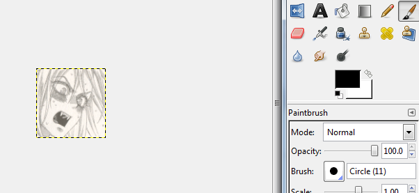
It is kind of ugly right now. So let's go to ...
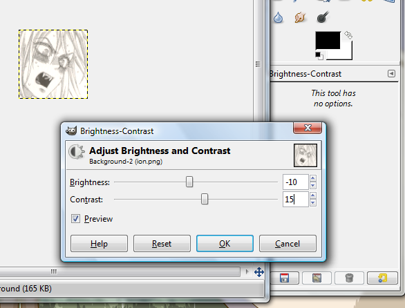
STEP TWO: Clean it up! The process differs depending on the scan quality, but mucking with brightness/contrast (in the Colours menu) will usually do the trick--set the brightness to -10 and the contrast to +15-20 or so. Remove all the icky grey tone bits without destroying the line quality!
Oh, yes, and Colours -> Desaturate is a must, too. Since nearly all of this colouring style involves screwing with the colour balance, it's best to start from a grayscale base.
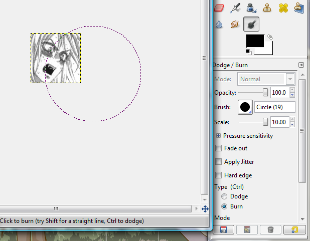
... which is way too light and bright! Select the Burn tool and darken it up. All of it. Do it enough so that 'black' areas in the icon are genuinely black and not just dark grey. Burning an icon will often create more little grey spots, but these vanish if you up the contrast again by +5 or so.
Okay, now for ...
STEP THREE: Colours -> Colour Balance! I always do one or two test icons to see what order to do the parts of the icon in and what colour mixes to use. A lot of them can be found over here. Since Trinity Blood hair in particular is all WISPY and FLOOFY, I start with that! Let's tint the whole thing the colour of Ion's hair to save the trouble of selecting it.
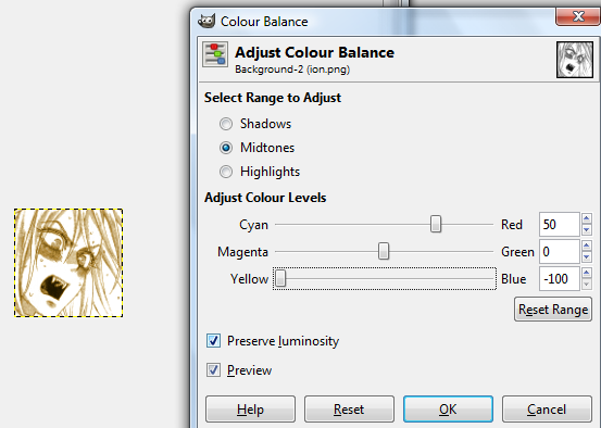
The next-largest area is Ion's skin and face, so hand-select that with the Lasso tool. Yes, this gets kind of tedious, especially with a touchpad, but I have learned to like it. :( I am aware it is not for everyone, though. Hold down Shift to lasso multiple areas! Don't select his eyelashes, which are the same colour as his hair. His eyes will come later too. Don't worry about his mouth just yet.
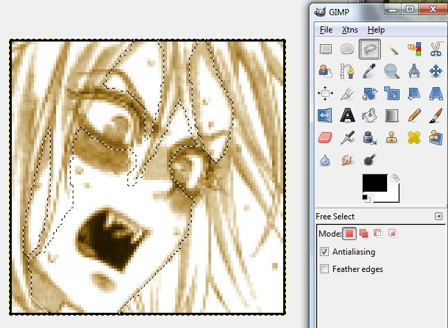
Hit Desaturate to get rid of the yellow on his skin (it's faster than rebalancing the colours). Then replace with a skin-tone mix.
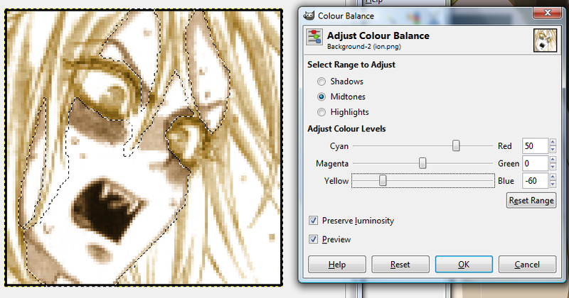
That's the basic colours done! Now for the little bits--the eyes, mouth, and the blush on his cheeks. Since Ion's hair and skin colour are so similar, I am fine with leaving his eyebrows the way they are.
For eyes, lasso the whole thing and desaturate. Then lasso the pupils and tint them the appropriate eye colour. I am super lazy and just ignore hair that falls over people's eyes most of the time.
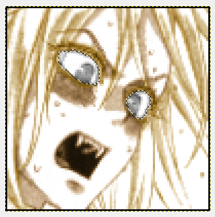
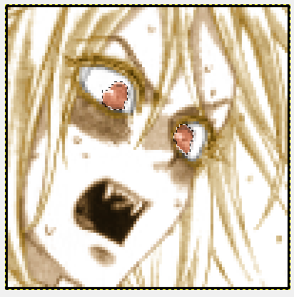
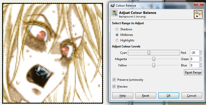
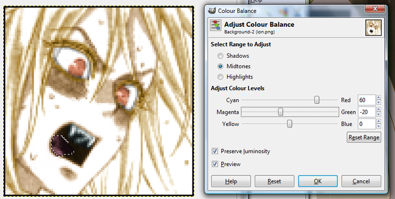
For the mouth, select the teeth, desaturate, then tint them very slightly cyan. This helps them stand out better! Oddly, it doesn't work as well on eyes. Then select the tongue and tint it pinkish.
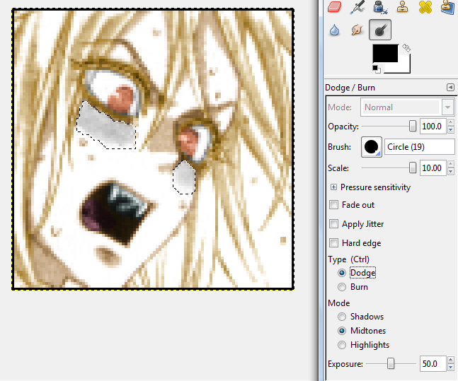
Blushes in Trinity Blood are toned kind of weirdly and are always very dark -- I desaturate, then hit up the Dodge tool and lighten that area a couple of times. This makes the pink tint look more natural and not like a really terrible sunburn.
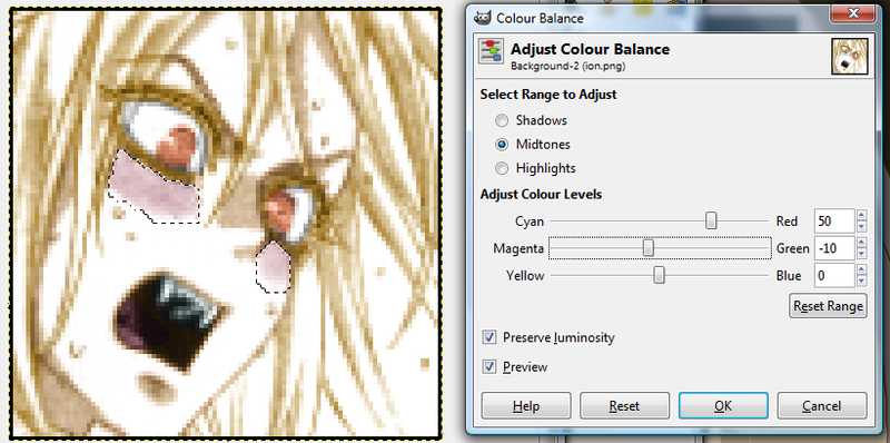
The fill does destroy some of the softness around the edges of the blush--that's easy to restore with the Blur tool.
OKAY, that was the hard part done. The colour balance numbers will remain consistent throughout a set. And so will ...
STEP FOUR: Filler colours. Since Ion's so pale and his skin and hair aren't very differentiated, I use the bucket fill and shove in a light flesh tone on his face and a light yellow tone on his hair. It is not necessary, and not a HUGE difference, but it is noticeable and makes the icon look brighter and bolder.
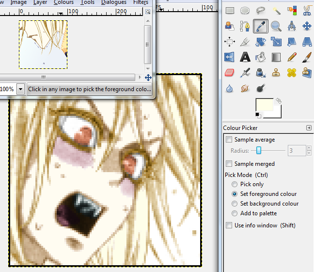
This is where test icons come in handy--once I've made one, I just keep it open and select the colour I need from it with the eyedropper tool for all subsequent icons. For this set, those would be the hair colour, eye colour, and both shades for the ...
STEP FIVE: Background! If there is a pretty background I don't want to erase in the icon, I tint it one colour and then dodge it so that it's lighter than the character, who stands out. But most icons just have white space! I will fill that in with some sort of neutral solid color (like for Seth's and Mirka's sets), OR a basic background gradient like with Ion's.
Just use the magic wand to select those parts, and eyedropper to get the two shades from your test icon. (Or if this IS your test icon, then, uh, have fun picking!!)
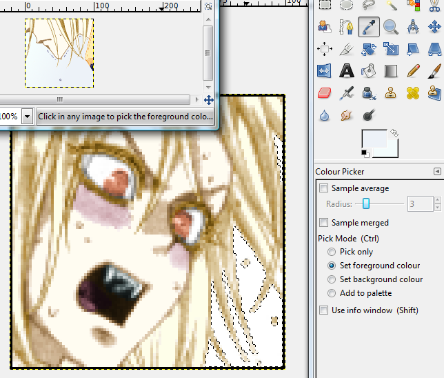
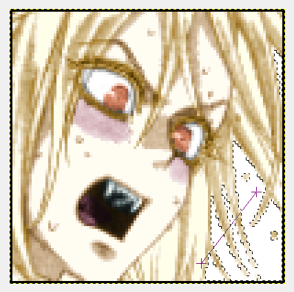
GIMP's Gradient tool is fun to play with, but yeah. Just click, stretch, and see if you like the result. If you don't, HIT UNDO instead of gradienting over it again. Every time you colour it expands a little beyond your selection, so if you do it too many times Ion will develop a fuzzy halo thing.

Aaand the end result!:
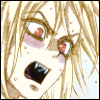
\o/! This works particularly well on Trinity Blood characters since the mangaka shades them so much with tones! It's also very nice if you want a flat, soft-coloured set (see: Mithos).
I should probably add in how I colour eyes and jewels by hand sometimes, but it is almost 3 AM and I need sleep. :(
SETS I HAVE MADE WITH THIS: SETH | RADU | MIRKA | YUAN | MITHOS | ZELOS | ALESSANDRO | ION
Seth's and Radu's are the earliest versions! Seth's has the most errors. The most recent--and IMHO best--ones are Ion's and Zelos's. I improve every time I make a set, but they all have the same basic method, give or take a few steps. :3b
EDIT: THIS TUTORIAL, WHILE STILL GOOD FOR SOME TECHNIQUES, IS NOW GROSSLY OUT OF DATE :|b
Note that this is for GIMP, but all the options/tools I use are very basic and Photoshop should have them too! Also note: I use no layers, because the program does not actually give that many options for them. :( ETA TWO WEEKS LATER: THIS IS A FILTHY LIE, I JUST COULDN'T FIND THEM FOR MONTHS
I AM USING A TEST ION ICON because his set combines all the methods I've used for others. :D I would use the same process on any icon set, give or take a few steps.
STEP ONE: GET YOUR ICON. I scan the manga myself because HQ scanslations for Trinity Blood's later volumes don't really exist on the internet! Aaaand I don't work well with large images, so I always shrink and icon before doing any colouring. Shrink with GIMP's scale image tool, then crop and add a border in Paint. ♥ So I really start out with something like this.

It is kind of ugly right now. So let's go to ...
STEP TWO: Clean it up! The process differs depending on the scan quality, but mucking with brightness/contrast (in the Colours menu) will usually do the trick--set the brightness to -10 and the contrast to +15-20 or so. Remove all the icky grey tone bits without destroying the line quality!
Oh, yes, and Colours -> Desaturate is a must, too. Since nearly all of this colouring style involves screwing with the colour balance, it's best to start from a grayscale base.

... which is way too light and bright! Select the Burn tool and darken it up. All of it. Do it enough so that 'black' areas in the icon are genuinely black and not just dark grey. Burning an icon will often create more little grey spots, but these vanish if you up the contrast again by +5 or so.

Okay, now for ...
STEP THREE: Colours -> Colour Balance! I always do one or two test icons to see what order to do the parts of the icon in and what colour mixes to use. A lot of them can be found over here. Since Trinity Blood hair in particular is all WISPY and FLOOFY, I start with that! Let's tint the whole thing the colour of Ion's hair to save the trouble of selecting it.

The next-largest area is Ion's skin and face, so hand-select that with the Lasso tool. Yes, this gets kind of tedious, especially with a touchpad, but I have learned to like it. :( I am aware it is not for everyone, though. Hold down Shift to lasso multiple areas! Don't select his eyelashes, which are the same colour as his hair. His eyes will come later too. Don't worry about his mouth just yet.

Hit Desaturate to get rid of the yellow on his skin (it's faster than rebalancing the colours). Then replace with a skin-tone mix.

That's the basic colours done! Now for the little bits--the eyes, mouth, and the blush on his cheeks. Since Ion's hair and skin colour are so similar, I am fine with leaving his eyebrows the way they are.
For eyes, lasso the whole thing and desaturate. Then lasso the pupils and tint them the appropriate eye colour. I am super lazy and just ignore hair that falls over people's eyes most of the time.


For the mouth, select the teeth, desaturate, then tint them very slightly cyan. This helps them stand out better! Oddly, it doesn't work as well on eyes. Then select the tongue and tint it pinkish.


Blushes in Trinity Blood are toned kind of weirdly and are always very dark -- I desaturate, then hit up the Dodge tool and lighten that area a couple of times. This makes the pink tint look more natural and not like a really terrible sunburn.


The fill does destroy some of the softness around the edges of the blush--that's easy to restore with the Blur tool.
OKAY, that was the hard part done. The colour balance numbers will remain consistent throughout a set. And so will ...
STEP FOUR: Filler colours. Since Ion's so pale and his skin and hair aren't very differentiated, I use the bucket fill and shove in a light flesh tone on his face and a light yellow tone on his hair. It is not necessary, and not a HUGE difference, but it is noticeable and makes the icon look brighter and bolder.

This is where test icons come in handy--once I've made one, I just keep it open and select the colour I need from it with the eyedropper tool for all subsequent icons. For this set, those would be the hair colour, eye colour, and both shades for the ...
STEP FIVE: Background! If there is a pretty background I don't want to erase in the icon, I tint it one colour and then dodge it so that it's lighter than the character, who stands out. But most icons just have white space! I will fill that in with some sort of neutral solid color (like for Seth's and Mirka's sets), OR a basic background gradient like with Ion's.
Just use the magic wand to select those parts, and eyedropper to get the two shades from your test icon. (Or if this IS your test icon, then, uh, have fun picking!!)

GIMP's Gradient tool is fun to play with, but yeah. Just click, stretch, and see if you like the result. If you don't, HIT UNDO instead of gradienting over it again. Every time you colour it expands a little beyond your selection, so if you do it too many times Ion will develop a fuzzy halo thing.


Aaand the end result!:

\o/! This works particularly well on Trinity Blood characters since the mangaka shades them so much with tones! It's also very nice if you want a flat, soft-coloured set (see: Mithos).
I should probably add in how I colour eyes and jewels by hand sometimes, but it is almost 3 AM and I need sleep. :(