Results: R1C8
CHALLENGE
VOTING
ELIMINATED: with -4 votes

marcal_92
I'm sorry to see you go, hun. Congratulations on making it this far!
PEOPLE'S CHOICE: with +3 votes

mal_contentum
MOD'S CHOICE:

angeldylan628
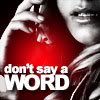
The entire icon is lovely! I really like the coloring, crop, text and the light texture is a wonderful accent.
1: -4 (ELIMINATED)
2: +1 / -1 = 0
3: -1
4: +3 (PEOPLE'S CHOICE)
5: -2
VOTING COMMENTS:
-1: I really like the black & white Peter section but the Claire part of the icon is contrasted as well. It would look better if the whole icon was in black & white.
-1: The icon doesn't have enough contrast.
-1: The greyscale at the bottom is too high in contrast, making Peter's face appear too bright, and doesn't compliment that well with the top regular colouring.
-1: The coloring is washed out.
+2: I love the close-up cropping, and the light textures compliment nicely with the text, which I think fits perfectly with the entire icon itself.
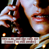
-2: Uninteresting use of texture, wrong color pick for the text.
-3: The icon is slightly over saturated.
+4: great cropping and excellent text
+4: The crop is thinking outside of the box and the text placement is perfect.
+4: Very interesting crop, great use of text.
-5: I really like the concept and blending job, but the overall colouring gives the icon a "sickly" look, and I think it's a bit too dark.
-5: The icon looks too crowded with the addition of the tiny text
VOTING
ELIMINATED: with -4 votes
marcal_92
I'm sorry to see you go, hun. Congratulations on making it this far!
PEOPLE'S CHOICE: with +3 votes
mal_contentum
MOD'S CHOICE:
angeldylan628
The entire icon is lovely! I really like the coloring, crop, text and the light texture is a wonderful accent.
1: -4 (ELIMINATED)
2: +1 / -1 = 0
3: -1
4: +3 (PEOPLE'S CHOICE)
5: -2
VOTING COMMENTS:
-1: I really like the black & white Peter section but the Claire part of the icon is contrasted as well. It would look better if the whole icon was in black & white.
-1: The icon doesn't have enough contrast.
-1: The greyscale at the bottom is too high in contrast, making Peter's face appear too bright, and doesn't compliment that well with the top regular colouring.
-1: The coloring is washed out.
+2: I love the close-up cropping, and the light textures compliment nicely with the text, which I think fits perfectly with the entire icon itself.
-2: Uninteresting use of texture, wrong color pick for the text.
-3: The icon is slightly over saturated.
+4: great cropping and excellent text
+4: The crop is thinking outside of the box and the text placement is perfect.
+4: Very interesting crop, great use of text.
-5: I really like the concept and blending job, but the overall colouring gives the icon a "sickly" look, and I think it's a bit too dark.
-5: The icon looks too crowded with the addition of the tiny text