[Results] LIMS R2C3
CHALLENGE
VOTING
Eliminated:
bitched with -4 votes.

I'm sorry to see you go. You're a fantastic icon maker. Please join us again for Round 3!
PEOPLE'S CHOICE:
lucky_star79 with +2 votes.

MOD'S CHOICE:
rtwofan

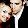
I love the manip; it's so realistic. And I love the coloring. It looks like an old photograph.
1: -3 / +2 = -1
2: +2
3: -4
4: -1 / +1 = 0
5: -5 / +2 = -3
Voting Off:
1 - the characters don't really match colorwise and the text + brush is a little much. it could have been better if there weren't as many effects.
1 - awkward cropping, good text placement but the font picked somewhat clashes with the icon's mood & coloring, which is a bit too green and yellow to look natural.
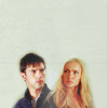
1 - It's a difficult choice, but I have to go with no. 1 here, for two reasons. Firstly, the text. While the layout of the text is done well, the actual words don't make a lot of sense to me. Peter and Claire have never seemed the type to be silent for very long (though, Peter would have more of a tendency to do so than Claire). I think text in an icon should match the character's personality. Secondly, the lighting sources for the two original images don't really match up to make the manip truly believable beyond a passing glance. Maybe if Claire's position were flipped, the light sources would match better.
3 - the characters are not cut out well. too blurry/overerased around the edges.
3 - The texture clouds too much of the characters
3 - Vote not counted.
3 - the cutting looks a bit inaccurately and there is too much free space for my taste.
3 - While I actually the icon (I like all of them, tbh), I think this one is definitely on the lower end of the quality scale (comparatively speaking, I mean). I don't know the most commonly used technical term, but I think the two images have been faded too much around the outside--specifically on Claire's hair; it seems to sort of disappear in some spots. If a different background color had been used, one that didn't blend in so well with blond hair, maybe it would look better.
4 - the blending is really good but thecoloring doesn't add much to icon
5 - The icon looks like it's still 2 different pictures rather than a manip.
5 - not enough contrast.
5 - the cropping doesn't compliment the subject enough
5 - low contrast, oversharpened.
5 - the positioning of them in the icon could have been better, she looks like she's taller than him, what is rather disturbing and the b/w looks a bit boring because it lacks something catchy like light and contrast.
Favorite:
1 - love the texture used and the text.
1 - the simple texture and the text blend really well with the manip and the cropping
2 - great cropping, great coloring (although it could've used less sharpening)
2 - The cropping is very interesting along with their facial expressions and I really like the bolt coloring.
4 - The manipulation on this one is pretty spectacular
5 - pretty scratch texture, nice use of color
5 - I like the way it's been made to look a bit like an old black and white picture (or a still from an old black and white movie when they always had that "scratchy" effect going on). I suppose I'm saying I like the texture. Also, in regards to the manip, I think the two images chosen go well together.
VOTING
Eliminated:
bitched with -4 votes.
I'm sorry to see you go. You're a fantastic icon maker. Please join us again for Round 3!
PEOPLE'S CHOICE:
lucky_star79 with +2 votes.
MOD'S CHOICE:
rtwofan
I love the manip; it's so realistic. And I love the coloring. It looks like an old photograph.
1: -3 / +2 = -1
2: +2
3: -4
4: -1 / +1 = 0
5: -5 / +2 = -3
Voting Off:
1 - the characters don't really match colorwise and the text + brush is a little much. it could have been better if there weren't as many effects.
1 - awkward cropping, good text placement but the font picked somewhat clashes with the icon's mood & coloring, which is a bit too green and yellow to look natural.
1 - It's a difficult choice, but I have to go with no. 1 here, for two reasons. Firstly, the text. While the layout of the text is done well, the actual words don't make a lot of sense to me. Peter and Claire have never seemed the type to be silent for very long (though, Peter would have more of a tendency to do so than Claire). I think text in an icon should match the character's personality. Secondly, the lighting sources for the two original images don't really match up to make the manip truly believable beyond a passing glance. Maybe if Claire's position were flipped, the light sources would match better.
3 - the characters are not cut out well. too blurry/overerased around the edges.
3 - The texture clouds too much of the characters
3 - Vote not counted.
3 - the cutting looks a bit inaccurately and there is too much free space for my taste.
3 - While I actually the icon (I like all of them, tbh), I think this one is definitely on the lower end of the quality scale (comparatively speaking, I mean). I don't know the most commonly used technical term, but I think the two images have been faded too much around the outside--specifically on Claire's hair; it seems to sort of disappear in some spots. If a different background color had been used, one that didn't blend in so well with blond hair, maybe it would look better.
4 - the blending is really good but thecoloring doesn't add much to icon
5 - The icon looks like it's still 2 different pictures rather than a manip.
5 - not enough contrast.
5 - the cropping doesn't compliment the subject enough
5 - low contrast, oversharpened.
5 - the positioning of them in the icon could have been better, she looks like she's taller than him, what is rather disturbing and the b/w looks a bit boring because it lacks something catchy like light and contrast.
Favorite:
1 - love the texture used and the text.
1 - the simple texture and the text blend really well with the manip and the cropping
2 - great cropping, great coloring (although it could've used less sharpening)
2 - The cropping is very interesting along with their facial expressions and I really like the bolt coloring.
4 - The manipulation on this one is pretty spectacular
5 - pretty scratch texture, nice use of color
5 - I like the way it's been made to look a bit like an old black and white picture (or a still from an old black and white movie when they always had that "scratchy" effect going on). I suppose I'm saying I like the texture. Also, in regards to the manip, I think the two images chosen go well together.