[LIMS Results] R2C1
CHALLENGE
VOTING
I'm sorry to say goodbye to:
cold_queen_5 with -7 votes.

I'm sorry to see you go. Please join us again for round 3!
PEOPLE'S CHOICE:
phoenix39 with +2 votes.

Thank you so much!
MOD'S CHOICE:
bitched (+1)

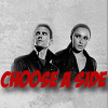
I love the light black & white coloring with the splash of red. I also love how Peter and Claire are laid out with the text underneath. It's nicely put together.
1: +2 / -1 = +1
2: 0
3: 0
4: -1 / +1 = 0
5: -7
6: -6
7: +2
8: -1 / +1 = +1
9: +1
10: +1
11: 0
Voting Off:
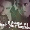
01 - the crop is a bit awkward and it takes away from the overall icon. Great coloring though.
04 - The low lighting in this erases too many of the qualities of the picture
05 - The darkness of the icon takes away from the image and I feel like the text doesn't fit the icon.
05 - the characters are too blurry
05 - the two different colourings do not work well in their composition?
05 - the text and the images are blurry; also, there's not enough contrast.
05 - no b&w contrast in the original pictures, and the colored texture just makes that more evident.
05 - the contrast is too light for my taste. it's not bold enough. i also feel like the text is a little unnecessary.
05 - Due to the dark coloring it is hard to see Claire & Peter clearly.
06 - the blue coloring is way overpowering, and i don't particularly like the font.
06 - unnatural coloring, unoriginal cropping.
06 - blurry picture, and the background doesn't really fit it, it doesn't blend with the picture.
06 - the coloring of the character doesn't go along well with the texture
06 - the texture doesn't really go well with the icon and the blue like coloring.
06 - THE TEXTURE AND COLOURING DO NOT COMPLIMENT EACH OTHER.
08 - I feel the cropping eliminates the ability to tell who is in the picture
Favorite:
01 - this icon is gorgeous. it must have taken so much work to make a black and white picture color. the coloring is brilliant and bold and i can tell how much work was put into it =)
01 - While this isn't necessarily my favorite, although I do like it a lot, I admire all the work that went into coloring the original picture - so I believe it is the best quality icon.
04 - the cropping and the curved text really compliment each other.
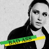
07 - nice contrast, good cropping, great use of splash of color.
08 - Great crop and the small use of color adds to the effect of the icon, not overriding it. Great job.
09 - great coloring and use of space.
10 - both the texture and the text are very effective
CHALLENGE 2
VOTING
I'm sorry to say goodbye to:
cold_queen_5 with -7 votes.
I'm sorry to see you go. Please join us again for round 3!
PEOPLE'S CHOICE:
phoenix39 with +2 votes.
Thank you so much!
MOD'S CHOICE:
bitched (+1)
I love the light black & white coloring with the splash of red. I also love how Peter and Claire are laid out with the text underneath. It's nicely put together.
1: +2 / -1 = +1
2: 0
3: 0
4: -1 / +1 = 0
5: -7
6: -6
7: +2
8: -1 / +1 = +1
9: +1
10: +1
11: 0
Voting Off:
01 - the crop is a bit awkward and it takes away from the overall icon. Great coloring though.
04 - The low lighting in this erases too many of the qualities of the picture
05 - The darkness of the icon takes away from the image and I feel like the text doesn't fit the icon.
05 - the characters are too blurry
05 - the two different colourings do not work well in their composition?
05 - the text and the images are blurry; also, there's not enough contrast.
05 - no b&w contrast in the original pictures, and the colored texture just makes that more evident.
05 - the contrast is too light for my taste. it's not bold enough. i also feel like the text is a little unnecessary.
05 - Due to the dark coloring it is hard to see Claire & Peter clearly.
06 - the blue coloring is way overpowering, and i don't particularly like the font.
06 - unnatural coloring, unoriginal cropping.
06 - blurry picture, and the background doesn't really fit it, it doesn't blend with the picture.
06 - the coloring of the character doesn't go along well with the texture
06 - the texture doesn't really go well with the icon and the blue like coloring.
06 - THE TEXTURE AND COLOURING DO NOT COMPLIMENT EACH OTHER.
08 - I feel the cropping eliminates the ability to tell who is in the picture
Favorite:
01 - this icon is gorgeous. it must have taken so much work to make a black and white picture color. the coloring is brilliant and bold and i can tell how much work was put into it =)
01 - While this isn't necessarily my favorite, although I do like it a lot, I admire all the work that went into coloring the original picture - so I believe it is the best quality icon.
04 - the cropping and the curved text really compliment each other.
07 - nice contrast, good cropping, great use of splash of color.
08 - Great crop and the small use of color adds to the effect of the icon, not overriding it. Great job.
09 - great coloring and use of space.
10 - both the texture and the text are very effective
CHALLENGE 2