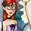
Oops... I arted... kinda...
I bet you were expecting an icon post, right?
Well... sorta.
I recently discovered the work of a mad-brilliant artist, lberghol. Upon looking at her HP images, I was instantly smitten and had to to do something with them! So, after much pondering, fussing, and going cross-eyed looking for the first pics to apply my touch to, I finally found my first victims. The wedding image I heavily cleaned up and colored in my normal style (though I'm just not sure about it... bah! I'm likely just being über-picky), but the second two, I tried out a style I've never done before as I can't make myself do a "messy" looking piece. Surprisingly, once I forced myself to stop over analyzing every little flub or bit of color out of the lines, I fell in love with them.
So where are the icons?
I actually decided that I would make thumbnails for the pics so that someone could sneak a peak at them without having to click on the cut. How better to kill two birds with one stone than to make the thumbnails icons!
I thought it sounded brilliant.
As a side note, if you take the art or icons, make sure you credit lberghol for her work as the originals aren't mine. And lberghol, if you're reading this, I hope them meet with your approval. Enjoy!
ICONS/THUMBNAILS:


Read "THE RULES" here
Click the pic for the bigger image...

This was the first picture I did. Something about the look on Ginny's face just screamed at me to color it in. For some reason, I just saw Fleur have a royal purple as her main color, and from there I started to think about Monet's paintings... Note to self, don't listen to too much classical music when you're contemplating color design. It does weird things...

After pointing out this picture to my sis, she said I had to color it. Who am I to disagree? I kept it mostly light and muted in it's colors 'cause anytime I tried to make it bright, it looked off to me.

This was the first pic I tried this sort of watercolor look on and I think it looks faboo! You may not think it, but I did the coloring on three layers: The bottom was white, then all the colors, and then the outline set on multiply. That was it... No, seriously, three. Expect to see more along these lines and likely sooner rather than later.
Current Mood:
ÜBER pleased