Round 09 Themes
ROUND 09 THEMES
Themes 01-10
01. Zoom in/Zoom out (+/-) 02. Notebook Texture 03. Contact 04. Nature 05. Magazine Cover
06. Rainbow 07. Text as a texture 08. Devil/Angel 09. Sprinkles of Joy 10. Culmination
Category 11-15
Background Story
Artist's Choice
Whatever you would like to show us ♥
Explanation:
01. This one's pretty self explanatory. The icon should have both "far away" and "close up" bits of your characters and/or scenes molded together in anyway you can.
02. Use a notebook texture in your icon. Use as many as you like. One is you minimum number. Blend it using multiply, dark, soft light or whatever mode of blending suits you.
03. And we don't just mean touch. We want sizzling chemistry in your icon. When two people see each other for the first, when they talk to each other or, yes, when the touch each other. Basically any sort of communication by any of the five senses is our idea of contact. Take that and run with it :p
04. NO CLOUDS PLEASE. Use a stock texture of trees, the ground, the earth. Or use an illustration that already has those things. We want the nature surrounding your otp to be highlighted in this icon.
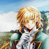
by ryfee
05.Magazine Cover/Cover Couple is an idea we leeched off moonstruckalice 's last spectacular set. I'm sure you all remember it. Manipulate your OTP into looking like the cover page of a magazine.

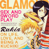
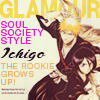
moonstruckalice
06. This has been such a used theme lately. Use colours, textures, blocking etc etc to show the seven colours of the rainbow.
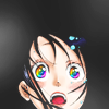
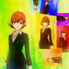
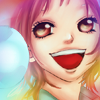
by shelliana, fiendie, ce_lestic
07.Kitty and I noticed how absolutely coool this idea is. Basically the idea is to use the text of your icon as your BG texture. It's a typographic maneuver. Be creative. You can use a text texture if you like.
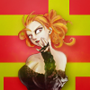
by astrokittie
Do you see that gorgeous geometric background? It's text. Freakin' awesome, huh?
08. Devil/Angel. Dual Themes again. You have to show both sides of your OTPs in one icon. Whether you want use colours, text or your characters to do this is absolutely your choice.
09. This is basically a fancy way of saying light textures :p Use em, abuse em.
10. Your icon needs to show the climax of a story. Use the expressions of your characters, dramatic colour or actual scenes to do this.
Category Set: Recently we've noticed the a trend in creating AC sets which use the idea of continuous background. This time Kitty and I thought to make this your cat set.
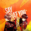
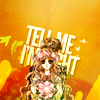
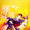


by kawaii_chicken
AC set: Have fun with this one :p
Questions? Doubts? Recriminations? Go ahead :p