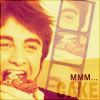
[0000] >> Old Graphics: Reposted from mistressdm8
the rules.
comment.
I love hearing what styles and coloring people like best.
It's also nice to know where my icons are going.
And of course, feedback is always appreciated. :)
credit the community.
(otemae_art, NOT leucocrystal)
For some reason, people seem to have trouble spelling my journal's name.
I'd appreciate it if you'd use the template in my info.
no altering or re-posting.
I never make bases, so no altering of my icons is allowed.
If I find any of my icons hotlinked on Xanga or something like that,
Chuck Norris will have to roundhouse kick you in the face. :(
12 HARRY POTTER
01.
02.
03.
04.
05.
06.
07.
08.
09.
10.
11.
12.
81 MULTI-FANDOM
harry potter
01.
02.
03.
04.
05.
06.
07.
08.
09.
10.
11.
12.
13.
14.
15.
16.
17.
18.
19.
20.
21.
22.
23.
24.
25.
26.
27.
28.
29.
30.
31.
* 32.
33.
34.
35.
36.
37.
38.
39.
40.
41.
42.
43.
44.
* (Made to match veelaoferised's header.)
the incredibles
45.
46.
47.
48.
49.
50.
51.
52.
53.
24
54.
55.
56.
57.
kiefer sutherland
58.
59.
60.
61.
62.
63.
64.
65.
csi: crime scene investigation
66.
67.
68.
69.
70.
71.
72.
73.
74.
75.
76.
77.
78.
79.
80.
81.
102 HARRY POTTER
001.
002.
003.
004.
005.
006.
007.
008.
009.
010.
011.
012.
013.
014.
015.
016.
017.
018.
019.
020.
021.
022.
023.
024.
025.
026.
027.
028.
029.
030.
031.
032.
033.
034.
035.
036.
037.
038.
039.
040.
041.
042.
043.
044.
045.
046.
047.
048.
049.
050.
051.
052.
053.
054.
055.
056.
057.
058.
059.
060.
061.
062.
063.
064.
065.
066.
067.
068.
069.
070.
071.
072.
073.
074.
075.
076.
077.
078.
079.
080.
081.
082.
083.
084.
085.
086.
087.
088.
089.
090.
091.
092.
093.
094.
095.
096.
097.
098.
099.
100.
101.
102.
BRUSHES 01 -- SIN CITY TEXTURES
My first brush set. I hope someone out there can find good use for them.
sample:
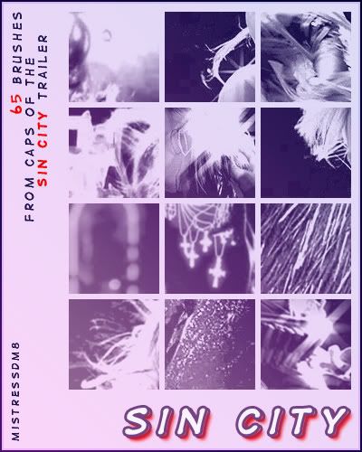
PS7 brushes --- image pack
Sample of multiple brushes being used:
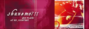
(I make winner's banners over at hp_icontest, and use my brushes for the design.)
Hope you like them; enjoy! ♥
TUTORIAL 01
OK, this is my first tutorial... Needless to say, I hope it's a comprehensive enough/clear enough tutorial to be of some use.
I will be showing you how to get from...
This base >>
...to...
<< this icon.
I know, the colours are a bit... interesting, but I was rather proud of the process involved in making this, and in the end, despite the interesting colours, I still think it looks pretty cool.
Warning: This tutorial IS image-heavy.
Also, before I forget, this tutorial is for use in Photoshop 7. I've never used PSP, so I can't be sure how easily it would transfer over into that or other programs. If anyone has any PSP-related questions, I'm sorry, but I'll be unable to answer them. However, if anyone viewing the comments knows anything, feel free to post any information you might have that could help.
First things first... I started with this picture here, courtesy of the mighty dr.com, if I'm not much mistaken:
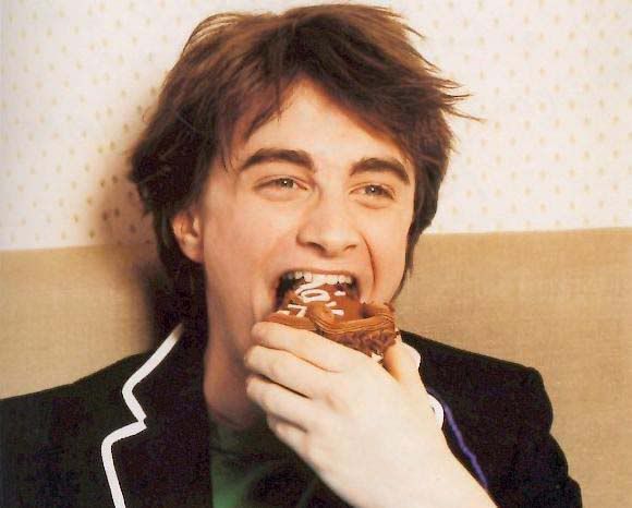
It’s kind of a low quality photo, since it appears to have been scanned from a magazine, but when we crop it, the quality will improve.
We crop the picture with the following settings...
Width: 100 pixels
Height: 100 pixels
Resolution: 72 pixels/inch
…to get this base:
In case you don’t already have your Layers window open, go to Window > Layers to bring it up.
Once you have the Layers window open, you should see your background layer (blank white -- but that’s irrelevant) and your base layer. Personally, I delete the white background layer whenever I make icons, just to get it out of the way.
Here is a guide to the Layers window, and an indication of what white layer I’m talking about:
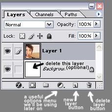
If you want to delete this (as far as I’ve been able to tell) useless white layer, simply double click on the little padlock that you see next to the word “Background.” Click “OK” on the window that pops up, and that will unlock the layer and rename it “Layer 0.” Then you can just delete it by clicking on the trash can button.
Now, make sure the base layer is selected. Then, click on the symbol that looks like a circle split into a black half and a white half, indicated above. Select the “Solid Color…” option. This creates a new layer to fill with a solid colour. In the colour chooser that pops up, type in the following info:
Hex: #F6CE80
R: 246
G: 206
B: 128
Set the layer to Normal, and the Opacity to 90%. The icon should now look like this:

Next, select the base layer in the Layer window, then go to Layer > Duplicate Layer, and drag the duplicate base layer up so that it’s on top of the solid color layer. Set the duplicate base layer to Overlay at 100% opacity. The icon should now look like this:

Duplicate the layer you just made, and drag it so that it’s on top of all the others. The icon now looks like this:

Next, select the “Solid Color…” Layer option again from the dropdown menu, but this time type in these colour settings:
Hex: #0C0B47
R: 12
G: 11
B: 71
Then set the layer to Exclusion at 100% opacity. The icon should now look like this:

Now, the icon looks a bit too bright and washed out for my taste, so I went back and selected the second Overlay layer, and selected Image > Adjustments > Brightness/Contrast, and downed the Brightness to -40, and upped the Contrast to +30. You can fiddle around with these to your taste, depending on the look of your base pic, and you can also fiddle around with the colour settings by selecting Image > Adjustments > Color Balance, though I personally left those alone. If you apply the same settings as I did, your icon should look like this:

And just for your information, here is a quick reference to how your Layer palette should look at this point:
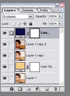
Once you’re satisfied, make a merged copy (Edit > Copy Merged) of the icon as it is now, and paste it into a new document to set aside for later use.
Now, back to the original icon.
Create a new layer, and use this brush:
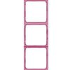
I got this brush from this set by the amazing icon brush goddess crumblingwalls.
So, I set the colour to #930B47, and place it where I’d like it to go on the image. It now looks like this:

I then hit Ctrl-T (Transform tool), which allows me to rotate the brush to the angle I’d like it to be set to. (Thanks to the lovely mod etoilepb for pointing out this much shorter method of rotating a brush!)
With the brush rotated, the icon now looks like this:
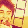
Now, remember the merged copy of the brushless icon we made earlier? Make a merged copy of that document, and paste it into a new layer in the icon we just put the brush on. Change the opacity of the top layer to 40%, to lighten the brush, without changing the opacity of the whole icon. It now should look like this:

Now, here’s the fun part -- creating the film strip. Select the Magic Wand Tool:

Make sure you have the FIRST layer selected -- the one with the brush on it, NOT the blank one. Use the wand tool to select the blank area in the first slot in the film strip. Click on that area, and drag the selection to hover over an area of the icon you’d like to have a piece of in the first film slot. Then, hit Ctrl+Shift+C (a quick way to make a merged copy of the selected area). Click on the blank film strip area you’re planning to fill again. Select the top layer (the brushless one). Then hit Paste. The small area you selected should fit perfectly into the first slot. It now looks like this:

However, I don’t want the small pictures to be that dark. So, select the layer with the small picture pasted in it, and change the Opacity to 40%. That way, the opacity of the little picture matches the opacity of the film brush. The icon now looks like this:

Repeat those steps for the remaining two picture slots. You can have the same piece repeating three times, or three different pieces... I chose the latter. Once I’m done, it looks like this:
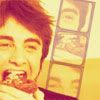
We’re getting there, I promise! It’s now time for a border and text. Create a new layer above all the others. Choose a one-pixel wide border around the entire icon, and fill it with solid black (#000000). Then change the layer setting to Soft Light. It now looks like this:

Just the text left, and then we’re done!
For this icon, I first created a new layer for the “Mmm…” text, and opened the Character window (Window > Character). Using that window, I changed the font to Arial, the size to 8, and the colour to #7B1315. I also set it to all caps and Bold face, with character spacing (space between letters) at the default 0pt, and the style to Crisp. This shows how the character window looks under these settings, with the selected all caps and bold buttons:
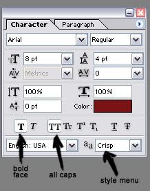
And here is how the icon looks under the above settings, after I position the text where I‘d like it to go:
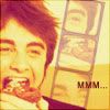
Then, I create another new layer for the “cake“ text, and use the Character window to set the font to Dirty Headline, size 20 (just click on the size and type in the one you want), regular (not bold), all caps, colour solid black (#000000), style Crisp, 0pt character spacing. Then, to give it that see-through look, just set that text layer to Soft Light.
Again for your information, this is how the Layers palette and character settings should look, if you’re working on the “cake” layer, just in case you think it doesn’t look right, but you're not sure why:
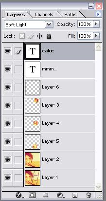
and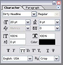
Note: If you think the text in the "cake" layer is too light, you can always just duplicate the layer -- be sure to leave it set to Soft Light -- to darken it. I chose to leave it as-is.
And finally, you’re finished! The finished product should look something like this:
comment.
I love hearing what styles and coloring people like best.
It's also nice to know where my icons are going.
And of course, feedback is always appreciated. :)
credit the community.
(otemae_art, NOT leucocrystal)
For some reason, people seem to have trouble spelling my journal's name.
I'd appreciate it if you'd use the template in my info.
no altering or re-posting.
I never make bases, so no altering of my icons is allowed.
If I find any of my icons hotlinked on Xanga or something like that,
Chuck Norris will have to roundhouse kick you in the face. :(
12 HARRY POTTER
01.

02.

03.

04.

05.

06.

07.

08.

09.

10.

11.

12.

81 MULTI-FANDOM
harry potter
01.

02.

03.

04.

05.

06.

07.

08.

09.

10.

11.

12.

13.

14.

15.

16.

17.

18.

19.

20.

21.

22.

23.

24.

25.

26.

27.

28.

29.

30.

31.
* 32.

33.

34.

35.

36.

37.

38.

39.

40.

41.

42.

43.

44.

* (Made to match veelaoferised's header.)
the incredibles
45.

46.

47.

48.

49.

50.

51.

52.

53.

24
54.

55.

56.

57.

kiefer sutherland
58.

59.

60.

61.

62.

63.

64.

65.

csi: crime scene investigation
66.

67.

68.

69.

70.

71.

72.

73.

74.

75.

76.

77.

78.

79.

80.

81.

102 HARRY POTTER
001.
002.
003.
004.
005.
006.
007.
008.
009.
010.
011.
012.
013.
014.
015.
016.
017.
018.
019.
020.
021.
022.
023.
024.
025.
026.
027.
028.
029.
030.
031.
032.
033.
034.
035.
036.
037.
038.
039.
040.
041.
042.
043.
044.
045.
046.
047.
048.
049.
050.
051.
052.
053.
054.
055.
056.
057.
058.
059.
060.
061.
062.
063.
064.
065.
066.
067.
068.
069.
070.
071.
072.
073.
074.
075.
076.
077.
078.
079.
080.
081.
082.
083.
084.
085.
086.
087.
088.
089.
090.
091.
092.
093.
094.
095.
096.
097.
098.
099.
100.
101.
102.
BRUSHES 01 -- SIN CITY TEXTURES
My first brush set. I hope someone out there can find good use for them.
sample:

PS7 brushes --- image pack
Sample of multiple brushes being used:

(I make winner's banners over at hp_icontest, and use my brushes for the design.)
Hope you like them; enjoy! ♥
TUTORIAL 01
OK, this is my first tutorial... Needless to say, I hope it's a comprehensive enough/clear enough tutorial to be of some use.
I will be showing you how to get from...
This base >>

...to...

<< this icon.
I know, the colours are a bit... interesting, but I was rather proud of the process involved in making this, and in the end, despite the interesting colours, I still think it looks pretty cool.
Warning: This tutorial IS image-heavy.
Also, before I forget, this tutorial is for use in Photoshop 7. I've never used PSP, so I can't be sure how easily it would transfer over into that or other programs. If anyone has any PSP-related questions, I'm sorry, but I'll be unable to answer them. However, if anyone viewing the comments knows anything, feel free to post any information you might have that could help.
First things first... I started with this picture here, courtesy of the mighty dr.com, if I'm not much mistaken:

It’s kind of a low quality photo, since it appears to have been scanned from a magazine, but when we crop it, the quality will improve.
We crop the picture with the following settings...
Width: 100 pixels
Height: 100 pixels
Resolution: 72 pixels/inch
…to get this base:

In case you don’t already have your Layers window open, go to Window > Layers to bring it up.
Once you have the Layers window open, you should see your background layer (blank white -- but that’s irrelevant) and your base layer. Personally, I delete the white background layer whenever I make icons, just to get it out of the way.
Here is a guide to the Layers window, and an indication of what white layer I’m talking about:

If you want to delete this (as far as I’ve been able to tell) useless white layer, simply double click on the little padlock that you see next to the word “Background.” Click “OK” on the window that pops up, and that will unlock the layer and rename it “Layer 0.” Then you can just delete it by clicking on the trash can button.
Now, make sure the base layer is selected. Then, click on the symbol that looks like a circle split into a black half and a white half, indicated above. Select the “Solid Color…” option. This creates a new layer to fill with a solid colour. In the colour chooser that pops up, type in the following info:
Hex: #F6CE80
R: 246
G: 206
B: 128
Set the layer to Normal, and the Opacity to 90%. The icon should now look like this:

Next, select the base layer in the Layer window, then go to Layer > Duplicate Layer, and drag the duplicate base layer up so that it’s on top of the solid color layer. Set the duplicate base layer to Overlay at 100% opacity. The icon should now look like this:

Duplicate the layer you just made, and drag it so that it’s on top of all the others. The icon now looks like this:

Next, select the “Solid Color…” Layer option again from the dropdown menu, but this time type in these colour settings:
Hex: #0C0B47
R: 12
G: 11
B: 71
Then set the layer to Exclusion at 100% opacity. The icon should now look like this:

Now, the icon looks a bit too bright and washed out for my taste, so I went back and selected the second Overlay layer, and selected Image > Adjustments > Brightness/Contrast, and downed the Brightness to -40, and upped the Contrast to +30. You can fiddle around with these to your taste, depending on the look of your base pic, and you can also fiddle around with the colour settings by selecting Image > Adjustments > Color Balance, though I personally left those alone. If you apply the same settings as I did, your icon should look like this:

And just for your information, here is a quick reference to how your Layer palette should look at this point:

Once you’re satisfied, make a merged copy (Edit > Copy Merged) of the icon as it is now, and paste it into a new document to set aside for later use.
Now, back to the original icon.
Create a new layer, and use this brush:

I got this brush from this set by the amazing icon brush goddess crumblingwalls.
So, I set the colour to #930B47, and place it where I’d like it to go on the image. It now looks like this:

I then hit Ctrl-T (Transform tool), which allows me to rotate the brush to the angle I’d like it to be set to. (Thanks to the lovely mod etoilepb for pointing out this much shorter method of rotating a brush!)
With the brush rotated, the icon now looks like this:

Now, remember the merged copy of the brushless icon we made earlier? Make a merged copy of that document, and paste it into a new layer in the icon we just put the brush on. Change the opacity of the top layer to 40%, to lighten the brush, without changing the opacity of the whole icon. It now should look like this:

Now, here’s the fun part -- creating the film strip. Select the Magic Wand Tool:

Make sure you have the FIRST layer selected -- the one with the brush on it, NOT the blank one. Use the wand tool to select the blank area in the first slot in the film strip. Click on that area, and drag the selection to hover over an area of the icon you’d like to have a piece of in the first film slot. Then, hit Ctrl+Shift+C (a quick way to make a merged copy of the selected area). Click on the blank film strip area you’re planning to fill again. Select the top layer (the brushless one). Then hit Paste. The small area you selected should fit perfectly into the first slot. It now looks like this:

However, I don’t want the small pictures to be that dark. So, select the layer with the small picture pasted in it, and change the Opacity to 40%. That way, the opacity of the little picture matches the opacity of the film brush. The icon now looks like this:

Repeat those steps for the remaining two picture slots. You can have the same piece repeating three times, or three different pieces... I chose the latter. Once I’m done, it looks like this:

We’re getting there, I promise! It’s now time for a border and text. Create a new layer above all the others. Choose a one-pixel wide border around the entire icon, and fill it with solid black (#000000). Then change the layer setting to Soft Light. It now looks like this:

Just the text left, and then we’re done!
For this icon, I first created a new layer for the “Mmm…” text, and opened the Character window (Window > Character). Using that window, I changed the font to Arial, the size to 8, and the colour to #7B1315. I also set it to all caps and Bold face, with character spacing (space between letters) at the default 0pt, and the style to Crisp. This shows how the character window looks under these settings, with the selected all caps and bold buttons:

And here is how the icon looks under the above settings, after I position the text where I‘d like it to go:

Then, I create another new layer for the “cake“ text, and use the Character window to set the font to Dirty Headline, size 20 (just click on the size and type in the one you want), regular (not bold), all caps, colour solid black (#000000), style Crisp, 0pt character spacing. Then, to give it that see-through look, just set that text layer to Soft Light.
Again for your information, this is how the Layers palette and character settings should look, if you’re working on the “cake” layer, just in case you think it doesn’t look right, but you're not sure why:

and

Note: If you think the text in the "cake" layer is too light, you can always just duplicate the layer -- be sure to leave it set to Soft Light -- to darken it. I chose to leave it as-is.
And finally, you’re finished! The finished product should look something like this:
