tutorial #1
Okay, let's get to business. :) So anon at icon secrets, posted a secret where he wanted some from me and other makers, but was too shy to ask :)
Sadly, I can't re-create my icons, because I always forgot how i did this or that and what texture i uses, so let's do this from the scratch.
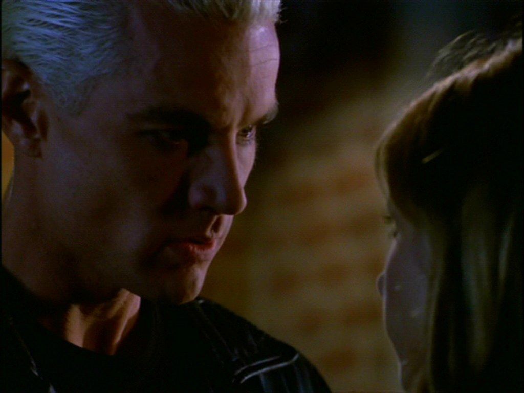
I wanted to do something a bit of challenge, so I decided to do an icon with Spike from "Buffy the vampire slayer", because most of the caps in this is quite dark, and sometimes too yellow-ish or red and I've wanted to play a bit here :)
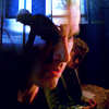
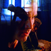
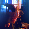
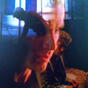
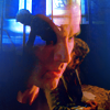
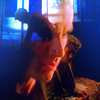
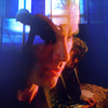
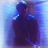
How to do it from this [1, 2, 3] to this.
#1 Composition.
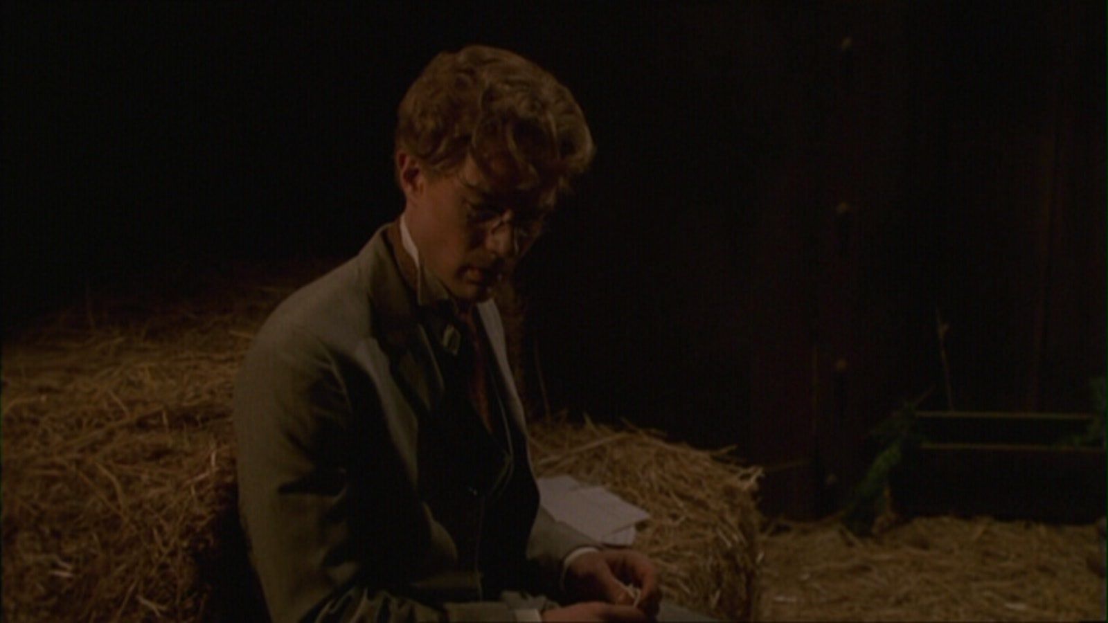
I love icons with meaning, with lots of emotions or angst, and I think composition&blending is always the first step. So I've picked caps, that I wanted include, to show how Spike changed through "Fool For Love" episode.
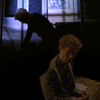
I thought this isn't enough and I need to add something, so I added this cap and played around with it, put it on screen, erased some unnecessary parts, made a new layer, put it under and used a brush tool with black color until i saw non-transparent part of Spike's face, then blurred it a bit and erased unnecessary parts. :)
Our composition is ready, let's go to the next step.
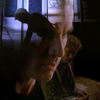
#2 Colouring & Textures.
The thing I do ALL THE TIME. Fill with white color and put it on soft light, then duplicating the base and put it on soft light, change the opacity if it's too dark. And add a bit of vibrance, here I used:
Vibrance +70
Saturation + 27
The actual coloring:) As I said before problem with Buffy, the caps are almost always too dark, red and yellow-ish and sometimes grainy :\ But as you could from step #1 dark isn't always bad? So what we would do with other problems?
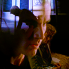
Here I've filled our icon with #020b1c and put it on screen,
then I've added selective color layer (I use them a lot, lately) with this numbers:
Reds
Cyan: -63
Magenta: +18
Yellow: -9
Black: 0
Yellows
Cyan: -9
Magenta: -25
Yellow: -25
Black: +13
Cyans
Cyan: +100
Magenta: +26
Yellow: -100
Black: +49
Blues
Cyan: +31
Magenta: -12
Yellow: -32
Black: +12
Magentas
Cyan: +100
Magenta: +32
Yellow: -8
Black: +37
Whites:
Cyan: +31
Magenta: -48
Yellow: 0
Black: +27
Blacks
Cyan: 0
Magenta: 0
Yellow: 0
Black: +6
Then I added this texture by innocent_lexys put it on screen, copied our base and put it on Soft light [opacity: 70%] above texture layer.

Still look a bit dull, isn't ? At least for me it is. I think I need a bit of yellow here, so we're going to use some color balance with this numbers:
Shadows:
Cyan/Red: +6
Magenta/Green: 0
Yellow/Blue: +9
Midtones:
Cyan/Red: -29
Magenta/Green: 0
Yellow/Blue: -16
Highlights:
Cyan/Red: +16
Magenta/Green: +3
Yellow/Blue: -24
Still it needs more colors, let's play with selective colors again, but with new layer ofcourse :)
Reds
Cyan: -11
Magenta: +2
Yellow: +6
Black: +7
Yellows
Cyan: -100
Magenta: 0
Yellow: +28
Black: 0
Cyans
Cyan: +7
Magenta: -21
Yellow: -45
Black: +54
Blues
Cyan: -4
Magenta: -10
Yellow: -14
Black: +17
Magentas
Cyan: +30
Magenta: +27
Yellow: +6
Black: +21
Whites:
Cyan: 0
Magenta: 0
Yellow: 0
Black: +33
Blacks
Cyan: 0
Magenta: 0
Yellow: 0
Black: -2
Then I've added this gorgeous texture by longerthanwedo, and it fitted perfectly! Also I added new layer put it on screen and drawn aloft with brush round 5 px with color #2086b6, where I though i needed to add a bit more color.
Then I put it this on gradient map {sadly, I don't remember the author :( } on soft light [opacity: 52, fill: 64]
Then selective color again, because I like how the skins looks, but I dislike this cyan :\
Reds
Cyan: +16
Magenta: -3
Yellow: +6
Black: -1
Yellows
Cyan: -43
Magenta: -12
Yellow: +45
Black: +2
Cyans
Cyan: +100
Magenta: +8
Yellow: -100
Black: +38
Blues
Cyan: +9
Magenta: -5
Yellow: -27
Black: +40
Magentas
Cyan: -100
Magenta: +3
Yellow: +58
Black: +24
Whites:
Cyan: 0
Magenta: 0
Yellow: 0
Black: +52
Blacks
Cyan: 0
Magenta: 0
Yellow: 0
Black: +4
I think we need more contrast here, and brightness? Right, so we will do with duplicating all the last years, merging them, put in on screen->>>gaussin blur with radius 21 px, then we again duplicating the same layers as before, merging them, put this layer above screen layer on soft light and use again gaussin blur with radius 0,3 px, change layer opacity to 54%.
Okay, so there's way too much blue here, so we gonna use selective color one last time :)
Blues
Cyan: -28
Magenta: -8
Yellow: +12
Black: +5
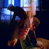
And the last step, merge all the layer, use sharpen filter, then fade it [opacity 38%]

All done :)
As you can see, english isn't my native language, and I kind of sucked at writing a bit, so I did PSD as well :)
P.S. The key to everything is experimenting, no matter what everybody says, there always would be people who will love your work and people who will hate it. Do what you like, if feel like completely re-color image then do it, if you think you need to use more vibrance and saturation then use it, ofcourse we always should to remeber about the quality, but with icons it's so much easier than with tumblr!artworks or wallpapers. Sadly I think I couldn't tell very much, but one important thing it's use your intuition and inspiration, and try to work with something you love! For example: Spike is kinda my favorite character at Buffy, so it was a bit easier to icon, I have lots of ideas how to portray him, I mean he is inspiration himself :)))
Some tips and tricks
anon wanted tutorials with this icons, but my memory is awful with icons, so i couldn't write the whole way, but I can tell what was the main theme :)

For this icon I've lots of selective color layers [mostly worked with reds and yellows] and filled background with color from the cap, and ofcourse lots of textures by innocent_lexys
Here was a lot of blue/cyan soft light and screen filled layers, selective coloring again mainly blues/cyans sections. And ofcourse some brush work, like one layer put on screen with light blobs at the background and soft light layer with dark blobs used at Nick face nd body. :)
Sadly, I can't re-create my icons, because I always forgot how i did this or that and what texture i uses, so let's do this from the scratch.
I wanted to do something a bit of challenge, so I decided to do an icon with Spike from "Buffy the vampire slayer", because most of the caps in this is quite dark, and sometimes too yellow-ish or red and I've wanted to play a bit here :)
How to do it from this [1, 2, 3] to this.
#1 Composition.
I love icons with meaning, with lots of emotions or angst, and I think composition&blending is always the first step. So I've picked caps, that I wanted include, to show how Spike changed through "Fool For Love" episode.
I thought this isn't enough and I need to add something, so I added this cap and played around with it, put it on screen, erased some unnecessary parts, made a new layer, put it under and used a brush tool with black color until i saw non-transparent part of Spike's face, then blurred it a bit and erased unnecessary parts. :)
Our composition is ready, let's go to the next step.
#2 Colouring & Textures.
The thing I do ALL THE TIME. Fill with white color and put it on soft light, then duplicating the base and put it on soft light, change the opacity if it's too dark. And add a bit of vibrance, here I used:
Vibrance +70
Saturation + 27
The actual coloring:) As I said before problem with Buffy, the caps are almost always too dark, red and yellow-ish and sometimes grainy :\ But as you could from step #1 dark isn't always bad? So what we would do with other problems?
Here I've filled our icon with #020b1c and put it on screen,
then I've added selective color layer (I use them a lot, lately) with this numbers:
Reds
Cyan: -63
Magenta: +18
Yellow: -9
Black: 0
Yellows
Cyan: -9
Magenta: -25
Yellow: -25
Black: +13
Cyans
Cyan: +100
Magenta: +26
Yellow: -100
Black: +49
Blues
Cyan: +31
Magenta: -12
Yellow: -32
Black: +12
Magentas
Cyan: +100
Magenta: +32
Yellow: -8
Black: +37
Whites:
Cyan: +31
Magenta: -48
Yellow: 0
Black: +27
Blacks
Cyan: 0
Magenta: 0
Yellow: 0
Black: +6
Then I added this texture by innocent_lexys put it on screen, copied our base and put it on Soft light [opacity: 70%] above texture layer.
Still look a bit dull, isn't ? At least for me it is. I think I need a bit of yellow here, so we're going to use some color balance with this numbers:
Shadows:
Cyan/Red: +6
Magenta/Green: 0
Yellow/Blue: +9
Midtones:
Cyan/Red: -29
Magenta/Green: 0
Yellow/Blue: -16
Highlights:
Cyan/Red: +16
Magenta/Green: +3
Yellow/Blue: -24
Still it needs more colors, let's play with selective colors again, but with new layer ofcourse :)
Reds
Cyan: -11
Magenta: +2
Yellow: +6
Black: +7
Yellows
Cyan: -100
Magenta: 0
Yellow: +28
Black: 0
Cyans
Cyan: +7
Magenta: -21
Yellow: -45
Black: +54
Blues
Cyan: -4
Magenta: -10
Yellow: -14
Black: +17
Magentas
Cyan: +30
Magenta: +27
Yellow: +6
Black: +21
Whites:
Cyan: 0
Magenta: 0
Yellow: 0
Black: +33
Blacks
Cyan: 0
Magenta: 0
Yellow: 0
Black: -2
Then I've added this gorgeous texture by longerthanwedo, and it fitted perfectly! Also I added new layer put it on screen and drawn aloft with brush round 5 px with color #2086b6, where I though i needed to add a bit more color.
Then I put it this on gradient map {sadly, I don't remember the author :( } on soft light [opacity: 52, fill: 64]
Then selective color again, because I like how the skins looks, but I dislike this cyan :\
Reds
Cyan: +16
Magenta: -3
Yellow: +6
Black: -1
Yellows
Cyan: -43
Magenta: -12
Yellow: +45
Black: +2
Cyans
Cyan: +100
Magenta: +8
Yellow: -100
Black: +38
Blues
Cyan: +9
Magenta: -5
Yellow: -27
Black: +40
Magentas
Cyan: -100
Magenta: +3
Yellow: +58
Black: +24
Whites:
Cyan: 0
Magenta: 0
Yellow: 0
Black: +52
Blacks
Cyan: 0
Magenta: 0
Yellow: 0
Black: +4
I think we need more contrast here, and brightness? Right, so we will do with duplicating all the last years, merging them, put in on screen->>>gaussin blur with radius 21 px, then we again duplicating the same layers as before, merging them, put this layer above screen layer on soft light and use again gaussin blur with radius 0,3 px, change layer opacity to 54%.
Okay, so there's way too much blue here, so we gonna use selective color one last time :)
Blues
Cyan: -28
Magenta: -8
Yellow: +12
Black: +5
And the last step, merge all the layer, use sharpen filter, then fade it [opacity 38%]
All done :)
As you can see, english isn't my native language, and I kind of sucked at writing a bit, so I did PSD as well :)
P.S. The key to everything is experimenting, no matter what everybody says, there always would be people who will love your work and people who will hate it. Do what you like, if feel like completely re-color image then do it, if you think you need to use more vibrance and saturation then use it, ofcourse we always should to remeber about the quality, but with icons it's so much easier than with tumblr!artworks or wallpapers. Sadly I think I couldn't tell very much, but one important thing it's use your intuition and inspiration, and try to work with something you love! For example: Spike is kinda my favorite character at Buffy, so it was a bit easier to icon, I have lots of ideas how to portray him, I mean he is inspiration himself :)))
Some tips and tricks
anon wanted tutorials with this icons, but my memory is awful with icons, so i couldn't write the whole way, but I can tell what was the main theme :)
For this icon I've lots of selective color layers [mostly worked with reds and yellows] and filled background with color from the cap, and ofcourse lots of textures by innocent_lexys
Here was a lot of blue/cyan soft light and screen filled layers, selective coloring again mainly blues/cyans sections. And ofcourse some brush work, like one layer put on screen with light blobs at the background and soft light layer with dark blobs used at Nick face nd body. :)