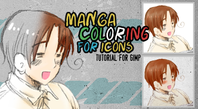
tassyn: manga coloring for icons tutorial
Program: GIMP 2.0
Translatable: I believe so.
Difficulty: Medium
Steps: 17 if you do the full tutorial
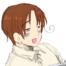
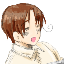
1. If you're making an icon and don't really care to have a whole colored manga page, then go ahead and crop your image. It'll save you a lot of time. I'm going to use this image of Feliciano from Axis Powers Hetalia to make an icon for kaurin since she bribed asked me so nicely.

1a. OPTIONAL STEP: If your image has a gradient or texture already on it, you might want to use your pen tool or eraser tool to get rid of it, especially if you're coloring a whole page. However a lot of times when I'm making an icon I won't bother with this because if the image is large enough the gradients aren't noticeable after you resize it.
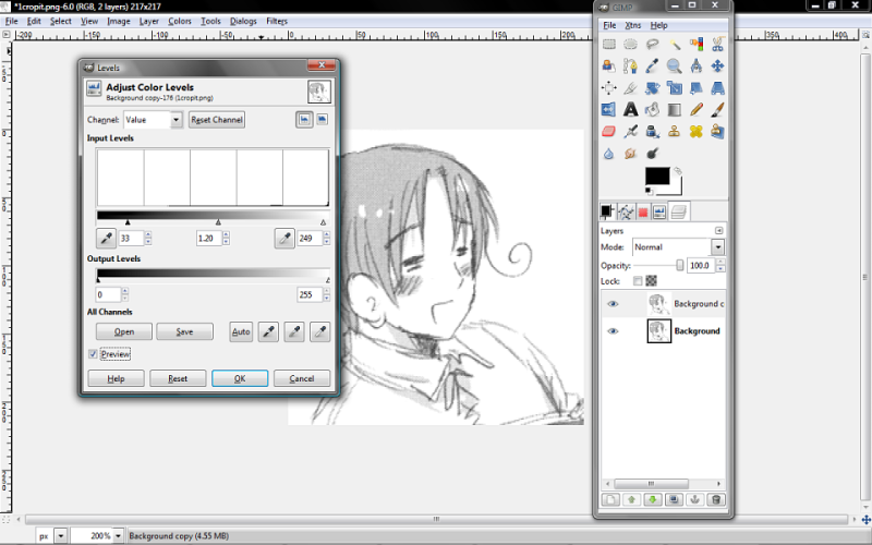
2. Duplicate the layer. Next we want to use levels to make the lines darker or lighter depending on your base image. For this, I just wanted to make the outside lines a bit darker yet lighten the inside texture gradient thing a bit, so I moved the black arrow to make the lines darker, the white arrow to make the texture lighter, and then adjusted the grey arrow until I thought it looked nice.
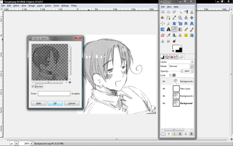
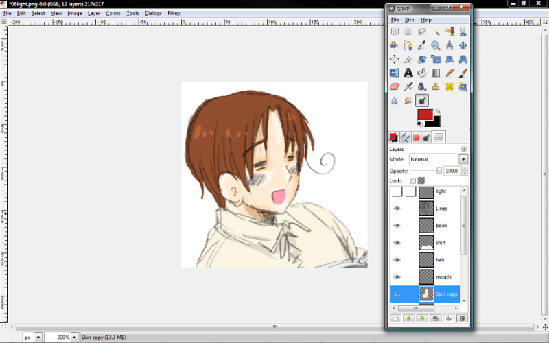
3. Duplicate the layer and name it 'Lines.' Create a new layer under your duplicate layer and fill it with white. Now select the Lines layer and go to Colors>Colors to Alpha. (Your image has to be in RGB mode for this to work, btw.) You should see something like this. The Colors to Alpha function is nice because it gets rid of all the white leaving you with just the lines. If you don't want to use Colors to Alpha or don't have this function, you can also set this layer to Multiply 100%.
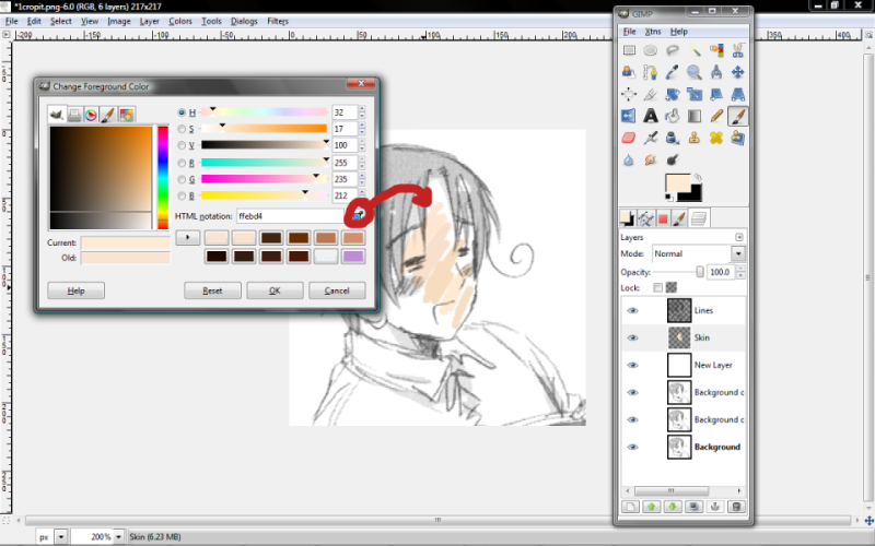
4. Create a new layer and name it skin. The hardest part of coloring manga in my opinion is choosing the right colors. Either you can use the wonderful color codes which evann_loud posted here or choose your own. When choosing your own, I think it's best to open up your color pallet and use the brush to color several colors on the skin side by side. When you find one you like, click the little eyedropper tool in the pallet box and select the color of skin that you like. I ended up with #ffebd4.
Don't worry about shading right now. We'll do that after we finishing filling in all the base colors.
5. Repeat everything you did in step 4 for the hair, clothes, eyes, mouth, etc, and put them all on new layers. If you're following along using the same image I am, I used #b7643c for Feliciano's hair and eyebrows, for his shirt I used #fdf5e3, for his mouth I used #ff9fb1, and for the book I used #efefef.
YAY NOW WE ARE DONE WITH COLORING!! If you don't care about shading, go ahead and skip on down to step 13.
6. Ok, now for shading. It helps to pick a light source. A lot of times I get lazy and don't bother for icons, but to be all nice and proper for our tutorial I'll go ahead and do it. Himaruya makes it somewhat easy for us because there's already some shading on the picture.
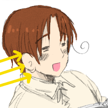
7. We'll start with shading the skin. Duplicate your skin layer. (All of my shading is done on duplicate layers because I like to use smudge and that tends to mess with the transparency.) Choose the dodge/burn tool, and keeping your light source in mind (or not if you're lazy like I usually am XD) burn the areas where the skin needs to be shaded. Some places that almost always get attacked with the burn tool are underneath the chin, around the eyes (which is a lot easier when the character's eyes are open), very slightly underneath the bangs, the side of the nose opposite your light source, and the jawline opposite your light source. I also usually shade the jawline facing the light source, but only slightly. You may have to go over these spots two or three times with the burn tool to make the shading as dark as you want it.
Once you're done shading, choose dodge to add in highlights. Here I've done the top of the ear, a bit around the chin and above the lip, the tip of the nose facing the light source, the cheekbones, and a bit of the forehead. It should look something like this. We'll use smudge once we finish shading everything to blend it and make it look nicer.
08. Next, I always shade the hair. Duplicate your layer again. Then keeping your light source in mind, shade and highlight like you did with the skin. With hair, it also helps to think about which pieces fall under other pieces and then shade those. I also have a tendency to burn the lower parts of the hair and highlight around the middle and crown.

09. Next is clothes. Duplicate your layer again. Keep your light source in mind. You know the drill by now. I usually highlight the shoulder facing the light source and a bit on the opposite shoulder as well as the top of the collar, then shade underneath the collar and around the armpits. On an image showing the rest of the shirt, I shade around the sides and highlight a bit on the side facing the light source, and shade and highlight around wrinkles in the clothing as necessary. It's a bit hard to see since the colors on the shirt are so light.

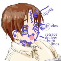
10. Now we want to smudge to make everything look all smooth and pretty. Starting back on your shaded skin layer, smudge the lines you burned and dodged. Along the jaw, nose, and ear you'll want to smudge in the same direction that you burned and dodged. Around the cheeks and eyes I think a circular motion works best. Smudge the highlight on the forehead in a sort of zigzag pattern and then go over it again in the same direction you originally dodged it. To help make sense of this since it's kind of confusing to see it written down:
When you're done it looks all nice and smooth like so. :D
11. Do the same thing for the hair, except here you always want to follow the direction the hair lays.

12. Do the same thing for the shirt, except here it doesn't really matter which way you blend it so long as it looks smooth.

Hooray! Now we're done with shading! If you're not making an icon, this means you're done unless you want to add a texture or something to the background. :D
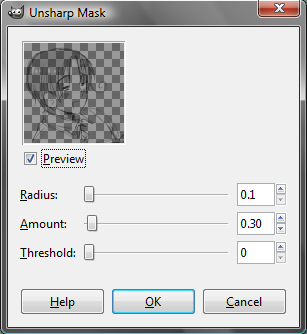
13. If you're making an icon, resize your image to 100x100.

It looks a bit blurry like this, so you want to select your lines layer and go to Filters>Enhance>Unsharp Mask. These are the settings I normally use, although if it looks too pixelated like this I'll change Amount to 25, sometimes lower.
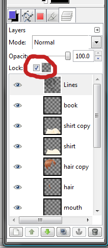
14. Now here comes a slightly tricky part. I want to color his ahoge instead of leaving it black. The easiest way to do this is to lock layer transparency on your lines layer. This will allow you to color the lines without getting color on the background. I chose #442805 and colored in his ahoge as well as the really harsh black lines around his hair. (You can use this method to color in the rest of the lines as well, but I usually don't.)

15. OPTIONAL: Sometimes I like to make the colors a bit softer, so I add a pink overlay layer above the lines layer. Here I used #eaa6a6 and set it to 50% opacity. I also added a burn layer of #e3e8e8 at 95% opacity above the pink overlay layer to make the lines a bit more defined.

16. And because I am fail and just realized I forgot to add in his blush marks, go create a layer called Blush right above the shaded skin layer. For this, I used #fd9871. Go to Filters>Blur>Gaussian Blur and change both Horizontal and Vertical blur radius to 2. If you don't want his blush to look so round, then use your smudge tool to make it more oblong. Then go back up to your Lines layer, make sure Lock Transparency is still on, choose #8f2e07 and color over the blush lines.

17. OPTIONAL AGAIN: Finally, add your textures and other effects. I used a texture by dusty_memories, then used smudge on the parts of the texture over his face and hair to get my end result.

And we're done!