tassyn: icon tutorial feat. dr. horrible
Going from 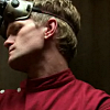
to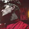
in GIMP2.0.
I've been on a Dr. Horrible's Sing-Along Blog kick lately, so I chose an image from that to work with.
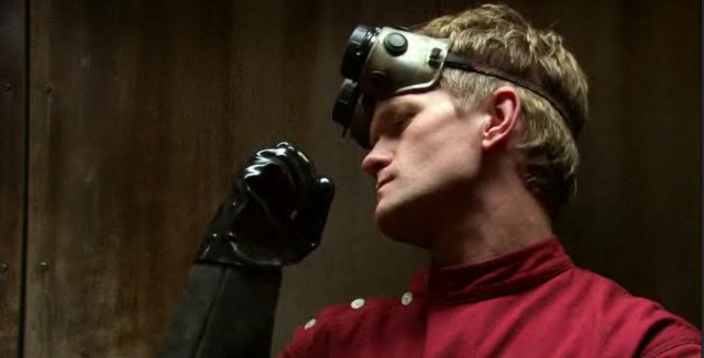
Yessssssss.
1. Okay, so first we'll make our base. Choose your image and crop it/resize it to 100x100. Open Filters>Enhance>Unsharp Mask. Set Radius to .01, Amount to .25, and Threshold to 0. This sharpens your base slightly since it gets a bit blurry from the resize.

2. Now we're going to fix the contrast. First, duplicate your base. (I always do this just in case I screw something up. >_>) Then open Colors>Levels. Right now we're only going to use the Value channel. (You can use the other channels if you want to, but it doesn't really matter for us since our image will be mostly in black and white.) Since my image needed to be brightened up a bit, I used the settings 18, 1.31, 255. (If your image was too bright, you would want to set the middle value to something less than 1.)
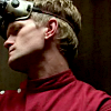
3. Duplicate the layer you just finished. Now we're going to make the image black and white as a prelude to coloring in the red of his jacket, which I want to be the main focus of the icon. Open Colors>Desaturate. Bam. EASIEST. STEP. EVER.
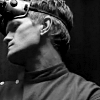
4. Create a new transparent layer. Using the eyedropper tool, choose whatever color you want to stand out from your Step 2 layer. In my case, it's the red in his jacket. Set your blending mode to color. Then using your paintbrush tool, color in that part on the new layer. Color blending mode is nice since it'll keep all the shading from the greyscale layer without blending your color into the layer below like multiply does.
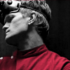
5. Now since we're wanting the other colors to be washed out rather than completely desaturated (for no particular reason other than I like it better that way), we want to duplicate our layer from step 2 again and drag it over your desaturated layer but under your color layer. Set the blending mode to color and reduce opacity to 30% or whatever you think looks best. That way I have a bit of color in the face and hair, but the red I chose for the jacket is mostly unchanged.
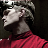
6. Now comes adding textures. I used a blend of three textures, all from the same texture set by innocent_lexys at serene_infinity. I mean, it looks alright as it is now, but it's a bit plain and boring. Yeah, "Red, the blood of angry men; Black, the dark of ages past" is a Tried and Tested Color Scheme, but I want something with a bit more character. Not to mention that while I want the red of his jacket to be the main feature of the icon, I don't want it to be as BAM in your face as it is right now. These three textures help to mute it a bit while adding a background at the same time. Two birds. Stone. Yeah.
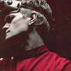
For the first texture, I used a soft grunge image. Since I wanted to maintain a warm color scheme for most of the image, I chose a texture with reds and oranges. I set the blending mode to Lighten Only with 100% opacity since it muted the red in his coat and added the warm colors to the background while at the same time not drastically affecting the cooler greys in his face.
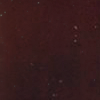
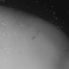
Above that, I added a black and white texture. I set the blending mode to Overlay with 100% opacity. This gives the image a bit of depth and brings the focus in towards the bit of the icon I want everyone to be looking at.
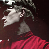
Last, I added another soft grunge texture. First, I rotated it 90 degrees clockwise because I didn't want the orange light above his head. Then I set blending mode to Lighten Only with 100% opacity, again so that the warm colors wouldn't blend into his face.

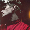
Now we get this sort of reddish brownish darkish greyish tone overlaying most of the background instead of plain boring black. It's a mutt color with character.
7. I still thought the icon was too dark overall and that it would look better with a bit more contrast, so I revisited the layer from Step 2 and brightened it up a bit more using levels. This time my settings were 9, 1.26, 255. A subtle difference, but a difference nonetheless.

8. I added a bit of text to mine, too, just to oomph it up a bit. Text isn't a must, but I had something decent to write on it this time. Using the Stamp font (found at dafont.com) and the same color I used in step 4 (since I want red to be the most prominent color in the icon), I typed "Hail to the King". I put it in between the orange light and his head even though there's a lot of space up near the top because I wanted some attention drawn to it and because I wanted to keep the main focus of the image away from that corner. Once I arranged the text to my satisfaction (What can I say? It looks nice all lined up and blocky), I merged all the text layers and set the blending mode to Screen with 85% opacity since it was detracting a bit too much attention from the jacket at 100%. I placed the layer between the first soft grunge texture and the black and white texture for the same reason. Also, it muted the red text a bit, just like the jacket.

And that's basically it unless you want to play around with opacities or something.
I don't have any idea if this is translatable or not. (Does PS or PSP have a Lighten Only feature?) A million thanks to anyone that can tell me.
Helpful tutorial? Y/N?
.Complete list of resources can be found here.
.Comments are not required but are greatly appreciated.

to

in GIMP2.0.
I've been on a Dr. Horrible's Sing-Along Blog kick lately, so I chose an image from that to work with.

Yessssssss.
1. Okay, so first we'll make our base. Choose your image and crop it/resize it to 100x100. Open Filters>Enhance>Unsharp Mask. Set Radius to .01, Amount to .25, and Threshold to 0. This sharpens your base slightly since it gets a bit blurry from the resize.

2. Now we're going to fix the contrast. First, duplicate your base. (I always do this just in case I screw something up. >_>) Then open Colors>Levels. Right now we're only going to use the Value channel. (You can use the other channels if you want to, but it doesn't really matter for us since our image will be mostly in black and white.) Since my image needed to be brightened up a bit, I used the settings 18, 1.31, 255. (If your image was too bright, you would want to set the middle value to something less than 1.)

3. Duplicate the layer you just finished. Now we're going to make the image black and white as a prelude to coloring in the red of his jacket, which I want to be the main focus of the icon. Open Colors>Desaturate. Bam. EASIEST. STEP. EVER.

4. Create a new transparent layer. Using the eyedropper tool, choose whatever color you want to stand out from your Step 2 layer. In my case, it's the red in his jacket. Set your blending mode to color. Then using your paintbrush tool, color in that part on the new layer. Color blending mode is nice since it'll keep all the shading from the greyscale layer without blending your color into the layer below like multiply does.

5. Now since we're wanting the other colors to be washed out rather than completely desaturated (for no particular reason other than I like it better that way), we want to duplicate our layer from step 2 again and drag it over your desaturated layer but under your color layer. Set the blending mode to color and reduce opacity to 30% or whatever you think looks best. That way I have a bit of color in the face and hair, but the red I chose for the jacket is mostly unchanged.

6. Now comes adding textures. I used a blend of three textures, all from the same texture set by innocent_lexys at serene_infinity. I mean, it looks alright as it is now, but it's a bit plain and boring. Yeah, "Red, the blood of angry men; Black, the dark of ages past" is a Tried and Tested Color Scheme, but I want something with a bit more character. Not to mention that while I want the red of his jacket to be the main feature of the icon, I don't want it to be as BAM in your face as it is right now. These three textures help to mute it a bit while adding a background at the same time. Two birds. Stone. Yeah.
For the first texture, I used a soft grunge image. Since I wanted to maintain a warm color scheme for most of the image, I chose a texture with reds and oranges. I set the blending mode to Lighten Only with 100% opacity since it muted the red in his coat and added the warm colors to the background while at the same time not drastically affecting the cooler greys in his face.


Above that, I added a black and white texture. I set the blending mode to Overlay with 100% opacity. This gives the image a bit of depth and brings the focus in towards the bit of the icon I want everyone to be looking at.


Last, I added another soft grunge texture. First, I rotated it 90 degrees clockwise because I didn't want the orange light above his head. Then I set blending mode to Lighten Only with 100% opacity, again so that the warm colors wouldn't blend into his face.


Now we get this sort of reddish brownish darkish greyish tone overlaying most of the background instead of plain boring black. It's a mutt color with character.
7. I still thought the icon was too dark overall and that it would look better with a bit more contrast, so I revisited the layer from Step 2 and brightened it up a bit more using levels. This time my settings were 9, 1.26, 255. A subtle difference, but a difference nonetheless.

8. I added a bit of text to mine, too, just to oomph it up a bit. Text isn't a must, but I had something decent to write on it this time. Using the Stamp font (found at dafont.com) and the same color I used in step 4 (since I want red to be the most prominent color in the icon), I typed "Hail to the King". I put it in between the orange light and his head even though there's a lot of space up near the top because I wanted some attention drawn to it and because I wanted to keep the main focus of the image away from that corner. Once I arranged the text to my satisfaction (What can I say? It looks nice all lined up and blocky), I merged all the text layers and set the blending mode to Screen with 85% opacity since it was detracting a bit too much attention from the jacket at 100%. I placed the layer between the first soft grunge texture and the black and white texture for the same reason. Also, it muted the red text a bit, just like the jacket.

And that's basically it unless you want to play around with opacities or something.
I don't have any idea if this is translatable or not. (Does PS or PSP have a Lighten Only feature?) A million thanks to anyone that can tell me.
Helpful tutorial? Y/N?
.Complete list of resources can be found here.
.Comments are not required but are greatly appreciated.