My Eyes Hurt: Tumblr updates its user interface

A month after banning adult content, Tumblr continues to make changes to its platform by updating the user interface and its color. In a recent post titled Tumblr is getting a facelift, they describe this and other changes as a way to be more in line with recommendations outlined by the Web Accessibility Initiative of the World Wide Web Consortium.
“This is the initiative that sets standards for accessibility for people who may need assistance using the internet. It outlines steps to take and tools to use to create as seamless of an experience online as possible, whether you have auditory, visual, or neurological disabilities, are using a limited device, are on a slow connection with limited bandwidth, or...well, a whole bunch of other reasons,” said the microblogging and social networking website.
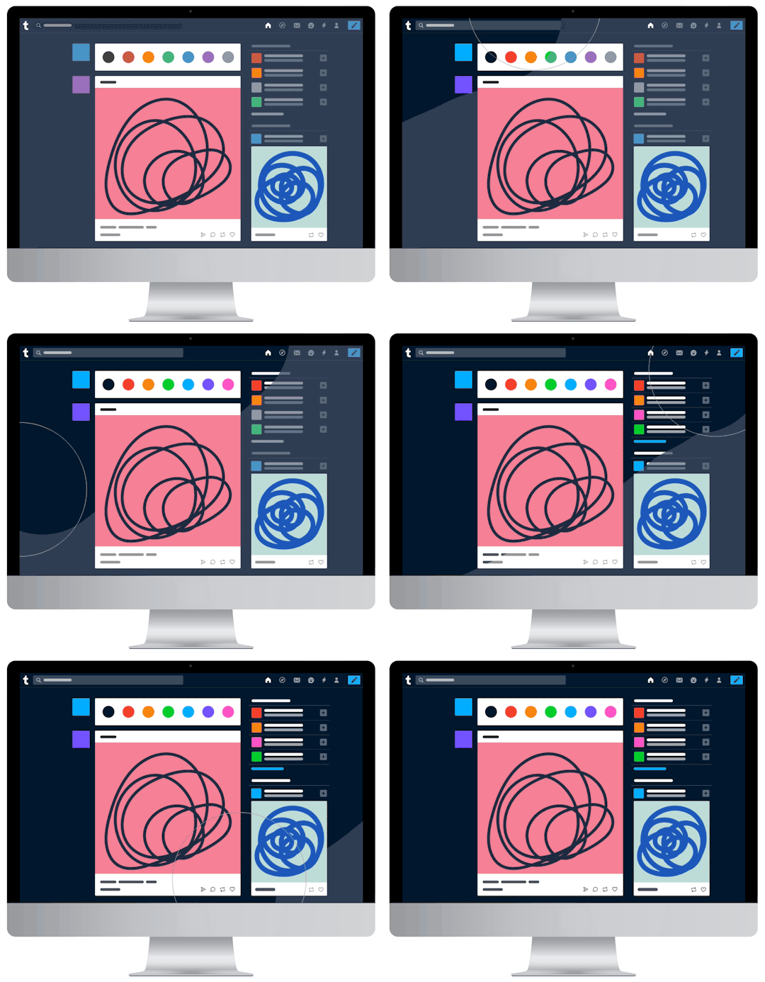
Here’s how your dash will look when the changes hit your tumblr dashboard:

For a more detailed breakdown of the changes, go here.
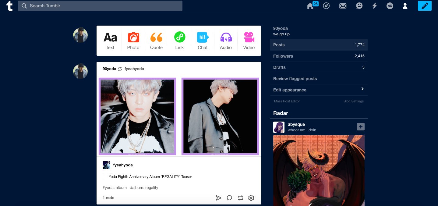
Naturally when changes are made and implemented to any website or online platform, complaints and outrage are to be expected. A lot of users are saying their “eyes hurt” since the changes started rolling out. Others feel this change should be an option and not forced upon everyone. People who made bluespace art aren’t happy either.
In response to the bluespace art, Tumblr writes, “Seeing these older posts lose the utilization of the dashboard-something that made them so special and unique to just Tumblr-is certainly not a great feeling. There’s no way around that. We hope, however, that this change only means newer, more bluespace art will be created, and that this time around it will be easier for everyone to experience.”
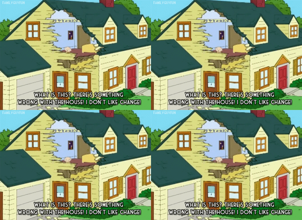
This is the kind of change that drives users nuts. They do it with zero input or warning, they only speak up after they've rolled out the change. It's also both subtle and noticeable, so like, it certainly made ME feel anxious, like am I hallucinating? What's different?
- Singsong Spoonie Raptor (@SingsongRaptor) January 30, 2019
@tumblr The new color change is causing many people eye strain, some to the point where they are struggling to use the site at all because it hurts to look at. Please make it Optional! pic.twitter.com/g5p1ZtefnO
- Harper “MelancholyStarlight” Kim 🌌💫 (@sh0rtysquadperi) January 31, 2019
aahhhh wtf happened to tumblr's layout? my eye hurt
- fatima 🌠 (@hermioncgrangcr) January 30, 2019
Dammit it, @Tumblr! This damn shade of blue is horrendous. My eyes hurt from looking at it for 30 goddamn seconds. Who is this supposed to help?
- M͙i͙l͙k͙a͙ (@encxant) January 31, 2019
i immediately used the xkit thing to change tumblr back to the regular color because that shade of blue really made my eyes hurt and the post/link/etc buttons looked ugly and oversaturated as shit
- stealthboy #3🌙 (@aymericlovemail) January 31, 2019
You get the idea but more complaints here.

Sources: 1 | 2 | 3 | 4 | 5 | 6 | 7 | 8 | 9