Sparkly Font Tutorial Part 1 of 2
My first tutorial. Wow, didn't think I'd do one of these ^_^
This tutorial is split to 2 : Photoshop / Imageready as to cut dling time.

How to make this sparkly font effect?
You'll need to use Adobe Photoshop & ImageReady, sorry.
Optional choices are marked with *
Fonts to use: For best results, pick something a little blocky and curvy. It can be used for script/ caligraphic fonts as well but it's not as effective. E.g of those types of fonts are Marcelle & Deftones (available at Dafont.com
Note: This effect can work on small (pixel) fonts as well, like sg04, redensek, etc. But you might want to adjust the sparkle brush's size so to not overwhelm the text.
Addendum: This is not a for-beginners tutorial but for those familiar with Photoshop & Imageready. I really suck with plain text explanation, so this is visual aid heavy. :D
1. You've done your icon, you want the finishing bling-blingy touch. Click text on your toolbar and write something. Since this is a tutorial, I'll put a plain background to make this clearer.
I wrote Sparkly because I'm not known for my subtlety.
2. * Let's make the text wave - yay.
To "wave" it : Select "text" on toolbar. Search for the circled "T" for the window to pop up. Highlight Wave.
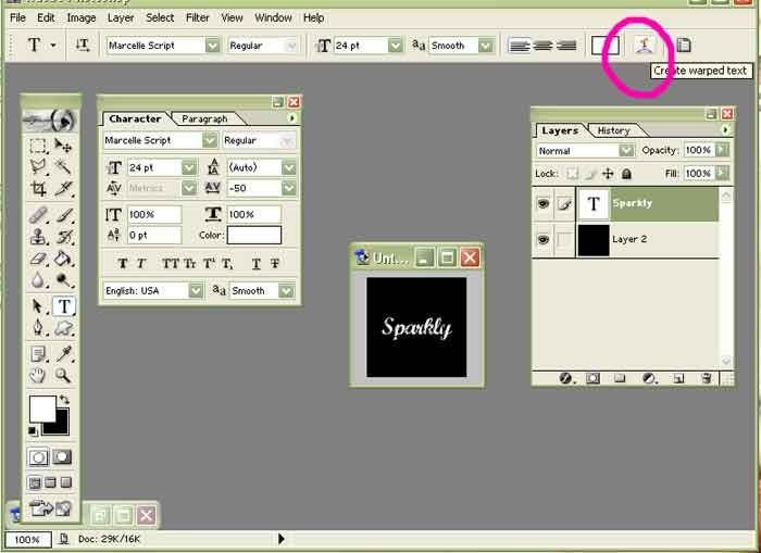
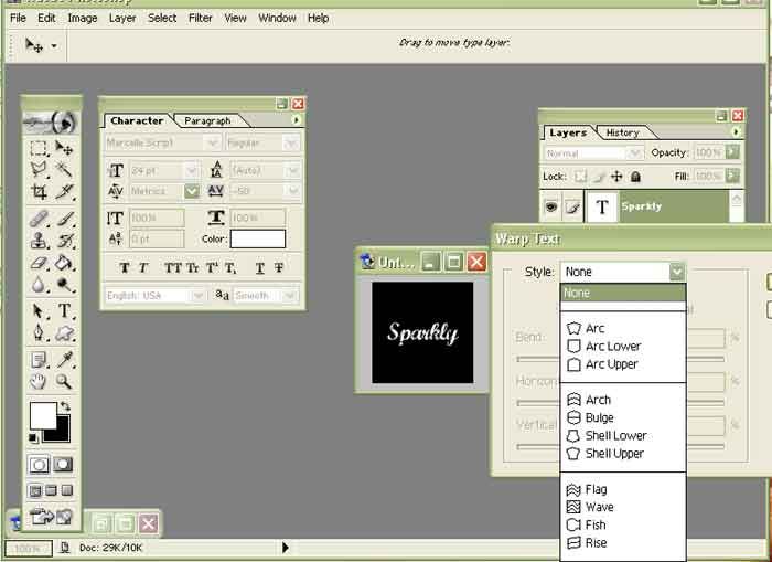
You can choose how much you want it to bend, I pick 35.

3. And now stroke the text, it helps with the font clarity. You can see how I like my stroke settings there. I don't care for 100% opacity sometimes unless I really want the text pop out. Otherwise, I prefer a "softer", slightly transparent look. Go ahead and experiment with that.
Note: with pixel fonts, use stroke to "1"
To stroke : Layer > Layer Style > Stroke
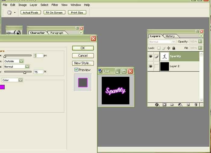
4. Gradient time! The most important bit is this. This is how I put in the changing colors effect.
To Gradient : Layer > Layer Style > Gradient Overlay
5. This window should pop up. The default settings are usually:
Opacity - 100
Gradient (followed by a color bar)
Style - Linear
Angle - 90 (degrees)
Scale - 100
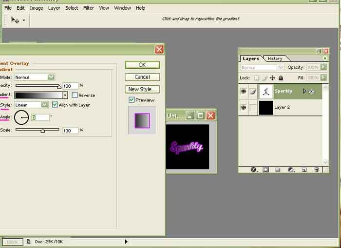
Change the angle to 0 (degrees), so that the gradient change is vertical.
To change the gradient color, Click the color bar next to "Gradient"
A new window will pop up, The Gradient Editor:
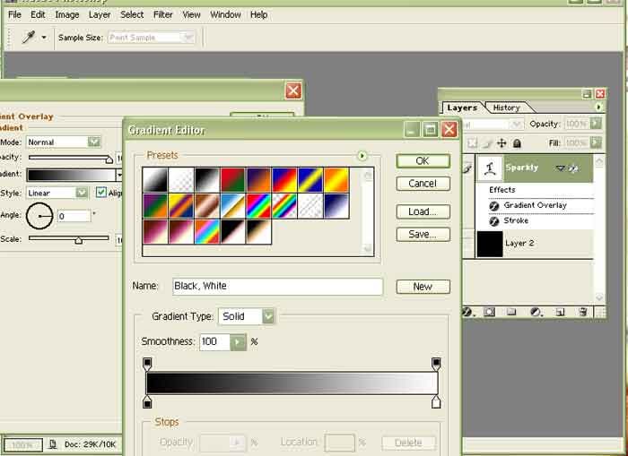
Take a good look at the Gradient Editor.
a) There are a lot of colorful squares of colors. Those are the available gradients ranging from solid colors to transparent stripes.
b) Gradient Type - We'll touch that subject another day
c) Smoothness - Ditto
d) The current gradient color. Note the little boxes just below the color(s). That's how you "move" it.
Default color is usually the Foreground & Background (mine is set to black & white), but you can change that to anything, including Rainbow! But the more colors, the more work for you :D
In this case, as the "Sparkly" text is in white, I'll have white as one of the gradients. It's always easier if your font shares one same color as the gradient.
I'll pick black for the contrast color but you can choose anything else, as long as it is either brighter or darker than the other color (white).
I moved the white closer to the black. Now black is crowded to a corner.
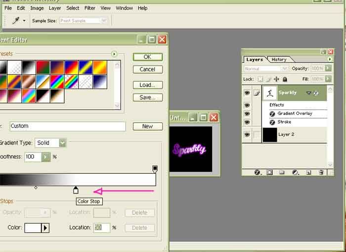
5. And now to make the sparkly stars.
Toolbar > Brush > Click 1 > 2
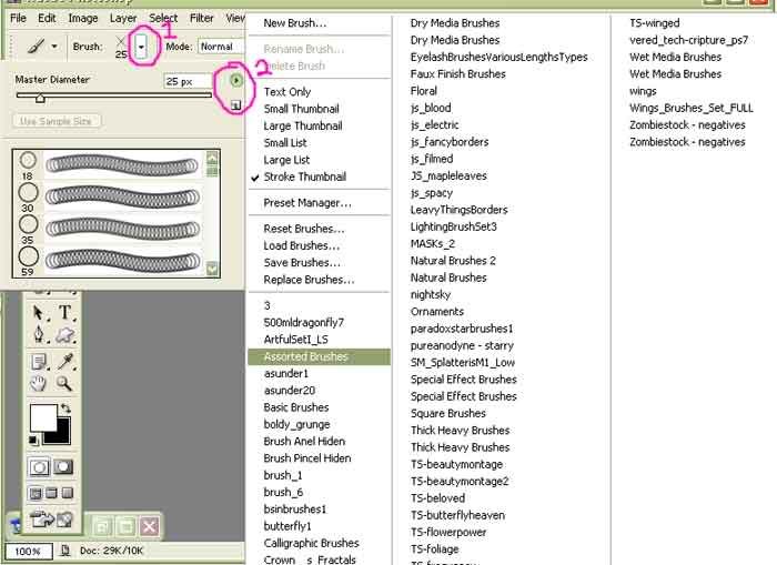
Now your brush menu pops up. Go to Assorted (it's a Photoshop template, you should have it!), and search for "Crosshatch". It looks like an "X"
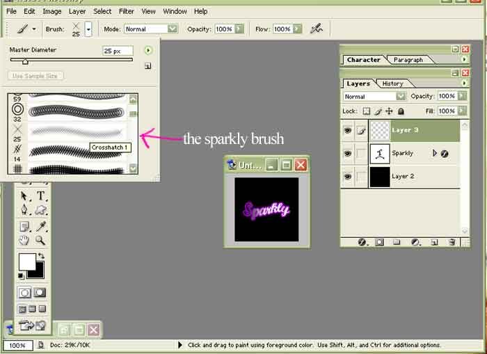
6. Create a new layer and use said Brush. Click more than once if you want a stronger look.
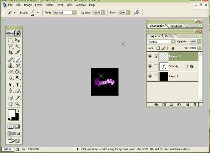
For extra bling, go back to the Brush List and Reset.
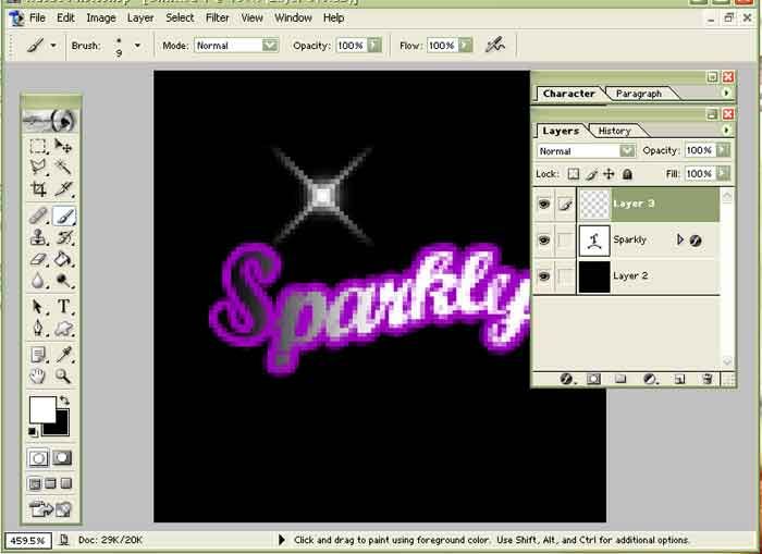
Pick a small, soft round brush and click it to the center of your sparkle.
I've magnified the icon to 300% for a better look.
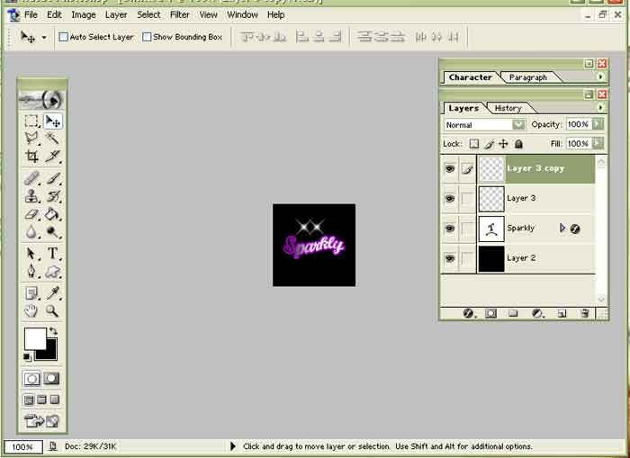
7. * Duplicate the sparkle brush, and you have two!
And now on to part 2.
This tutorial is split to 2 : Photoshop / Imageready as to cut dling time.

How to make this sparkly font effect?
You'll need to use Adobe Photoshop & ImageReady, sorry.
Optional choices are marked with *
Fonts to use: For best results, pick something a little blocky and curvy. It can be used for script/ caligraphic fonts as well but it's not as effective. E.g of those types of fonts are Marcelle & Deftones (available at Dafont.com
Note: This effect can work on small (pixel) fonts as well, like sg04, redensek, etc. But you might want to adjust the sparkle brush's size so to not overwhelm the text.
Addendum: This is not a for-beginners tutorial but for those familiar with Photoshop & Imageready. I really suck with plain text explanation, so this is visual aid heavy. :D
1. You've done your icon, you want the finishing bling-blingy touch. Click text on your toolbar and write something. Since this is a tutorial, I'll put a plain background to make this clearer.
I wrote Sparkly because I'm not known for my subtlety.
2. * Let's make the text wave - yay.
To "wave" it : Select "text" on toolbar. Search for the circled "T" for the window to pop up. Highlight Wave.


You can choose how much you want it to bend, I pick 35.

3. And now stroke the text, it helps with the font clarity. You can see how I like my stroke settings there. I don't care for 100% opacity sometimes unless I really want the text pop out. Otherwise, I prefer a "softer", slightly transparent look. Go ahead and experiment with that.
Note: with pixel fonts, use stroke to "1"
To stroke : Layer > Layer Style > Stroke

4. Gradient time! The most important bit is this. This is how I put in the changing colors effect.
To Gradient : Layer > Layer Style > Gradient Overlay
5. This window should pop up. The default settings are usually:
Opacity - 100
Gradient (followed by a color bar)
Style - Linear
Angle - 90 (degrees)
Scale - 100

Change the angle to 0 (degrees), so that the gradient change is vertical.
To change the gradient color, Click the color bar next to "Gradient"
A new window will pop up, The Gradient Editor:

Take a good look at the Gradient Editor.
a) There are a lot of colorful squares of colors. Those are the available gradients ranging from solid colors to transparent stripes.
b) Gradient Type - We'll touch that subject another day
c) Smoothness - Ditto
d) The current gradient color. Note the little boxes just below the color(s). That's how you "move" it.
Default color is usually the Foreground & Background (mine is set to black & white), but you can change that to anything, including Rainbow! But the more colors, the more work for you :D
In this case, as the "Sparkly" text is in white, I'll have white as one of the gradients. It's always easier if your font shares one same color as the gradient.
I'll pick black for the contrast color but you can choose anything else, as long as it is either brighter or darker than the other color (white).
I moved the white closer to the black. Now black is crowded to a corner.

5. And now to make the sparkly stars.
Toolbar > Brush > Click 1 > 2

Now your brush menu pops up. Go to Assorted (it's a Photoshop template, you should have it!), and search for "Crosshatch". It looks like an "X"

6. Create a new layer and use said Brush. Click more than once if you want a stronger look.

For extra bling, go back to the Brush List and Reset.
Pick a small, soft round brush and click it to the center of your sparkle.
I've magnified the icon to 300% for a better look.

7. * Duplicate the sparkle brush, and you have two!

And now on to part 2.