Tutorial
>
- Made in Photoshop CS3 Extended.
- Translatable to older versions of Photoshop.
- Involves Curves, Selective Color and Color Balance.
- Image heavy.
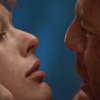
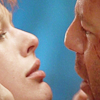
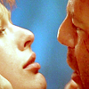
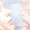
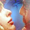
In this tutorial, I'll be using this image from Elfmoogle.
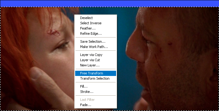
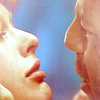
As you can see, the screencap is a little bit out of proportion so I use the Free Transform tool to shape the image and make it a little bit more in proportion. You can do this by selecting the image with the Marquee tool (or a part of an image), right click and select Free Transform. You can also do this with text layers, but they have to be rasterized before it can be used. Anyway, this is a useful tool for when the caps have been made from a widescreen source and look a little stretched.
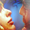
So, after that I cropped the image down to 100 x 100 pixels.
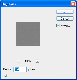
Now the image looks a little blurred, and I don't like using the Sharpen tool because I'm a little bit OCD about the quality of my images. What I did was use the High Pass tool, which can be found in Filter > Other > High Pass. To use this, duplicate the base layer and set it to Overlay, 100%. It might look a little dark now, but the High Pass tool will correct this. Click on High Pass and you should see a grey version of your image that looks a little embossed.
Move the slider until your image looks as sharp as you want it, and click okay. As you can see, the image has reverted back to its original coloring and it's a little bit sharper than before. It might be a bit trickier than the Sharpen tool, but in my opinion it just looks better.

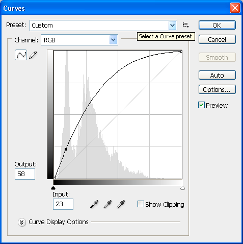
Okay so now the image is sharpened, it's time to start on the coloring. Well the image obviously needs to be brighter before anything else can be done to it, and what I do is use the Curves tool. Go to Layer > New Adjustment Layer > Curves and play with the RGB settings until the image looks nice and bright. Of course, there are other ways to do this like Brighten/Contrast or a few Screen layers but I like this way better. These were my settings for this image, and although every image is different, I find this setting is usually the same for most.
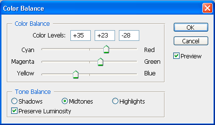
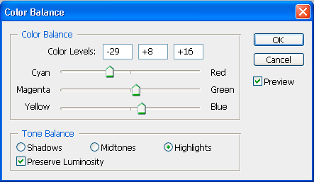
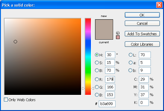
So now to add the color, I usually use Color Balance although I sometimes use Selective Color, both found in the Layer > New Adjustment Layer menu. It's all a matter of personal opinion to be honest. Color Balance is better for more natural coloring, although the same can be achieved with the Selective Color tool if you just play around with the settings and do a bit of experimentation. I find Selective Color to be more useful for more bright, colorful images, especially ones with a lot of blue and green. Anyway, for this icon I used Color Balance because there's already a lot of blue in the image, and I don't want to draw too much attention to it. I usually use all three settings in Color Balance, and I find the Highlights section to be the most important of the bunch. Here were my settings -

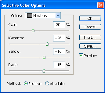
So now you should have a pretty nice looking image, and if you think the coloring is nice enough as it is, then you can move onto making the icon a little more original with the use of textures and font's and stuff. Of course if you think the icon looks nice enough as it, you can save it and finish. It's just a matter of your own personal opinion really and what kind of effect you're going for with that icon. With this particular icon, I thought it was nice but still a little bit plain so I added a bit more color with the Selective Color tool. I usualy only ever use the Neutrals section of SC, because I find that it can achieve nearly every kind of coloring you want. These were my settings, although if you going for a brighter, bluer image I suggest playing with the Cyan setting (highering it) and the Black setting (lowering it.)
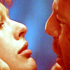
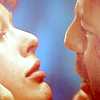
With that done, I like the coloring a lot... on Leeloo and the background but it's made Korben look radio active, so I use the Eraser brush with a blurred edge and just erase the part of the Selective Color that's covering Korben. He still looks a bit red, but we'll sort this using the next step.
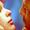
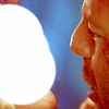
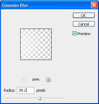
When I make icons, and when I look at them, I prefer lighter icons than darker ones. And to make an icon look nice and light, I usually just paint a small blob on the part of the icon I want to illuminate using a basic white brush and go to Filter > Blur > Gaussian Blur and play with the settings until it looks right. On this icon, I did it first on Leeloo's face and then on Korben's.
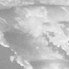
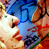
Anyway, I still wanted it even brighter than that, and to do this I usually use this texture by
sinhathecat.

It doesn't really work being as blue as it is, so I desaturated it and pasted it on top of my icon, setting it to Screen. As you can see, it's really bright now, but you can hardly see what's on the icon.
I used the Brighten/Contrast tool to darken the layer, and lowered the opacity to about 65%. If it still looks a bit bright, take a blurred eraser brush and erase the parts of the layer that are covering the parts you want to show on the base.
Recently with my icons I've been using some amazing graffiti textures by
cooloring and I think they look really good. In this icon I used this one.
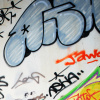
I pasted it on top of my icon, setting it to Color Burn, 100%.
But that's kind of ruined everything we've done with the lighting, so I moved it to underneath all the light layers but on top of the coloring layers.
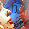
It still covers a lot of the faces, so I took my blurred eraser again and erased small parts of the texture. Now I think it looks quite nice, but there's still something missing.
So I added a Color Fill layer, underneath all the texture and light layers, with these settings.
Again, it's made Leeloo look quite nice but Korben looks weird, so I used the blurred eraser tool again and erased the part of the Color Fill that covered Korben's face. And that's it. Finished. Layer > Merge Visible. And save. Hope it helped.