Header Tutorial
I definitely don't do this often, and I probably WON'T do it again anytime soon, but I'm doing this for a friend. Yeah, that's my only reason why. xP I have no idea if I'll ever make anymore tuts. Eh, you never know what the future holds. *shrug*
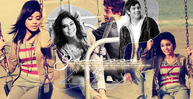
Requested by the lovely triedtoholdonto, a tutorial on how I've made my recent personal journal header: ttrulytt. We'll be making this header today. Enjoy:

DON'T COPY EXACTLY!!!
Icons and graphics for my next post will be up tomorrow! Look forward to it. ;]
Please do not hotlink any of these images!!!
1. Your first step for creating any header with more than one image is to find your pictures and blend them well together. In my case, I used these three pictures:
http://i20.photobucket.com/albums/b203/ttrulytt/Extras/vanessa-hudgens_net-sayok-set2006fe.jpg
http://i20.photobucket.com/albums/b203/ttrulytt/Extras/vanessa-hudgens_net-sayok-set200-1.jpg
http://i20.photobucket.com/albums/b203/ttrulytt/Extras/vanessa-hudgens_net-sayok-set200-2.jpg
It's also important opening a new document according to the size of your layout. If you're using this tut to make a sig, which is completely fine, then pick any size you desire.
2. To blend images well together I use the Add Layer Mask tool, which you can locate at the bottom of your layers box, pointed out to me by triedtoholdonto.
Arrange your pictures in any order that you like. Try to put pictures with the same background next to each other. That doesn't technically work in this case, but I would recommend you do so. I had a lot of trouble blending these pictures well together, as you can see.
3. Make sure your paint brush color is set to BLACK and color away on the parts you wish to disappear. Make sure to use a Soft Round, large brush. You should get something like this:
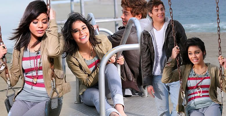
4. Also, I've skipped a step above but if you look closely you can see that the faces of Zac and V are smoothened out for the two images to the right. That's because I like to zoom in and use the Blur tool to smooth celebrity faces to make the image look more "professional". I would recommend you do this to all of your images. Just don't blur any edges! Also sharpen Vanessa's lips and eyes (with the Sharpen tool) to make them stand out a bit. Use a tiny Soft Round brush.
5. Next I merge all of my layers, duplicate my base, and set it to Soft Light.
6. I duplicate my base again, bring it to the top, desaturate it (Ctrl+Shift+U) and set it to Soft Light.
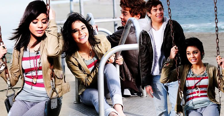
Now here comes one of the fun parts. Experimenting with colors!
7. Create a new layer and set it to Exclusion 100% and fill it with a dark blue color, but not too dark. I used #0b137b. Keep in mind that this type of blue doesn't work for all images. Experiment with the next few steps in this tut.
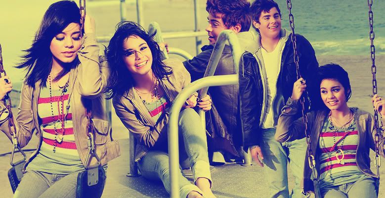
8. Create a new layer again, set it to Color Burn 45-50% and fill it with a light sky blue color. #c8f0ff
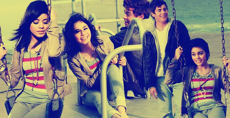
9. Create a new layer, once again, set it to Soft Light 65% and fill it with a light pink color. #ffc8c8
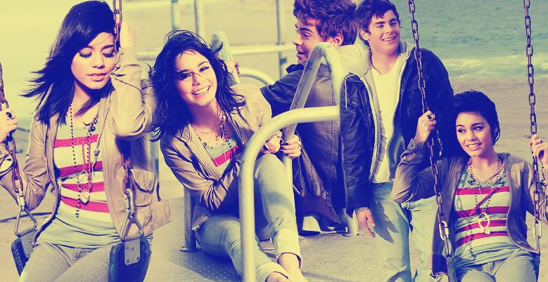
10. (My favorite step) New layer, once more, set it to Multiply 100% and fill it with a beige color. #ffe1c8
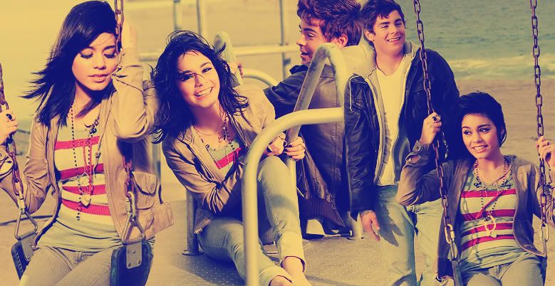
Alright, we're getting somewhere.
11. Go back to your base and duplicate it. Bring it to the top, Desaturate (Ctrl+Shift+U) and set it to Soft Light 40%.
12. Then duplicate your base again, bring it to the top and set it to Soft Light 60%. But this time we're only going to bring the saturation down half way. Go to Image>Adjustments>Hue and Saturation (Ctrl+U). Bring the saturation down to around -50-60 (make sure it's a negative number). I don't remember exactly how much I did for this pic, but it should be half way.
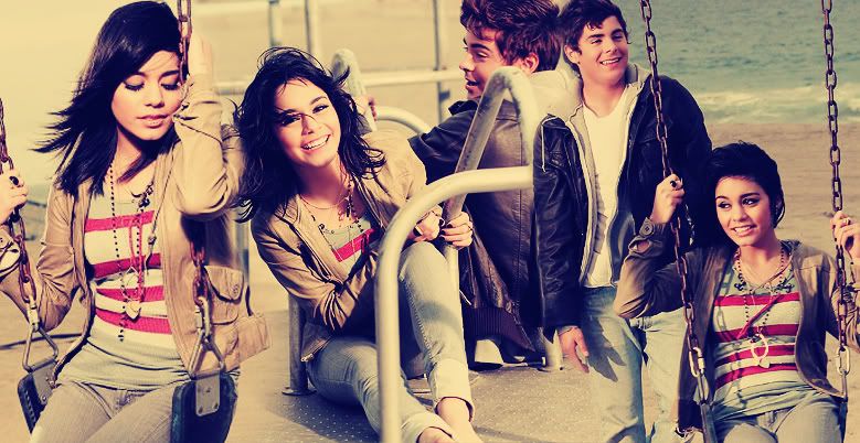
Here's where things get a little complicated, but oh so interesting.
13. Create a new layer and start making a bunch of random scribbles. Like you're making a puzzle. But don't make too many. And you don't want to go over the person's face much either. I wouldn't recommend you do so at all unless you managed to find away of not covering up their face too much. To make these lines is simple. Use your pen tool to create a bunch of lines (aim for round lines too, not just straight), go back to your brush tool and set it to Hard Round 1 px brush, then go back to your pen tool and stroke the lines. Please make sure this is on a new layer. Try to keep the lines drawn on the main focus of your image. My main focus would be right in the center. Don't draw them ALL over your header/sig/etc.
However, if you're lazy like me you can always search the net for already made squiggle brushes and use those, like I did. I used these lines by latexandleather.
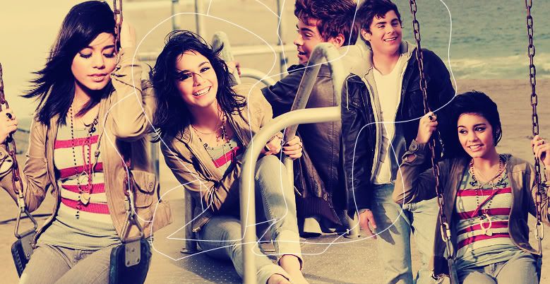
14. Now, use your Magic Wand tool
and, on your squiggle lined layer, select the spots that focus mainly on the faces. Don't pick too many spots. Try to get at least two or three. One's too little and four is just too much. You don't want to distract from the background image too much. To select more than one spot at the same time, click and hold down the Shift key on your keyboard and select all the places you like.
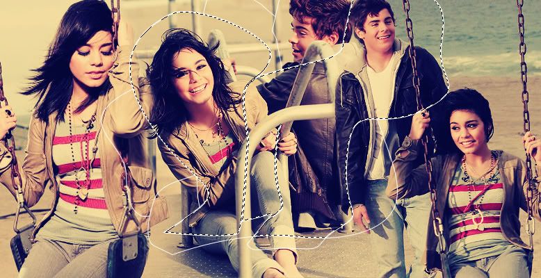
15. Go back to your base and click Edit>Copy. Now, go back to your top layer and paste as a new layer UNDER your squiggle lined layer. You'll see that your newly added images are from your original base.
16. Desaturate (Ctrl+Shift+U) that layer, duplicate it, and set it to soft light. You may have to add a duplicate Screen layer between those layers if your pictures turned out too dark.
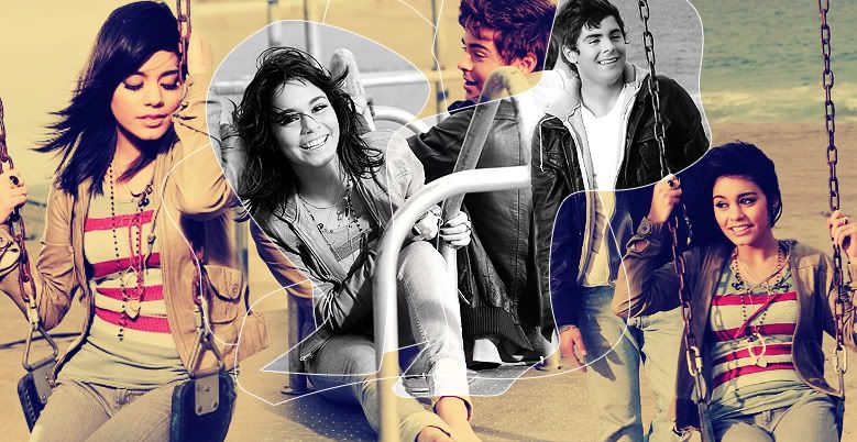
However, if you're a bit picky like me, you might be annoyed by the desaturation of the images NEXT to each other. So what I did was take a Soft Round eraser around 25-40% opacity, selected my desaturated layer with Zac Efron and Vanessa Hudgens, and erased right where the two images are cut off by the squiggly line. It should look, then, something like this:
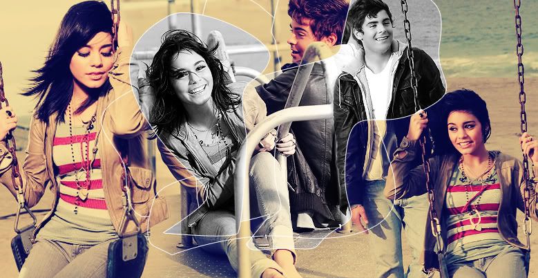
Of course that step is just optional for those who are picky about their images like me. ;P
I think we pretty much got through the hardest part. Now we add some text.
17. For my header I decided to go with something simple for the large text. "Zanessa". The font I used was Carpenter TCG. Definitely one of my favorite fonts, pointed out to me by titan_girl, and the size was around 116 pt. Center the text not too far down from the faces. Then add some tiny text. You can add anything you like. I used text from the latest lyrics for HSM 2, coming out August 17 (the day I return to school, goddammit! >_>). The font was 04b08, Size: 8 pt. Add it a bit lower than your large text.
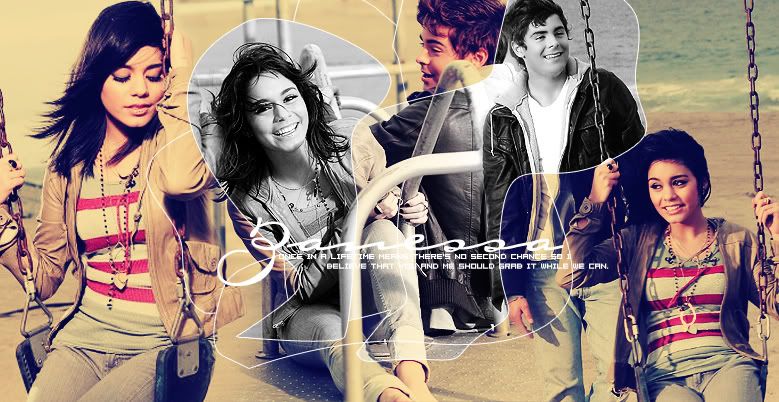
18. Now add some tiny text right underneath all of you other text for a nice little touch. You can use a brush like so:

(By ??? Let me know if you know who it was made by. It's a really old brush.)
19. To make your text a bit clearer, underneath all of your text layers create a new layer and select a Soft Round small brush. Pick a commonly seen background color. I went with a yellowish type and start making strokes across from left to right underneath your text.
20. Next to go Filter>Blur>Motion Blur and pick any settings you desire. I would go with something around 20-30 px for large images. For small, go with 10 px. Make sure it's blurring from left to right and not up and down. Click OK. Repeat this same step, but instead of it blurring left and right, choose up and down, but bring the px size down so it doesn't blur too much. Work with the opacity on this layer. If it's too light, duplicate the base and play with your opacity. If it's too dark, just lower the opacity on that layer. EXPERIMENT!
21. Now go to your Rectangular Marquee tool and select the Elliptical one.
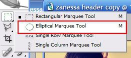
22. Go back to your base layer once again and make an oval shape with your tool around one of Vanessa's faces. Pick a face you haven't already worked with a couple of times, like the desaturated one. Don't pick that because it's overused. Then copy and paste it as a new layer underneath your text layers. Go back with the same tool and do the same with another ZAC face. Copy and paste it over or under the Vanessa face layer. Depending on where it looks best.
23. Select the Move tool (V) and resize both ovals to your liking. Make one larger than the other, it'll look nicer that way, and place them to the far left of your text, right underneath it. Sharpen if you wish, then bring the saturation down to around -50 for both layers, duplicate those layers and set to soft light. This should all sound familiar.
24. Stroke those 2 layers with 1 px white. Edit>Stroke.
You should now have something like this (and sorry for the lack of screencaps):
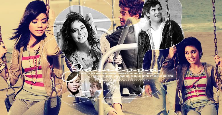
25. Add extra brushes like hearts and whatnot to your header/sig/etc.
26. And, last, but not least, create a new layer ABOVE all of the other layers, click Ctrl+A (Select All), then go to Edit>Stroke and select a commonly seen background color with 3 or 4 px size. Click ok. That will be your border.
Final Result should look something like this:
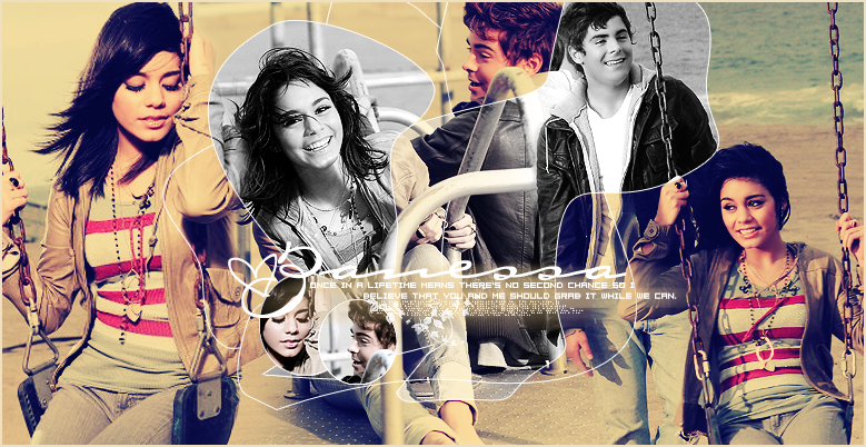
Or, if you can easily figure this out, you can have a result like this (which I think looks KICKASS, mind you):

lolz, I'll let you figure it out on your own. xP
And there you have it, a simple new header for your layouts or sig or whatever you wish to use this tut for. Just please keep in mind that this style I created on my own and personally did not want to show how I EXACTLY did it, so PLEASE don't copy this word for word. Experiment. Create your own styles. Knock yourselves out, just please don't mimic this style the exact same way I created it. EXPERIMENT!!! Hmm, that seems to be my fav word lately, I wonder why ... *sarcasm*
I would love to see anything you guys might have made with this tut. Don't let my previous words discourage you!
Have fun Photoshopping!
Requested by the lovely triedtoholdonto, a tutorial on how I've made my recent personal journal header: ttrulytt. We'll be making this header today. Enjoy:

DON'T COPY EXACTLY!!!
Icons and graphics for my next post will be up tomorrow! Look forward to it. ;]
Please do not hotlink any of these images!!!
1. Your first step for creating any header with more than one image is to find your pictures and blend them well together. In my case, I used these three pictures:
http://i20.photobucket.com/albums/b203/ttrulytt/Extras/vanessa-hudgens_net-sayok-set2006fe.jpg
http://i20.photobucket.com/albums/b203/ttrulytt/Extras/vanessa-hudgens_net-sayok-set200-1.jpg
http://i20.photobucket.com/albums/b203/ttrulytt/Extras/vanessa-hudgens_net-sayok-set200-2.jpg
It's also important opening a new document according to the size of your layout. If you're using this tut to make a sig, which is completely fine, then pick any size you desire.
2. To blend images well together I use the Add Layer Mask tool, which you can locate at the bottom of your layers box, pointed out to me by triedtoholdonto.

Arrange your pictures in any order that you like. Try to put pictures with the same background next to each other. That doesn't technically work in this case, but I would recommend you do so. I had a lot of trouble blending these pictures well together, as you can see.
3. Make sure your paint brush color is set to BLACK and color away on the parts you wish to disappear. Make sure to use a Soft Round, large brush. You should get something like this:

4. Also, I've skipped a step above but if you look closely you can see that the faces of Zac and V are smoothened out for the two images to the right. That's because I like to zoom in and use the Blur tool to smooth celebrity faces to make the image look more "professional". I would recommend you do this to all of your images. Just don't blur any edges! Also sharpen Vanessa's lips and eyes (with the Sharpen tool) to make them stand out a bit. Use a tiny Soft Round brush.
5. Next I merge all of my layers, duplicate my base, and set it to Soft Light.
6. I duplicate my base again, bring it to the top, desaturate it (Ctrl+Shift+U) and set it to Soft Light.

Now here comes one of the fun parts. Experimenting with colors!
7. Create a new layer and set it to Exclusion 100% and fill it with a dark blue color, but not too dark. I used #0b137b. Keep in mind that this type of blue doesn't work for all images. Experiment with the next few steps in this tut.

8. Create a new layer again, set it to Color Burn 45-50% and fill it with a light sky blue color. #c8f0ff

9. Create a new layer, once again, set it to Soft Light 65% and fill it with a light pink color. #ffc8c8

10. (My favorite step) New layer, once more, set it to Multiply 100% and fill it with a beige color. #ffe1c8

Alright, we're getting somewhere.
11. Go back to your base and duplicate it. Bring it to the top, Desaturate (Ctrl+Shift+U) and set it to Soft Light 40%.
12. Then duplicate your base again, bring it to the top and set it to Soft Light 60%. But this time we're only going to bring the saturation down half way. Go to Image>Adjustments>Hue and Saturation (Ctrl+U). Bring the saturation down to around -50-60 (make sure it's a negative number). I don't remember exactly how much I did for this pic, but it should be half way.

Here's where things get a little complicated, but oh so interesting.
13. Create a new layer and start making a bunch of random scribbles. Like you're making a puzzle. But don't make too many. And you don't want to go over the person's face much either. I wouldn't recommend you do so at all unless you managed to find away of not covering up their face too much. To make these lines is simple. Use your pen tool to create a bunch of lines (aim for round lines too, not just straight), go back to your brush tool and set it to Hard Round 1 px brush, then go back to your pen tool and stroke the lines. Please make sure this is on a new layer. Try to keep the lines drawn on the main focus of your image. My main focus would be right in the center. Don't draw them ALL over your header/sig/etc.
However, if you're lazy like me you can always search the net for already made squiggle brushes and use those, like I did. I used these lines by latexandleather.

14. Now, use your Magic Wand tool

and, on your squiggle lined layer, select the spots that focus mainly on the faces. Don't pick too many spots. Try to get at least two or three. One's too little and four is just too much. You don't want to distract from the background image too much. To select more than one spot at the same time, click and hold down the Shift key on your keyboard and select all the places you like.

15. Go back to your base and click Edit>Copy. Now, go back to your top layer and paste as a new layer UNDER your squiggle lined layer. You'll see that your newly added images are from your original base.
16. Desaturate (Ctrl+Shift+U) that layer, duplicate it, and set it to soft light. You may have to add a duplicate Screen layer between those layers if your pictures turned out too dark.

However, if you're a bit picky like me, you might be annoyed by the desaturation of the images NEXT to each other. So what I did was take a Soft Round eraser around 25-40% opacity, selected my desaturated layer with Zac Efron and Vanessa Hudgens, and erased right where the two images are cut off by the squiggly line. It should look, then, something like this:

Of course that step is just optional for those who are picky about their images like me. ;P
I think we pretty much got through the hardest part. Now we add some text.
17. For my header I decided to go with something simple for the large text. "Zanessa". The font I used was Carpenter TCG. Definitely one of my favorite fonts, pointed out to me by titan_girl, and the size was around 116 pt. Center the text not too far down from the faces. Then add some tiny text. You can add anything you like. I used text from the latest lyrics for HSM 2, coming out August 17 (the day I return to school, goddammit! >_>). The font was 04b08, Size: 8 pt. Add it a bit lower than your large text.

18. Now add some tiny text right underneath all of you other text for a nice little touch. You can use a brush like so:

(By ??? Let me know if you know who it was made by. It's a really old brush.)
19. To make your text a bit clearer, underneath all of your text layers create a new layer and select a Soft Round small brush. Pick a commonly seen background color. I went with a yellowish type and start making strokes across from left to right underneath your text.
20. Next to go Filter>Blur>Motion Blur and pick any settings you desire. I would go with something around 20-30 px for large images. For small, go with 10 px. Make sure it's blurring from left to right and not up and down. Click OK. Repeat this same step, but instead of it blurring left and right, choose up and down, but bring the px size down so it doesn't blur too much. Work with the opacity on this layer. If it's too light, duplicate the base and play with your opacity. If it's too dark, just lower the opacity on that layer. EXPERIMENT!

21. Now go to your Rectangular Marquee tool and select the Elliptical one.

22. Go back to your base layer once again and make an oval shape with your tool around one of Vanessa's faces. Pick a face you haven't already worked with a couple of times, like the desaturated one. Don't pick that because it's overused. Then copy and paste it as a new layer underneath your text layers. Go back with the same tool and do the same with another ZAC face. Copy and paste it over or under the Vanessa face layer. Depending on where it looks best.
23. Select the Move tool (V) and resize both ovals to your liking. Make one larger than the other, it'll look nicer that way, and place them to the far left of your text, right underneath it. Sharpen if you wish, then bring the saturation down to around -50 for both layers, duplicate those layers and set to soft light. This should all sound familiar.
24. Stroke those 2 layers with 1 px white. Edit>Stroke.
You should now have something like this (and sorry for the lack of screencaps):

25. Add extra brushes like hearts and whatnot to your header/sig/etc.
26. And, last, but not least, create a new layer ABOVE all of the other layers, click Ctrl+A (Select All), then go to Edit>Stroke and select a commonly seen background color with 3 or 4 px size. Click ok. That will be your border.
Final Result should look something like this:

Or, if you can easily figure this out, you can have a result like this (which I think looks KICKASS, mind you):

lolz, I'll let you figure it out on your own. xP
And there you have it, a simple new header for your layouts or sig or whatever you wish to use this tut for. Just please keep in mind that this style I created on my own and personally did not want to show how I EXACTLY did it, so PLEASE don't copy this word for word. Experiment. Create your own styles. Knock yourselves out, just please don't mimic this style the exact same way I created it. EXPERIMENT!!! Hmm, that seems to be my fav word lately, I wonder why ... *sarcasm*
I would love to see anything you guys might have made with this tut. Don't let my previous words discourage you!
Have fun Photoshopping!