(no subject)
Because I'm a feedback!whore *le sigh* and people seemed to like the previous one...
...and because I'm trying not to think about tomorrow's exam.
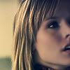
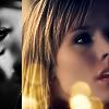
Second tutorial. From
to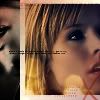
Find a cap and crop it to your heart delight. Try not to centre the face too much - it can be interesting, but usually it’s not. Face-centered icons are so 1997.
Now, Duplicate the background, go to Filter->Sharpen->Sharpen, and then again the same.
Now I Desaturate (Ctrl+Shift+U) my layer and set it to Screen. Depending on how bright your picture is, you may want to do it again. Or not. *shrug*
I leave it as it is and merge down.

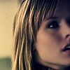
I think her skin could be softer, so I’m choosing Blur Tool, set on around 10px, Mode: Normal and 50% Strenght. With that I soften her face and neck, avoiding eyes and lips.

There, all pretty.
Now, make-up *g*
(This part isn't exactly necessary for the final result. But I love playing with that. And it *does* look better. Slightly. Kinda. If you are me, or/and picky)
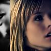
Choose Burn Tool. I set it on 4px, Midtones and 30% Exposure. Now paint around her eyes, lashes, possibly eyebrows.

See? Veronica has eyeliner now (at least I can use it on her... when I try with my own eyes I usually stab them. Le sigh)
Now Burn Tool again, but larger, around 40px, I darken her hair.

Now I change Burn into Dodge, 15px, Highlights, 20% and give Veronica pretty highlights.

Who needs hair-dye, anyway? I do this to all my photos *L*
She looks kinda rock chick with this eye-liner, doesn’t she?
So create a new layer and paint over the part of her blouse with dark soft brush, then set layer to Overlay. Ah, pretty.

Okay, you know, I wanted to give her green eyes, too. So I created yet another layer, chosen green I liked and painted a 9px dot on her eyes, then set layer to Color and lowered Opacity (set on 50%).

Now, let’s get to business. Colorisation starts here.
My favourite thing first. New layer, fill with dark blue (#011637), set to Exlusion.

All pretty, isn’t it? Wee.
Now, one of my favourite gradients:
by crumblingwalls, set to Overlay, 50%Opacity.
Merge Down and go to Image->Adjustements->Brightness/Contrast and play with options. I ended up with -10 and +10
Now, create new layer and fill it with white. Set it to low Opacity for time being, so you can see the background. Now, still working on the White layer, select the part of your icon you want to be visible with Rectangular Marquee Tool. Delete the selection.
Choose part of your background you want to be on the side of the icon, using Marquee Tool. Copy, Paste, place above the White Layer. You can Flip it Horizontal, or Vertical, or leave it as it is.... (go to Edit->Transform)
Now, desaturate this layer (Ctrl+Shift+U)
Image->Adjustements->Brightness/Contrast (my settings +10, +20). It wasn’t looking like I wanted it to, so I duplicated it and set it to Overlay.
Now, back to our background layer. Over this create new layer, past this
texture by colorfilter and set it to Screen.
Back to White Layer, make it visible - Opacity 100%
Now, I added this
Brush by terra_katta.
And to finish it off, this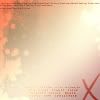
texture by crazy_perfume, set to Multiply, 80%Opacity.
Merge Down.
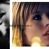
Here it is!
Now. Sleep. Exam tomorrow. Wish me luck?
...and because I'm trying not to think about tomorrow's exam.
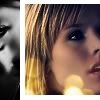
Second tutorial. From
to
Find a cap and crop it to your heart delight. Try not to centre the face too much - it can be interesting, but usually it’s not. Face-centered icons are so 1997.
Now, Duplicate the background, go to Filter->Sharpen->Sharpen, and then again the same.
Now I Desaturate (Ctrl+Shift+U) my layer and set it to Screen. Depending on how bright your picture is, you may want to do it again. Or not. *shrug*
I leave it as it is and merge down.
I think her skin could be softer, so I’m choosing Blur Tool, set on around 10px, Mode: Normal and 50% Strenght. With that I soften her face and neck, avoiding eyes and lips.
There, all pretty.
Now, make-up *g*
(This part isn't exactly necessary for the final result. But I love playing with that. And it *does* look better. Slightly. Kinda. If you are me, or/and picky)
Choose Burn Tool. I set it on 4px, Midtones and 30% Exposure. Now paint around her eyes, lashes, possibly eyebrows.
See? Veronica has eyeliner now (at least I can use it on her... when I try with my own eyes I usually stab them. Le sigh)
Now Burn Tool again, but larger, around 40px, I darken her hair.
Now I change Burn into Dodge, 15px, Highlights, 20% and give Veronica pretty highlights.
Who needs hair-dye, anyway? I do this to all my photos *L*
She looks kinda rock chick with this eye-liner, doesn’t she?
So create a new layer and paint over the part of her blouse with dark soft brush, then set layer to Overlay. Ah, pretty.
Okay, you know, I wanted to give her green eyes, too. So I created yet another layer, chosen green I liked and painted a 9px dot on her eyes, then set layer to Color and lowered Opacity (set on 50%).
Now, let’s get to business. Colorisation starts here.
My favourite thing first. New layer, fill with dark blue (#011637), set to Exlusion.
All pretty, isn’t it? Wee.
Now, one of my favourite gradients:
by crumblingwalls, set to Overlay, 50%Opacity.
Merge Down and go to Image->Adjustements->Brightness/Contrast and play with options. I ended up with -10 and +10
Now, create new layer and fill it with white. Set it to low Opacity for time being, so you can see the background. Now, still working on the White layer, select the part of your icon you want to be visible with Rectangular Marquee Tool. Delete the selection.
Choose part of your background you want to be on the side of the icon, using Marquee Tool. Copy, Paste, place above the White Layer. You can Flip it Horizontal, or Vertical, or leave it as it is.... (go to Edit->Transform)
Now, desaturate this layer (Ctrl+Shift+U)
Image->Adjustements->Brightness/Contrast (my settings +10, +20). It wasn’t looking like I wanted it to, so I duplicated it and set it to Overlay.
Now, back to our background layer. Over this create new layer, past this
texture by colorfilter and set it to Screen.
Back to White Layer, make it visible - Opacity 100%
Now, I added this
Brush by terra_katta.
And to finish it off, this
texture by crazy_perfume, set to Multiply, 80%Opacity.
Merge Down.
Here it is!
Now. Sleep. Exam tomorrow. Wish me luck?