Further adventures in gendered advertising
So today I happened to be comparing the packaging on Schick's Quattro razor with trimmer, which comes in two flavors-the kind "For Women," and the "Titanium" kind for everybody else.
They have, of course, the obvious differences-one is conveniently colored bright pink and green so that women will squee over the pretty colors, and the other is colored a safe, docile black so that men won't accidentally squee over the pretty colors and suddenly start liking penises. And, in the event that buying a razor with attached trimmer still makes men feel vaguely insecure about their sexuality, it even comes branded with the likeness of that paragon of manliness, Wolverine, with manly claw marks all over the black packaging.
There is, however, another difference you'll encounter if you happen to be wondering if the razor comes with batteries or not. From the respective bottom right corners of the packages:
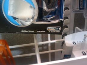
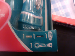
That's right. Just in case, after having their attention directed to the correct product by the color-coded package, women happen to still be confused, the package designer eases their minds further by not requiring them to read those difficult word things.
Seriously, this seems straight out of The Handmaid's Tale.
(In fairness, the package designer would probably justify this difference by pointing out that the bright pink package happens to be bilingual, and using visual icons is a more compact way of illustrating the contents in a bilingual way. I'm not sure that's really a good justification, though.)
They have, of course, the obvious differences-one is conveniently colored bright pink and green so that women will squee over the pretty colors, and the other is colored a safe, docile black so that men won't accidentally squee over the pretty colors and suddenly start liking penises. And, in the event that buying a razor with attached trimmer still makes men feel vaguely insecure about their sexuality, it even comes branded with the likeness of that paragon of manliness, Wolverine, with manly claw marks all over the black packaging.
There is, however, another difference you'll encounter if you happen to be wondering if the razor comes with batteries or not. From the respective bottom right corners of the packages:
That's right. Just in case, after having their attention directed to the correct product by the color-coded package, women happen to still be confused, the package designer eases their minds further by not requiring them to read those difficult word things.
Seriously, this seems straight out of The Handmaid's Tale.
(In fairness, the package designer would probably justify this difference by pointing out that the bright pink package happens to be bilingual, and using visual icons is a more compact way of illustrating the contents in a bilingual way. I'm not sure that's really a good justification, though.)