ask the maker 3.0
Ask the Maker 3.0
**I've never done a guide before so bear with with me because I am super horrible at explaining this stuff.**
Okay so scoobyatemysnax asked:
"may i ask for a guide for your lighting and/or your darker colouring? because i love the effect like in these icons"

This is actually pretty simple but I've been using it a lot lately. It is something that I started doing by accident after trying a similar effect but JUST TO BE CLEAR this is not my idea, many have done it before I tweaked it here and there for my style. Also, I imagine it would work with most coloring.
Step One: (Let's call them steps)
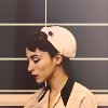
Prepare your image. I'm using a screencap that will go on my tumblr for this but I usually make my icons on a 100 x 100 canvas or they are cropped down versions of larger graphics. Crop it, do your usual steps and some basic coloring(I have a curves layer for brightness, selective color, photo filter and vibrance on this one). It doesn't need to be perfect or fancy, in fact you could probably just brighten up the cap and do the rest and still get good results. Anyways, here's what I had...

Step 2: (this is more like half a step)
Now you want to add anew gradient layer on top of all the other layers. This layer ends up being more of a guide in the end but I've skipped it before and it just doesn't come out as well. I chose the black and white gradient then go in change the black from true black to a dark grey. Any dark grey works. You should now have something like this...

Step 3:
Now you decide what you want to pop out. In this cap I want her hair and her lips to stand out so make a new fill layer, a yellow in this case for her hair. Now depending on what I think works best I'll set it to either soft light, darken or overlay. In this case it was darken so we have this...

Looks dumb but now we use LAYER MASKS! This is why the gradient layers is important(imo) because you can really see specifically where the color needs to be and where it doesn't. So now you simply mask everything you don't want to be yellow. I also lowered the opacity a bit so now I have this...

Now I do the same thing for her lips...

and finally the background which I always set to darken because you kind of want the opposite effect as you do with the hair and lips. The pops of color on the subject stand out in the end but making the entire "background" one color dulls it and makes the subject really stand out. Anyways, here is the background...

Before I continue I should add that you don't have to be PERFECT when you mask these bits because they are just enhancements. Plus if you missed a bit you can just go in and fix it quick so don't worry.
Step 4:
So now you just do a lot of adjusting. Go to your gradient layer and lower the opacity. I personally like to have it around 20 - 30% but you can delete it entirely or keep it higher. It's all up to you. Then go your layer mask layers and adjust the opacity until you like the effect. When I was all done with the opacity I had this...

Step 5:
This is where you can go in and add your own tweaks. I added a soft light layer in a lighter teal(I also changed the background layer mask color to a reddish brown and lowered the opacity a bit more because I wasn't thrilled with how it was looking). The soft light layer sort of unifies the whole thing. It can look very disjointed without one color sort of over everything. Obviously this is a personal preference though. I have this...

Step 6:
Now you add your textures, text or whatever else. I used a black and white gradient layer on soft light and a grainy texture on screen. Nothing really fancy.

-----
It's pretty basic really, most of the lighting comes from the layer masks you add. What I love about this style though is that you can add color to as many different parts as you like. Obviously on this I only added color to her hair and lips but on this I have 7 or 8 or this where I keep the gradient layer at 100%. It's kind of like a coloring book.
Okay, I'm so sorry if this is awful but I tend to just play around so going step by step is sort of opposite of how I do things. If you have any questions or something didn't make sense just ask and I'll do my best to answer :)