(no subject)
DEAR INTERNET
I HAVE WRITTEN A TUTORIAL
cause all the cool kids do and I wanna be cool too.
also star wars is awesome and I'm on a little obsessive kick here so deal.
anyways
go from THIS!!! to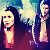
This tutorial is written for PSP8, but it should translate. It's also hilariously beginner friendly because I feel like explaining how to add 1 and 1.
Now, this here looks pretty dark. And dark is bad, because we can't see anything! We'll deal with that in a minute. The first thing I always do is resize, right away, even before I crop. Some people think that starting work at larger sizes will make a better icon, but in my experience, you can't know what you're working with until you see what you're working with! Pretty straight forward.
So we're going to resize a lot. I'm resizing by 25%, with the weighted average resize option. (I always used weighted average, I find it gets cleaner results than smart size) So now, we've got this:

Now, I crop a lot differently from some. I select the into image, and the paste into (ctrl + e) a 100 x 100 blank document. This lets me move the image around and see which cropping option is going to look the best. I'm only telling you all this because I believe my way it totally feriour and want more to join my side. So I'm going to crop to this!:

Wow, is that ever dark. We should be dealing with that, right off the bat, here. I'm going to duplicate that image about five times, and set it to screen every time. On most icons, you'll only need to duplicate two or three times, but those nights on Endor are pretty dark. So that's going to get me this:

Much brighter. A little too bright, in fact, and kind of washed out, too. Hm. Well, we can do something about that. Now, most normal people would now go up to Edit and select copy merged. However, I'm an obsessive compulsive merger, and I merge my image everytime I breathe on my icon! So if you're normal, I think that should get the same result lol. COPY MERGED. Then past that into a new layer, make sure it's lined up real nice. Then duplicate that. Set your first merged layer there to soft light. Set the second on to hard light.
Wow, that's bright. Weren't we fixing that??? Yup, just holy your horses! Desaturate the hard light layer by 100%. So now, we've got this:
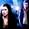
Oh shit. That's still really fucking bright. It's starting to look pretty cool though. So I'm going to make a new layer, fill it with #03073B, and YES HERE IT COMES, set the layer to Exclusion 100%. Now our icon looks like this:
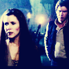
People can say whatever they want about that exclusion layer, that looks a lot better as far as I'm concerned.
So now, I'm going to make another new layer. I use a foregrond-background fader for all my gradiants, if anyone needs help with setting those up, tell me and I'll give you a hand, it actually took ME a while to get 8) I'm going to put #F68C98 as my foreground, #C1CCF5 as my background, and set the gradiant to a 47 degree angle. Then I'm going to set that layer to soft light and drag it under my exclusion layer. That's going to lighten up poor Han back there, and add some warmth into Leia's skin. Like so:

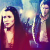
So now I'm going to add a bit of colour to the darker tones there. Because I like colour, and you do too cause I say so. So I'm going to take this texture made by some hot hot hot beast called leah_lightwing and I'm going to set it to screen. Red makes a neat colour to screen, because unlike every other colour, which kinda respects the integrity of the colours beneath it, red flips the other colours the bird and plops its ass right on there. So now ...
-->
There are undoubtably some people who don't like my colouring techniques. I tell them to blow themselves.
So now we're going to take what we have there and merge it!!!! copy merged again. Set up the copied image on a new layer, and duplicate it twice. Set all three layers to soft light.
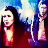
Oh my fuck that's bright. Don't worry lol, we'll fix that. Make a new Adjustment Layer (right-click on the layer bar thing and go from there) and check monochrome. Set the opacity to 18. This should mute it. Then make a new layer and use #03073B set to exclusion 100% again. Now we have this!!:
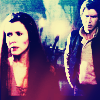
So now I think I'm kinda happy with this, but we do have the issue that it's really blurry. So sharpen it once, giving us

TADA!!! This is one of the worst icons I've made, and now YOU CAN MAKE IT TOO!!!! I wish I made icons like a normal person. Then I could totally make tutorials when I'm done the icon, instead of starting with an image, tuting as I go along and HOLDING MY BREATH LOL. I hope you've enjoyed this excercise in hilarity.
I HAVE WRITTEN A TUTORIAL
cause all the cool kids do and I wanna be cool too.
also star wars is awesome and I'm on a little obsessive kick here so deal.
anyways
go from THIS!!! to

This tutorial is written for PSP8, but it should translate. It's also hilariously beginner friendly because I feel like explaining how to add 1 and 1.
Now, this here looks pretty dark. And dark is bad, because we can't see anything! We'll deal with that in a minute. The first thing I always do is resize, right away, even before I crop. Some people think that starting work at larger sizes will make a better icon, but in my experience, you can't know what you're working with until you see what you're working with! Pretty straight forward.
So we're going to resize a lot. I'm resizing by 25%, with the weighted average resize option. (I always used weighted average, I find it gets cleaner results than smart size) So now, we've got this:

Now, I crop a lot differently from some. I select the into image, and the paste into (ctrl + e) a 100 x 100 blank document. This lets me move the image around and see which cropping option is going to look the best. I'm only telling you all this because I believe my way it totally feriour and want more to join my side. So I'm going to crop to this!:

Wow, is that ever dark. We should be dealing with that, right off the bat, here. I'm going to duplicate that image about five times, and set it to screen every time. On most icons, you'll only need to duplicate two or three times, but those nights on Endor are pretty dark. So that's going to get me this:

Much brighter. A little too bright, in fact, and kind of washed out, too. Hm. Well, we can do something about that. Now, most normal people would now go up to Edit and select copy merged. However, I'm an obsessive compulsive merger, and I merge my image everytime I breathe on my icon! So if you're normal, I think that should get the same result lol. COPY MERGED. Then past that into a new layer, make sure it's lined up real nice. Then duplicate that. Set your first merged layer there to soft light. Set the second on to hard light.
Wow, that's bright. Weren't we fixing that??? Yup, just holy your horses! Desaturate the hard light layer by 100%. So now, we've got this:

Oh shit. That's still really fucking bright. It's starting to look pretty cool though. So I'm going to make a new layer, fill it with #03073B, and YES HERE IT COMES, set the layer to Exclusion 100%. Now our icon looks like this:

People can say whatever they want about that exclusion layer, that looks a lot better as far as I'm concerned.
So now, I'm going to make another new layer. I use a foregrond-background fader for all my gradiants, if anyone needs help with setting those up, tell me and I'll give you a hand, it actually took ME a while to get 8) I'm going to put #F68C98 as my foreground, #C1CCF5 as my background, and set the gradiant to a 47 degree angle. Then I'm going to set that layer to soft light and drag it under my exclusion layer. That's going to lighten up poor Han back there, and add some warmth into Leia's skin. Like so:

So now I'm going to add a bit of colour to the darker tones there. Because I like colour, and you do too cause I say so. So I'm going to take this texture made by some hot hot hot beast called leah_lightwing and I'm going to set it to screen. Red makes a neat colour to screen, because unlike every other colour, which kinda respects the integrity of the colours beneath it, red flips the other colours the bird and plops its ass right on there. So now ...

-->

There are undoubtably some people who don't like my colouring techniques. I tell them to blow themselves.
So now we're going to take what we have there and merge it!!!! copy merged again. Set up the copied image on a new layer, and duplicate it twice. Set all three layers to soft light.

Oh my fuck that's bright. Don't worry lol, we'll fix that. Make a new Adjustment Layer (right-click on the layer bar thing and go from there) and check monochrome. Set the opacity to 18. This should mute it. Then make a new layer and use #03073B set to exclusion 100% again. Now we have this!!:

So now I think I'm kinda happy with this, but we do have the issue that it's really blurry. So sharpen it once, giving us

TADA!!! This is one of the worst icons I've made, and now YOU CAN MAKE IT TOO!!!! I wish I made icons like a normal person. Then I could totally make tutorials when I'm done the icon, instead of starting with an image, tuting as I go along and HOLDING MY BREATH LOL. I hope you've enjoyed this excercise in hilarity.