Vidding notes for "Blood Makes Noise"
freelancer_47 asked, "At 1:37, how did you do that stretched streak/blur on Juliet's face? Also, could you perhaps post some of the curve and color settings on some of the colorful shots?"
kiki_myserychic wanted to know "about the ending shot, 3:00" and how I made it "look like the shudder was closing on the edges."
mystisblom wrote: "Oh I would love to see how you made it :)"
I tried to cover your requests as well as I could. If you feel like I have overlooked an important information in my explanations, do not hesitate to let me know.
To make this video, I used the following tools: VirtualDub, Sony Vegas Pro 8, Adobe Photoshop CS3. This post should be understandable and translatable even if you use other programs though.
You can watch "Blood Makes Noise" here.
Because of mystisblom's request, I decided to do a sort of commentary of my project files, show you how I organized things. This is not a tutorial on how to use Sony Vegas though, and throughout my ramblings, I assume that you already know how to set up a project, add effects to a layer vs adding effects to a clip, change composite mode, create a gradient, animate effects with keyframes, etc...
I do not own the Lost DVDs (yet!) so I had to work with the high resolution divx files available on the www. I clipped and converted them in VirtualDub. My lossless codec of choice for editing is huffyuv. I organize my vid folder like so:
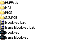
The folder names are pretty straight-forward, but here's a short description anyway:
+ HUFFYUV contains my VirtualDub-converted video clips.
+ MP3 contains the audio track, and any other additional sound effects I may use. In the case of this vid, there was none.
+ PICS contains the pictures. For this vid, it means the dharma-like frame I made in PS which you can see all around the vid, and a cap of Ben's radio.
+ SOURCE contains the divx clips I extracted from the various episodes of Lost.
+ .veg files: For this vid, I had two veg files; blood.veg is the main one and where I did all the editing. The second file, frame blood.veg, is where I added the dharma frame, as well as the blurring around the edges of the video.
Let's open blood.veg:
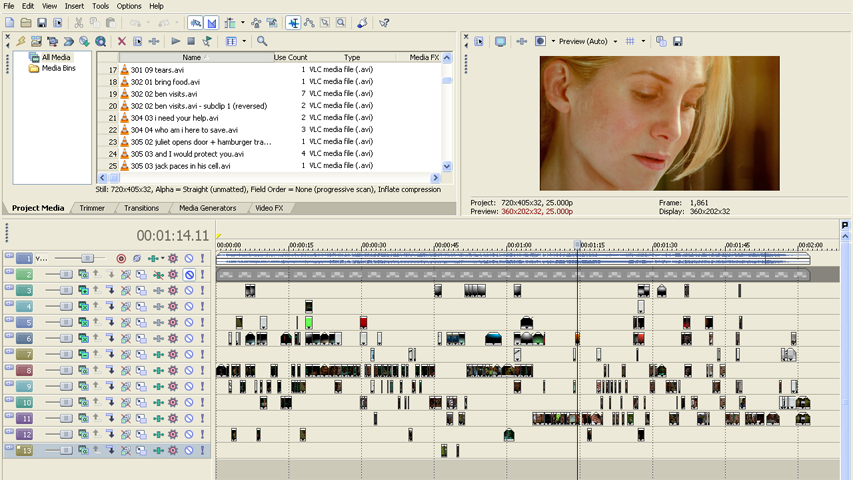
Top left, you can see listed my project media files. I find that having my clips labelled in a systematic manner helps me save loads of time. My system --which is only one amongst many-- is the following: season and episode number, divx clip number from which was extracted the converted clip, a short description. Top right, the preview window. Bottom part, the various video layers and audio layer. There are 13 layers in total: 1 audio, 1 for the frame (which doesn't really count), 5 "fancy-it-up" layers, 6 coloring layers.

Layer 1: the audio track (Suzanne Vega's Blood Makes Noise).

Layer 2: the Dharma frame. As you can see in the screen capture of the veg file, this layer is muted. It's only there so that when needed, I can check that the frame won't be covering anything I wouldn't want to be covered. The frame will only be added to the video in the second veg file (see further down).

Layer 3: The top layer of the 5 "fancy-it-up" layers. What I call "fancy-it-up" layers are layers I use for adding textures, a light effect, overlaying-footage, etc. Set to "add", layer 03 was used to brighten the footage by creating spots of light.


Layers 4, 5, 6: Those layers are set to "screen". I used them to create halos of light, to add texture and overlay footage. I mostly used layer 6; layers 4 and 5 were used when 6 was already filled with a clip -- you can see how everything's piled up quite clearly in the blood.veg screenshot.

Layer 07: Last of the "fancy-it-up" layers. This one is set to "substract". I only used it occasionally to overlay the blood or x-rays in negative.
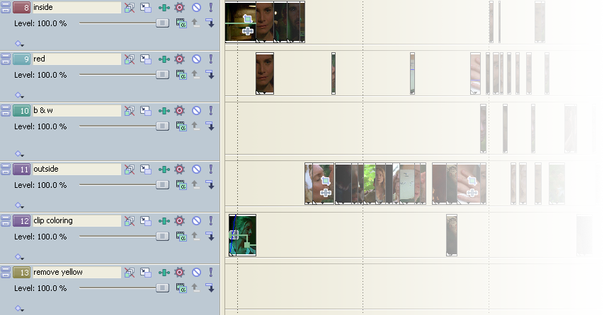
Layer 8 to 13: Those are the coloring layers. Right from the beginning, I knew I wanted to play with different colorings and rather than edit the coloring of each clip independently --which would have been extremely tedious for this vid-- I opted for editing the coloring of the layer. I created one layer for each type of coloring:
+ 8 inside: it accentuates the abundant green of the footage and tints the highlights a light blue. I used it mostly for in-door scenes (the cell, the operating room) hence the name.
+ 9 red: colorizes the footage in red. The contrast was adjusted at clip level, not the layer's, as it varied greatly from clip to clip.
+ 10 b & w: makes the footage black and white, also increases the contrast and luminosity lightly. Then if needed, the contrast was adjusted further at clip level.
+ 11 outside: colors the out-door footage with a light yellow wash.
+ 12 clip coloring: there's a small contrast adjustment of the layer, but the coloring is done at clip level. I used 12 when the other layers were already full or for when I wanted a coloring I didn't have already elsewhere.
+ 13 remove yellow: I think I used this layer for three clips only. It removes the yellow wash of the scenes in the operating room.
Examples of how I used the various layers:
1) footage + stock footage + circular gradient

2) footage + footage + stock footage

3) footage 1 + elliptical gradient + solid color with mask + footage 2

4) footage + footage + stock footage + circular gradient 1 + circular gradient 2
Those four examples are pretty representative of the various combinations I used throughout the vid. In the fourth one, you can see an example of how to combine two colorings through the use of a mask. At 0:17 in the video, I used a similar technique, but there, the mask is animated, making the red coloring change shape.
Here's another and more detailed example of mask + coloring that may interest you:
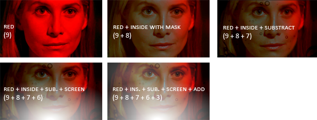
5)
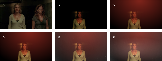
A is the original footage.
B: Layer 12, clip coloring. I reduced the size of the footage and masked everything but Juliet and the light behind her. The mask is animated to follow her as she moves. The clip is also darkened to hide the border of the mask; it was still too visible as I had to keep the feathering to a minimum since I didn't want Charlotte to show.
C: Layer 6, screen, red halo made with a red/black circular gradient with an opacity of 50%.
D: Layer 5, screen, copy of the clip on layer 12 to bring out Juliet a bit more. Opacity of 60%.
E: Layer 4, screen, moving dust in water footage, with an opacity of 70%.
F: Layer 3, add, white/black elliptical gradient, with an opacity of 30%.
And that's pretty much it as far as the coloring is concerned. freelancer_47 asked for curve and color settings so here they are for inside, red, outside, black and white. Those settings were applied to the layer; I did not include the settings that were applied to each clip. My favorite effects for coloring are color curves, color balance and color corrector.
Once I finished editing the video, I rendered a lossless copy and created a second vegas project to add the frame and the blurring. I decided to blur the edges for two reasons:
+ I found it visually interesting. It went well with the frame and the mood of the vid.
+ Technically, I needed to hide the abc HD logo. I had removed the logo in VirtualDub but the removal was not seamless in every shot. Blurring the edges was a way to smooth those imperfections out.
Let's open frame blood.veg:
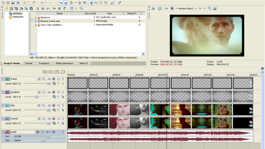
Layer 1: the dharma frame
Layer 2: a black/transparent gradient. The layer opacity is set to 50%.
Layer 3: is the video file to which is applied a gaussian blur effect. Then I added a feathered mask to mask out the center so that layer 4 could show through.
Layer 4: is the video file, unchanged.
Layer 5: is the audio track.
You can see how it builds up below.

From left to right:
the video file as rendered from blood.veg (note that you can see a blurred rectangle where the logo used to be)
the video file + the video with blurred edges
the video file + the video with blurred edges + elliptical black/transparent gradient
the video file + the video with blurred edges + elliptical black/transparent gradient + frame
And I was done! :)
***
Now, on to kiki_myserychic's question "about the ending shot, 3:00" and how I made it "look like the shudder was closing on the edges."
The answer is simple, I did nothing. The shudder-like effect was already in the original footage --the flickering lights are the ones responsible! *g* It may have been accentuated by the coloring I chose: black and white for the corridor, colors for Jack and Juliet.
***
freelancer_47 asked, "At 1:37, how did you do that stretched streak/blur on Juliet's face?"
Download mp4 (16.40Mb; better quality than the stream), or watch streaming:
Questions, comments, chocolate, and hotsexymen are much appreciated, as always.
kiki_myserychic wanted to know "about the ending shot, 3:00" and how I made it "look like the shudder was closing on the edges."
mystisblom wrote: "Oh I would love to see how you made it :)"
I tried to cover your requests as well as I could. If you feel like I have overlooked an important information in my explanations, do not hesitate to let me know.
To make this video, I used the following tools: VirtualDub, Sony Vegas Pro 8, Adobe Photoshop CS3. This post should be understandable and translatable even if you use other programs though.
You can watch "Blood Makes Noise" here.
Because of mystisblom's request, I decided to do a sort of commentary of my project files, show you how I organized things. This is not a tutorial on how to use Sony Vegas though, and throughout my ramblings, I assume that you already know how to set up a project, add effects to a layer vs adding effects to a clip, change composite mode, create a gradient, animate effects with keyframes, etc...
I do not own the Lost DVDs (yet!) so I had to work with the high resolution divx files available on the www. I clipped and converted them in VirtualDub. My lossless codec of choice for editing is huffyuv. I organize my vid folder like so:
The folder names are pretty straight-forward, but here's a short description anyway:
+ HUFFYUV contains my VirtualDub-converted video clips.
+ MP3 contains the audio track, and any other additional sound effects I may use. In the case of this vid, there was none.
+ PICS contains the pictures. For this vid, it means the dharma-like frame I made in PS which you can see all around the vid, and a cap of Ben's radio.
+ SOURCE contains the divx clips I extracted from the various episodes of Lost.
+ .veg files: For this vid, I had two veg files; blood.veg is the main one and where I did all the editing. The second file, frame blood.veg, is where I added the dharma frame, as well as the blurring around the edges of the video.
Let's open blood.veg:
Top left, you can see listed my project media files. I find that having my clips labelled in a systematic manner helps me save loads of time. My system --which is only one amongst many-- is the following: season and episode number, divx clip number from which was extracted the converted clip, a short description. Top right, the preview window. Bottom part, the various video layers and audio layer. There are 13 layers in total: 1 audio, 1 for the frame (which doesn't really count), 5 "fancy-it-up" layers, 6 coloring layers.
Layer 1: the audio track (Suzanne Vega's Blood Makes Noise).
Layer 2: the Dharma frame. As you can see in the screen capture of the veg file, this layer is muted. It's only there so that when needed, I can check that the frame won't be covering anything I wouldn't want to be covered. The frame will only be added to the video in the second veg file (see further down).
Layer 3: The top layer of the 5 "fancy-it-up" layers. What I call "fancy-it-up" layers are layers I use for adding textures, a light effect, overlaying-footage, etc. Set to "add", layer 03 was used to brighten the footage by creating spots of light.
Layers 4, 5, 6: Those layers are set to "screen". I used them to create halos of light, to add texture and overlay footage. I mostly used layer 6; layers 4 and 5 were used when 6 was already filled with a clip -- you can see how everything's piled up quite clearly in the blood.veg screenshot.
Layer 07: Last of the "fancy-it-up" layers. This one is set to "substract". I only used it occasionally to overlay the blood or x-rays in negative.
Layer 8 to 13: Those are the coloring layers. Right from the beginning, I knew I wanted to play with different colorings and rather than edit the coloring of each clip independently --which would have been extremely tedious for this vid-- I opted for editing the coloring of the layer. I created one layer for each type of coloring:
+ 8 inside: it accentuates the abundant green of the footage and tints the highlights a light blue. I used it mostly for in-door scenes (the cell, the operating room) hence the name.
+ 9 red: colorizes the footage in red. The contrast was adjusted at clip level, not the layer's, as it varied greatly from clip to clip.
+ 10 b & w: makes the footage black and white, also increases the contrast and luminosity lightly. Then if needed, the contrast was adjusted further at clip level.
+ 11 outside: colors the out-door footage with a light yellow wash.
+ 12 clip coloring: there's a small contrast adjustment of the layer, but the coloring is done at clip level. I used 12 when the other layers were already full or for when I wanted a coloring I didn't have already elsewhere.
+ 13 remove yellow: I think I used this layer for three clips only. It removes the yellow wash of the scenes in the operating room.
Examples of how I used the various layers:
1) footage + stock footage + circular gradient
2) footage + footage + stock footage
3) footage 1 + elliptical gradient + solid color with mask + footage 2
4) footage + footage + stock footage + circular gradient 1 + circular gradient 2
Those four examples are pretty representative of the various combinations I used throughout the vid. In the fourth one, you can see an example of how to combine two colorings through the use of a mask. At 0:17 in the video, I used a similar technique, but there, the mask is animated, making the red coloring change shape.
Here's another and more detailed example of mask + coloring that may interest you:
5)
A is the original footage.
B: Layer 12, clip coloring. I reduced the size of the footage and masked everything but Juliet and the light behind her. The mask is animated to follow her as she moves. The clip is also darkened to hide the border of the mask; it was still too visible as I had to keep the feathering to a minimum since I didn't want Charlotte to show.
C: Layer 6, screen, red halo made with a red/black circular gradient with an opacity of 50%.
D: Layer 5, screen, copy of the clip on layer 12 to bring out Juliet a bit more. Opacity of 60%.
E: Layer 4, screen, moving dust in water footage, with an opacity of 70%.
F: Layer 3, add, white/black elliptical gradient, with an opacity of 30%.
And that's pretty much it as far as the coloring is concerned. freelancer_47 asked for curve and color settings so here they are for inside, red, outside, black and white. Those settings were applied to the layer; I did not include the settings that were applied to each clip. My favorite effects for coloring are color curves, color balance and color corrector.
Once I finished editing the video, I rendered a lossless copy and created a second vegas project to add the frame and the blurring. I decided to blur the edges for two reasons:
+ I found it visually interesting. It went well with the frame and the mood of the vid.
+ Technically, I needed to hide the abc HD logo. I had removed the logo in VirtualDub but the removal was not seamless in every shot. Blurring the edges was a way to smooth those imperfections out.
Let's open frame blood.veg:
Layer 1: the dharma frame
Layer 2: a black/transparent gradient. The layer opacity is set to 50%.
Layer 3: is the video file to which is applied a gaussian blur effect. Then I added a feathered mask to mask out the center so that layer 4 could show through.
Layer 4: is the video file, unchanged.
Layer 5: is the audio track.
You can see how it builds up below.
From left to right:
the video file as rendered from blood.veg (note that you can see a blurred rectangle where the logo used to be)
the video file + the video with blurred edges
the video file + the video with blurred edges + elliptical black/transparent gradient
the video file + the video with blurred edges + elliptical black/transparent gradient + frame
And I was done! :)
***
Now, on to kiki_myserychic's question "about the ending shot, 3:00" and how I made it "look like the shudder was closing on the edges."
The answer is simple, I did nothing. The shudder-like effect was already in the original footage --the flickering lights are the ones responsible! *g* It may have been accentuated by the coloring I chose: black and white for the corridor, colors for Jack and Juliet.
***
freelancer_47 asked, "At 1:37, how did you do that stretched streak/blur on Juliet's face?"
Download mp4 (16.40Mb; better quality than the stream), or watch streaming:
Questions, comments, chocolate, and hotsexymen are much appreciated, as always.