TUTORIAL #1
This was done on PhotoshopCS, but it should work on PSP as well.

to

to
2 different examples of the same technique.
The base: 
Now... A lot of people like to do Auto Color, but I think it messes up the colors and contrast and everything. So...
Dupliate the base, set it to SCREEN.
I got this:
Make a new layer, fill it with 
(#FF4656)
Set the color layer to SOFT LIGHT.

Looks bad, doesn't it? Don't worry. We'll fix that.
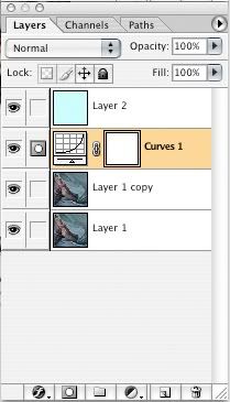
Now, select the SCREEN layer, which should be your second layer-- the one between the base and the color. From the Menu, go to Layer>New Adjustment Layer>Curves.
This is where your adjustment layer should be:

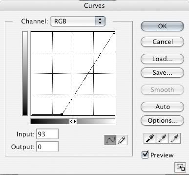
Play with the curves until your icon looks good. Vague statement, I know, but that's how it is. For this icon, here are my settings:

Flatten your icon, and you're done!
Here's my finished icon:
Of course, you can try different colors with different icons, according to the color of the image of your choice. Here's another example with a different image and a different color.
Base:
Color:
(#FCE5C5)
Finished icon:
Have fun!
Like this tutorial? Add it to your memories.
to
to
2 different examples of the same technique.
Now... A lot of people like to do Auto Color, but I think it messes up the colors and contrast and everything. So...
I got this:
(#FF4656)
Looks bad, doesn't it? Don't worry. We'll fix that.
This is where your adjustment layer should be:
Here's my finished icon:
Of course, you can try different colors with different icons, according to the color of the image of your choice. Here's another example with a different image and a different color.
Base:
Color:
(#FCE5C5)
Finished icon:
Have fun!
Like this tutorial? Add it to your memories.