Manip school: Tutorial 2 - The Couple
Since the response to my first manip tutorial was so overwhelming I've decided to do a few more. Or at least one more. :P This is tutorial number two and it focuses on placing two people next to each other in a picture. Please note that tutorial one was easier than this tutorial (maybe a 5 on a scale from 1 to 10, while this is a 6 or 7) and therefore this tut contains more steps, in other words: more pictures. However, some of the steps are not necessary in all manips. It's up to you.
Not in any way dial-up friendly!
Previosuly: Tutorial 1 - Head/body swap
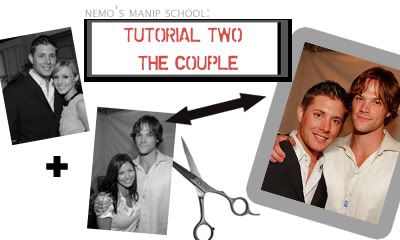
Examples; older manips on which I've used this technique:
#1 Logan/Veronica
#2 Mac/Dick
I'm still using Photosho 7.0. It's still In Swedish. I am not a native speaker.
Who said Jensen Ackles wasn't at the Teen Choice Awards?? Let's pretend he was!
These are our bases:
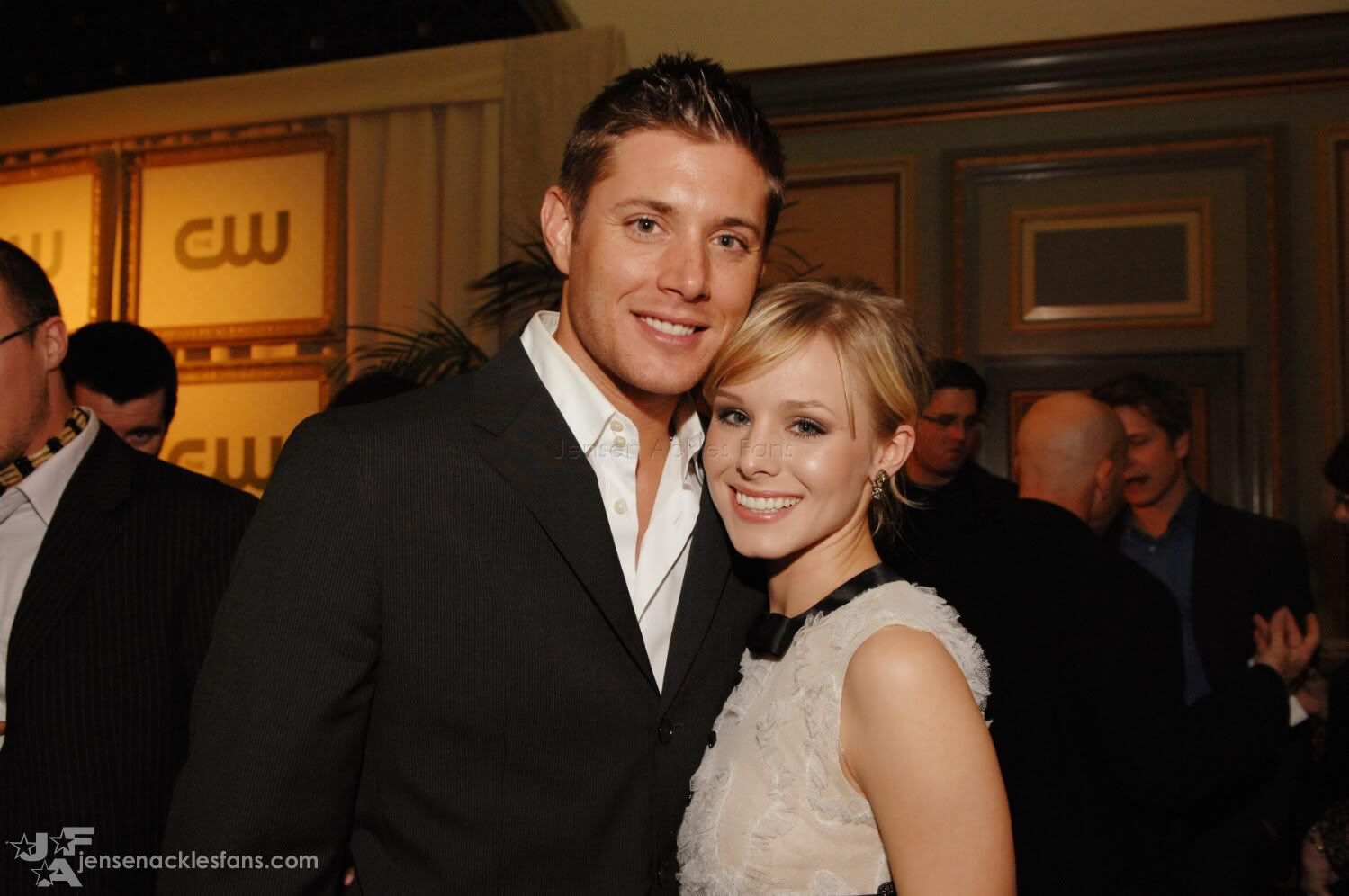
Click for larger
Pic of Jensen Ackles (with Kirsten Bell), snagged at JensenAcklesFans.com
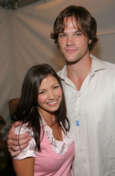
Click for larger
Pic of Jared Padalecki (with girlfriend Sandra McCoy - sorry Sandy!) shared by twistedlaletz in this post.
Oh, and if you're bothered by the slashy undertones of this manip, look a the real pics of these guys. Enough said.
Let's begin!

Both of the pics in one .psd file, on seperate layers. Jensen is the top layer.
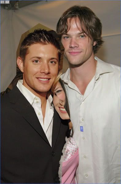
I have cut Jensen out some (using the polygonal lasso tool) to make him easier to extract later. I have also tilted and positioned him to my liking.
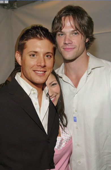
I have started extracting Jensen using the magnetic lasso tool. There are many different ways of extracting an object out of its background in PS, I suggest you use the method you like the best.
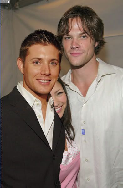
Jensen's backgorund is bye bye!
Click for larger
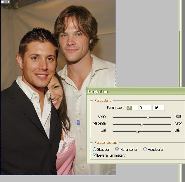
If you look at Jared's face you can tell that the lighting in his picture is less 'professional' than in the pic of Jensen. Jared looks more greyish/pinkish like we all do without the right light while Jensen looks tanned and fresh. The lighting in the pic of Jared looks more 'real', more like a pic you've snapped yourself but it's also a lot harder to recreate. That's why (and now I'm actually getting to the point *lol*) I will try to make Jared's skintone look like Jensen's and not the other way around.
I've gone back to my base pic of Jared, duplicated it and I am expermenting with the color balance on this new copy.
Click for larger
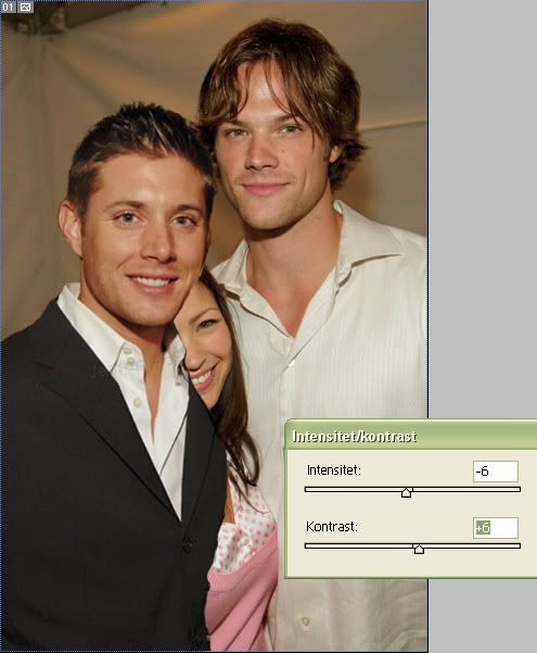
The pic of Jared also needed less intensity to make it more like Jensen's pic...
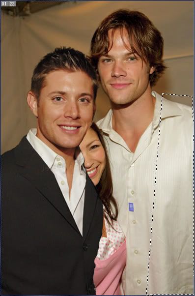
Time to get rid of Sandy!
I've selected this area of Jared's shirt, using the polygonal lasso tool (make sure to have the right layer of Jared selected). I copy this selection onto a new layer.
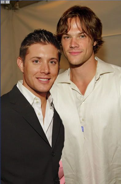
I've turned this new layer horisontically and tilted it until I'm satisfied with the position.
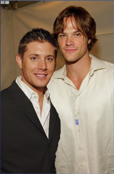
With some careful masking we can give the impression we saw more of Jared's shirt in the original pic.
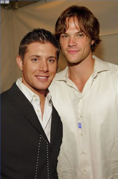
In the same way, I'm selecting a piece of Jensen's suit...

...and masking it to my liking.

Time for shadows! Shadows might just be the hardest part about doing a manip. At least I think so. I always struggle to get my shadows right and most of the time I don't succeed. *lol* But anyway, no harm in trying! This kind of manip without shadows will look extremely unreal.
The thing to thik about when adding shadows: From which direction is the light coming from?
When I'm adding shadows on skin I prefer to use a brown color instead of black (to get a warm tone instead of a grey, cold one). Here I've painted on several seperate layers with a soft brush.
On Jared's shoulder, I've used a light grey tone as a shadow. All of these layers are for now set on normal blend mode and on 100% opacity.
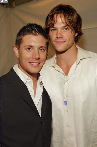
More shadows. (The other shadow layers are set to invisible on this screencap - they will be visible later.) Here I've used darker colors on the edge of Jensen's suit and where it meets Jared's shirt.

The shadows are in place. The blend mode is multiply and I've lowered the opacity to 35-40% on some layers, 60-70% on others. It all depends on the picture.

I talked earlier about Jared's pinkish face and I decided to give Jensen's face some pink tones as well. Here I've painted with a pink, soft brush on a new, top layer. Yes, I know it looks crazy. xD
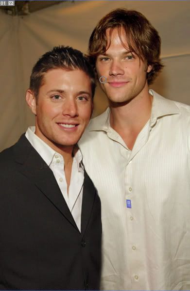
I've set the layer with the pink doodles on soft light, 56% opacity. Better, right?
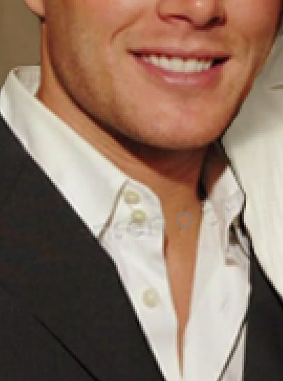
Jensen had a faint, but still visible, watermark on his suit jacket. I'm removing it by zooming in on the area and using the clone stamp tool.
(Note: I know that the watermarks are put there for a reason and I don't encourage anyone to remove the watermarks if they're not using the picture in graphics and it's in the way.)
The pic this far without the watermark
If we want to this could be the finished manip. But why not try to add Jared's hand too?
(Note: adding limbs to a manip like this is something I find extremely hard as well, along with the shadows. Most of the time I think my added hands look like gigantic spiders crawling all over the place. You guys will have to be the judge if that is the case this time...)
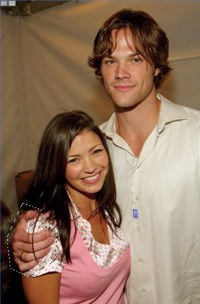
Selecting the area with Jared's hand on my base layer (note: the layer with the right color/intensity!)
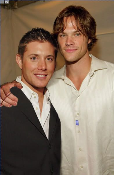
I have extracted the hand, moved it so that it is the top layer and positioned it on Jensen's shoulder.

With a little help of the clone stamp tool and Sandy's hair strands are all gone.
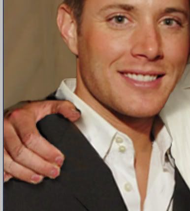
A few dark shadows painted on a new layer.
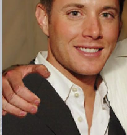
A few brown shadows painted on a new layer.

The brown shadows are set on multiply, the dark ones still on normal mode. The opacity is somewhere around 60%.
The hand is in place! Spider? What's your verdict? *lol*
We could say that this manip is done now but I'd like to try to make it look like a piece of Jared's sleeve is showing...
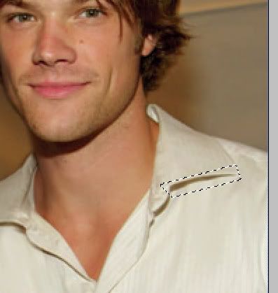
Zooming in on a piece of Jared's shirt and selecting a small area with a good shadow.

The piece of the shirt in the right position.
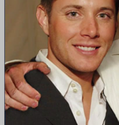
And with some masking and a little shadow it's done!
Okay. Fine. I give up. We're done now. *LOL*
The manip in all its finsihed glory:

Do not use without permission!
Not perfect (damn those shadows!) but as close as I can get. What do you think? :D Comments? Questions?
Older tutorials by Nemo
My most recent manips
My Supernatural fanart
Not in any way dial-up friendly!
Previosuly: Tutorial 1 - Head/body swap

Examples; older manips on which I've used this technique:
#1 Logan/Veronica
#2 Mac/Dick
I'm still using Photosho 7.0. It's still In Swedish. I am not a native speaker.
Who said Jensen Ackles wasn't at the Teen Choice Awards?? Let's pretend he was!
These are our bases:

Click for larger
Pic of Jensen Ackles (with Kirsten Bell), snagged at JensenAcklesFans.com

Click for larger
Pic of Jared Padalecki (with girlfriend Sandra McCoy - sorry Sandy!) shared by twistedlaletz in this post.
Oh, and if you're bothered by the slashy undertones of this manip, look a the real pics of these guys. Enough said.
Let's begin!

Both of the pics in one .psd file, on seperate layers. Jensen is the top layer.

I have cut Jensen out some (using the polygonal lasso tool) to make him easier to extract later. I have also tilted and positioned him to my liking.

I have started extracting Jensen using the magnetic lasso tool. There are many different ways of extracting an object out of its background in PS, I suggest you use the method you like the best.

Jensen's backgorund is bye bye!

Click for larger
If you look at Jared's face you can tell that the lighting in his picture is less 'professional' than in the pic of Jensen. Jared looks more greyish/pinkish like we all do without the right light while Jensen looks tanned and fresh. The lighting in the pic of Jared looks more 'real', more like a pic you've snapped yourself but it's also a lot harder to recreate. That's why (and now I'm actually getting to the point *lol*) I will try to make Jared's skintone look like Jensen's and not the other way around.
I've gone back to my base pic of Jared, duplicated it and I am expermenting with the color balance on this new copy.

Click for larger
The pic of Jared also needed less intensity to make it more like Jensen's pic...

Time to get rid of Sandy!
I've selected this area of Jared's shirt, using the polygonal lasso tool (make sure to have the right layer of Jared selected). I copy this selection onto a new layer.

I've turned this new layer horisontically and tilted it until I'm satisfied with the position.

With some careful masking we can give the impression we saw more of Jared's shirt in the original pic.

In the same way, I'm selecting a piece of Jensen's suit...

...and masking it to my liking.

Time for shadows! Shadows might just be the hardest part about doing a manip. At least I think so. I always struggle to get my shadows right and most of the time I don't succeed. *lol* But anyway, no harm in trying! This kind of manip without shadows will look extremely unreal.
The thing to thik about when adding shadows: From which direction is the light coming from?
When I'm adding shadows on skin I prefer to use a brown color instead of black (to get a warm tone instead of a grey, cold one). Here I've painted on several seperate layers with a soft brush.
On Jared's shoulder, I've used a light grey tone as a shadow. All of these layers are for now set on normal blend mode and on 100% opacity.

More shadows. (The other shadow layers are set to invisible on this screencap - they will be visible later.) Here I've used darker colors on the edge of Jensen's suit and where it meets Jared's shirt.

The shadows are in place. The blend mode is multiply and I've lowered the opacity to 35-40% on some layers, 60-70% on others. It all depends on the picture.

I talked earlier about Jared's pinkish face and I decided to give Jensen's face some pink tones as well. Here I've painted with a pink, soft brush on a new, top layer. Yes, I know it looks crazy. xD

I've set the layer with the pink doodles on soft light, 56% opacity. Better, right?

Jensen had a faint, but still visible, watermark on his suit jacket. I'm removing it by zooming in on the area and using the clone stamp tool.
(Note: I know that the watermarks are put there for a reason and I don't encourage anyone to remove the watermarks if they're not using the picture in graphics and it's in the way.)
The pic this far without the watermark
If we want to this could be the finished manip. But why not try to add Jared's hand too?
(Note: adding limbs to a manip like this is something I find extremely hard as well, along with the shadows. Most of the time I think my added hands look like gigantic spiders crawling all over the place. You guys will have to be the judge if that is the case this time...)

Selecting the area with Jared's hand on my base layer (note: the layer with the right color/intensity!)

I have extracted the hand, moved it so that it is the top layer and positioned it on Jensen's shoulder.

With a little help of the clone stamp tool and Sandy's hair strands are all gone.

A few dark shadows painted on a new layer.

A few brown shadows painted on a new layer.

The brown shadows are set on multiply, the dark ones still on normal mode. The opacity is somewhere around 60%.
The hand is in place! Spider? What's your verdict? *lol*
We could say that this manip is done now but I'd like to try to make it look like a piece of Jared's sleeve is showing...

Zooming in on a piece of Jared's shirt and selecting a small area with a good shadow.

The piece of the shirt in the right position.

And with some masking and a little shadow it's done!
Okay. Fine. I give up. We're done now. *LOL*
The manip in all its finsihed glory:

Do not use without permission!
Not perfect (damn those shadows!) but as close as I can get. What do you think? :D Comments? Questions?
Older tutorials by Nemo
My most recent manips
My Supernatural fanart