Results - Challenge 4 - Round 2
Hi to all! Challenge 4 Round 1 voting is closed. Thanks to all who voted!
Eliminated:

dance_the_dance
Sorry! Personally I like your icon. Hope to see you next session!
People's choice:

by tory_guvera
BANNER
Congrats!!!
Mod's choice:

by rockn_rose
BANNER
Crop is great, but colouring is really awesome))
Results:
01. +2
02. -3
03. -5
04. +1
05. -3+1=-2
06. -1+3=2
07. 1
08. 4
Reasons:
negative:
# 2
-oversaturation makes her make-up look exaggerated
-icon is over-saturated and a bit blurry
-colouring is too saturated and contrasted
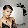
# 3
-too pale colors, not good use of textures, and tiny looks a little rude
-texture use and choice isn't nice. icons like this iconmakers made about 5 years ago
-icon looks too busy with decorative elements. These distract attention from Nelly
-oversharped, the background looks weird
-the colouring and background don't quite fit together
# 5
-not good composition and colors, too dark icon
-dark colouring. there could be any decorative details like text or some texture
-the way how Nelly was cut looks inaccurate
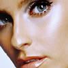
# 6
-the coloring is lovely, but crop should show at least a little bit of something other than her cheek, otherwise her face looks too wide
positive:
# 1
-it's creative, good background too - the empty space doesn't actually look empty
-amazing use of textures and good crop. beautiful composition)
# 4
-great crop, lovely colouring
# 5
-nice texture use and crop
# 6
-awesome colouring! gorgeous clarity of colours <3
-beautiful colouring and rotated cropping
-i like the way of cropping
# 7
-interesting cropping and unique colouring
# 8
-lovely crop, her eyes are really beautiful of it, amazing colors^^
-fantastic colours. very beautiful result!
-awesome coloring
-gorgrous colouring, i like how it brings out her eyes
Eliminated:

dance_the_dance
Sorry! Personally I like your icon. Hope to see you next session!
People's choice:

by tory_guvera
BANNER
Congrats!!!
Mod's choice:

by rockn_rose
BANNER
Crop is great, but colouring is really awesome))
Results:
01. +2
02. -3
03. -5
04. +1
05. -3+1=-2
06. -1+3=2
07. 1
08. 4
Reasons:
negative:
# 2
-oversaturation makes her make-up look exaggerated
-icon is over-saturated and a bit blurry
-colouring is too saturated and contrasted
# 3
-too pale colors, not good use of textures, and tiny looks a little rude
-texture use and choice isn't nice. icons like this iconmakers made about 5 years ago
-icon looks too busy with decorative elements. These distract attention from Nelly
-oversharped, the background looks weird
-the colouring and background don't quite fit together
# 5
-not good composition and colors, too dark icon
-dark colouring. there could be any decorative details like text or some texture
-the way how Nelly was cut looks inaccurate
# 6
-the coloring is lovely, but crop should show at least a little bit of something other than her cheek, otherwise her face looks too wide
positive:
# 1
-it's creative, good background too - the empty space doesn't actually look empty
-amazing use of textures and good crop. beautiful composition)
# 4
-great crop, lovely colouring
# 5
-nice texture use and crop
# 6
-awesome colouring! gorgeous clarity of colours <3
-beautiful colouring and rotated cropping
-i like the way of cropping
# 7
-interesting cropping and unique colouring
# 8
-lovely crop, her eyes are really beautiful of it, amazing colors^^
-fantastic colours. very beautiful result!
-awesome coloring
-gorgrous colouring, i like how it brings out her eyes