LIMS
Another round of lims and another 3 I've been voted out of. :( I'm really sort of annoyed/sad/bothered by two of them and sort of by the third. But more about that shortly.
Entry 10 VOTED OUT
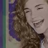
hp_lims Challenge 4: Trio : 21 votes
Other Entries Results
Entry 22
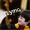
hp_lims Challenge 3: Harry and Hedwig : 6 votes
Other Entries Results
Entry 20 VOTED OUT
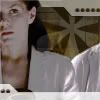
challenge_lims Challenge 2: Group Shot : 10 votes
Other Entries Results
Entry 22

challenge_lims Challenge 1: Black and White : 1 vote
Other Entries Results
Entry 3 VOTED OUT
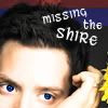
actor_lims Challenge 4: Elijah Wood : 12 votes
Other Entries Results
Entry 2
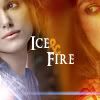
actress_lims Challenge 3: Keira : 3 votes
Other Entries Results
Entry 9
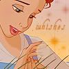
disney_lims Challenge 1: Beauty and the Beast : -1 votes
Other Entries Results
Entry 3
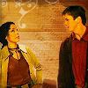
firefly_lims Challenge 3: Out of Gas : 4 votes
Other Entries Results
hp_lims #4
-Very... gray. Emma looks like a statue.
-The coloring is very strange. She looks purplish/grey, which isn't a good thing.
-The coloring on the icon is off.
-the image is too dark, colors need to be brighter and more vibrant
-The coloring washes out the image and makes the overall effect very grey and blah. Also, oversharpened.
-Colours faded/washed out, picture quality too grainy.
-The coloring is mostly black and white but not quite. It's too washed out and does not flatter the subject at all.
-Too dark, and the coloring is weird.
-The icon is too dark
-The coloring doesn't compliment the cap.
-Gradient overpowering picture.
-the picture has been dulled too much and the colors are not good for the picture
-It's too dark
-Icon too dark; Emma's coloring makes the icon look too dull.
-The colors are a bit odd and it looks like they overused an exclusion layer.
-Image is too dark, the colouring does not suit the image
-The coloring washes out the image
-the gradient on Emma overpowers her greatly
-the icon is too dark.
-The Icon is too dark
-Too desaturated and negative-looking.
All and all what this really says is that the coloring was too dim and washed out. Some of the comments are sort of out of place, like saying the colors I used on the icon don't match etc. They are colors pulled straight from the crop. But overall I get what the comments are trying to tell me. I thought as much when I was making it. However, I don't think it meritted as many votes as it recieved.
hp_lims #3
-Image looks pixellated, distracting brushes.
-the brushes and text are overpowering the icon
-You can tell this person has not had a lot of experience because the text and brushing do not fit with the icon very well.
-the overall composition of the icon seems awkward. The font doesn't fit the icon.
-the sparkles add nothing of value to the icon.
-The texture use is tacky and there's nothing interesting.
The gist is that it's tacky. Which I agree with. I hated this icon. But the cap was really annoying to work with. It's not something I would ever have voluntarily used.
challenge_lims #2
20 - the main image is too dark, and the brushes don't work.
20. The lines in the background are good, but the cropping is kind of uninteresting.
20; This icon is much too dark. There's no contrast at all, and the colors are very muted and "dirty."
#20 - odd colouring, too dark, asterisk is distracting
20. Is that a exclusion layer? Oh, no. Or something set to Darken. No. Do not do that, the coloring gets so boring and if an icon like that participated in a 'vote your fave icon' voting, it would go unnoticed. Besides, the brush/texture around Cameron is what you'd use with a happy-colored image (not that I would use it, anyway). The brushes don't look fine, either - like, white lowering the opacity? Lowering the opacity when the blend mode is Normal doesn't work in most of cases, I assure you. But the cropping is fine, and the image doesn't look bad quality under the coloring.
#20 - very blurred, the image is too large really, it's been enlarged too much and nothing has been done to compensate this. The coloring is fairly blah too.
20 - oversharpened and weird brush which kinda takes over and ruins the icon
20 - the cropping is good, but the coloring completely dulls out the image and makes you focus more on the background than the subject.
20 - needs sharpening, texture is overbearing, colors are dull
20 - It uses a nice texture, but it just doesn't seem to fit the picture. It makes it too dark and it is still slightly blurry.
Agreed for the most part actually, though again, like the hp icon, in comparison to many of the other icons, I don't believe it deserved as many votes as it got.
challenge_lims #1
22 - The icon's texture overpowering.
I think by this they mean the brush in the bottom left corner, but I'm not really sure. I like the icon, though I wish the colors had been a bit deeper.
actor_lims
03: The blue eyes just don't look very realistic. Plus, their brightest draws your attention away from the rest of the icon.
03 - While I can understand the shire thing, it just seems strange in a way. Elijah is not Frodo and this is an actor picture, not a LotR picture and no matter how you crop it you can tell that. The cropping is imaginative, though, but the font could have been a bit more sharp.
03. The icon is pretty, but the eyes are kinda creepy, the blue is too big on the left eye or something. The border on the top doesn't seem to fit with the rest.
3.eyes are too bright, dark and over sharpened
3-his eyes look really creepy.
03; The colors look slightly too bright and the red band on the top is kind of random and doesn't really do anything for the icon.
03. It's admirable that you tried to create blue-r eyes but it didn't blend well with the rest of the icon.
3 - the eyes and face are too bright (the eye color looks unnatural), and the cut of the icon emphasizes the large forehead.
03. They had a good idea to try and brighten his eyes more, but the end result didn't do the idea justice. The color didn't fit him, and ended up making him look cock-eyed and odd. Also, the text seems like a last minute add in instead of fitting the icons as well as the others did.
3: The text placements distracts from the subject of the icon.
3 - the cropping is weird, and the text aliasing is weird, either that or it's the font. The icon just doesn't do much for me.
03. The maroon band at the top doesn't compliment the rest of the icon.
I knew this icon was probably done when I entered it. But I wanted to try something new for me. It flopped. I understand the comments, but some of them have more to do with the cap(lopsided? look at the original picture again and tell me his expression is normal and not creepy/depressed). It really comes down to the fact that the other icons were better.
actress_lims
02 - interesting concept but the orange gradient thing makes the icon's quality look bad and the font could be made more tranceparent
02: The texture used doesn't "match" the image and diverts attention away from the image itself.
02 The blue/red theme does not work well. The coloring is too clashing, and not in a good way.
To be completely honest, this is probably my favourite icon of this whole set, and if I could have voted favourite for myself, I probably would have XD. That said however, I can understand how one wouldn't like the icon. The font comment was a good one(though honestly I did try it and it looked worse). The color comments are in my mind, a matter of opinion.
disney_lims
no comments
To be frank, it is RIDICULOUS that I am not out of this contest. I mispelled the word "wishes" as "whishes." I don't care how pretty it was or wasn't -- I mispelled the one word on the icon. I was shocked to find out that I was not only still in the contest, but that someone had voted mine as their favourite and none voted me out.
That said, I'm redoing the icon for future use with the word spelt correctly. :)
firefly_icons
(the comments haven't been sent and the comm hasn't been updated in a bit :( )
I couldn't decide whether or not I liked this icon. The cap was very difficult to use(everything was blurry and the bright yellow background washes right into zoe and mal's color). I like that it mimics the dvd menus of firefly a little, but the quality just isn't great.
Challenges I'm still in:
firefly_lims
actress_lims
disney_lims
coffee_lims (silly I know XD )
Entry 10 VOTED OUT

hp_lims Challenge 4: Trio : 21 votes
Other Entries Results
Entry 22

hp_lims Challenge 3: Harry and Hedwig : 6 votes
Other Entries Results
Entry 20 VOTED OUT

challenge_lims Challenge 2: Group Shot : 10 votes
Other Entries Results
Entry 22

challenge_lims Challenge 1: Black and White : 1 vote
Other Entries Results
Entry 3 VOTED OUT

actor_lims Challenge 4: Elijah Wood : 12 votes
Other Entries Results
Entry 2

actress_lims Challenge 3: Keira : 3 votes
Other Entries Results
Entry 9

disney_lims Challenge 1: Beauty and the Beast : -1 votes
Other Entries Results
Entry 3

firefly_lims Challenge 3: Out of Gas : 4 votes
Other Entries Results
hp_lims #4
-Very... gray. Emma looks like a statue.
-The coloring is very strange. She looks purplish/grey, which isn't a good thing.
-The coloring on the icon is off.
-the image is too dark, colors need to be brighter and more vibrant
-The coloring washes out the image and makes the overall effect very grey and blah. Also, oversharpened.
-Colours faded/washed out, picture quality too grainy.
-The coloring is mostly black and white but not quite. It's too washed out and does not flatter the subject at all.
-Too dark, and the coloring is weird.
-The icon is too dark
-The coloring doesn't compliment the cap.
-Gradient overpowering picture.
-the picture has been dulled too much and the colors are not good for the picture
-It's too dark
-Icon too dark; Emma's coloring makes the icon look too dull.
-The colors are a bit odd and it looks like they overused an exclusion layer.
-Image is too dark, the colouring does not suit the image
-The coloring washes out the image
-the gradient on Emma overpowers her greatly
-the icon is too dark.
-The Icon is too dark
-Too desaturated and negative-looking.
All and all what this really says is that the coloring was too dim and washed out. Some of the comments are sort of out of place, like saying the colors I used on the icon don't match etc. They are colors pulled straight from the crop. But overall I get what the comments are trying to tell me. I thought as much when I was making it. However, I don't think it meritted as many votes as it recieved.
hp_lims #3
-Image looks pixellated, distracting brushes.
-the brushes and text are overpowering the icon
-You can tell this person has not had a lot of experience because the text and brushing do not fit with the icon very well.
-the overall composition of the icon seems awkward. The font doesn't fit the icon.
-the sparkles add nothing of value to the icon.
-The texture use is tacky and there's nothing interesting.
The gist is that it's tacky. Which I agree with. I hated this icon. But the cap was really annoying to work with. It's not something I would ever have voluntarily used.
challenge_lims #2
20 - the main image is too dark, and the brushes don't work.
20. The lines in the background are good, but the cropping is kind of uninteresting.
20; This icon is much too dark. There's no contrast at all, and the colors are very muted and "dirty."
#20 - odd colouring, too dark, asterisk is distracting
20. Is that a exclusion layer? Oh, no. Or something set to Darken. No. Do not do that, the coloring gets so boring and if an icon like that participated in a 'vote your fave icon' voting, it would go unnoticed. Besides, the brush/texture around Cameron is what you'd use with a happy-colored image (not that I would use it, anyway). The brushes don't look fine, either - like, white lowering the opacity? Lowering the opacity when the blend mode is Normal doesn't work in most of cases, I assure you. But the cropping is fine, and the image doesn't look bad quality under the coloring.
#20 - very blurred, the image is too large really, it's been enlarged too much and nothing has been done to compensate this. The coloring is fairly blah too.
20 - oversharpened and weird brush which kinda takes over and ruins the icon
20 - the cropping is good, but the coloring completely dulls out the image and makes you focus more on the background than the subject.
20 - needs sharpening, texture is overbearing, colors are dull
20 - It uses a nice texture, but it just doesn't seem to fit the picture. It makes it too dark and it is still slightly blurry.
Agreed for the most part actually, though again, like the hp icon, in comparison to many of the other icons, I don't believe it deserved as many votes as it got.
challenge_lims #1
22 - The icon's texture overpowering.
I think by this they mean the brush in the bottom left corner, but I'm not really sure. I like the icon, though I wish the colors had been a bit deeper.
actor_lims
03: The blue eyes just don't look very realistic. Plus, their brightest draws your attention away from the rest of the icon.
03 - While I can understand the shire thing, it just seems strange in a way. Elijah is not Frodo and this is an actor picture, not a LotR picture and no matter how you crop it you can tell that. The cropping is imaginative, though, but the font could have been a bit more sharp.
03. The icon is pretty, but the eyes are kinda creepy, the blue is too big on the left eye or something. The border on the top doesn't seem to fit with the rest.
3.eyes are too bright, dark and over sharpened
3-his eyes look really creepy.
03; The colors look slightly too bright and the red band on the top is kind of random and doesn't really do anything for the icon.
03. It's admirable that you tried to create blue-r eyes but it didn't blend well with the rest of the icon.
3 - the eyes and face are too bright (the eye color looks unnatural), and the cut of the icon emphasizes the large forehead.
03. They had a good idea to try and brighten his eyes more, but the end result didn't do the idea justice. The color didn't fit him, and ended up making him look cock-eyed and odd. Also, the text seems like a last minute add in instead of fitting the icons as well as the others did.
3: The text placements distracts from the subject of the icon.
3 - the cropping is weird, and the text aliasing is weird, either that or it's the font. The icon just doesn't do much for me.
03. The maroon band at the top doesn't compliment the rest of the icon.
I knew this icon was probably done when I entered it. But I wanted to try something new for me. It flopped. I understand the comments, but some of them have more to do with the cap(lopsided? look at the original picture again and tell me his expression is normal and not creepy/depressed). It really comes down to the fact that the other icons were better.
actress_lims
02 - interesting concept but the orange gradient thing makes the icon's quality look bad and the font could be made more tranceparent
02: The texture used doesn't "match" the image and diverts attention away from the image itself.
02 The blue/red theme does not work well. The coloring is too clashing, and not in a good way.
To be completely honest, this is probably my favourite icon of this whole set, and if I could have voted favourite for myself, I probably would have XD. That said however, I can understand how one wouldn't like the icon. The font comment was a good one(though honestly I did try it and it looked worse). The color comments are in my mind, a matter of opinion.
disney_lims
no comments
To be frank, it is RIDICULOUS that I am not out of this contest. I mispelled the word "wishes" as "whishes." I don't care how pretty it was or wasn't -- I mispelled the one word on the icon. I was shocked to find out that I was not only still in the contest, but that someone had voted mine as their favourite and none voted me out.
That said, I'm redoing the icon for future use with the word spelt correctly. :)
firefly_icons
(the comments haven't been sent and the comm hasn't been updated in a bit :( )
I couldn't decide whether or not I liked this icon. The cap was very difficult to use(everything was blurry and the bright yellow background washes right into zoe and mal's color). I like that it mimics the dvd menus of firefly a little, but the quality just isn't great.
Challenges I'm still in:
firefly_lims
actress_lims
disney_lims
coffee_lims (silly I know XD )