LIMS: Round 1
So I've managed to stay in all of the Lims challenges! Yay! Two were close, two were far off :)
Here are the icons, the challenges they match, and the scores. Comments below the cut.
Entry 11

firefly_lims - Challenge 1: International Serentity Poster -1 votes
Other Entries The Outcome
Entry 42
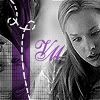
fandom_lims - Challenge 1: Veronica Mars 7
Other Entries The Outcome
Entry 11
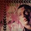
actor_lims - Challenge 1: Brad Pitt 4 -1
Other Entries The Outcome
Entry 7

actress_lims Challenge 1: Keira Knightley - PotC -1
Other Entries The Outcome
(minus signs mean that I recieved a members choice vote if there is only one number with a minus sign it means that I recieved no negative votes :) )
firefly_lims
Your positive comment:
My favourite is 11. I love the focus on Mal and Zoe whereas everyone else went for River. It's very original
That was sort of the point. I didn't want to do river because she's the focus of the photo. I started to crop for her and didn't like anything I saw. Then I saw mal and zoe framed like that and loved it. I wanted to add more bullet holes but they didn't fit anywhere except for that top corner. So I tried the dotted line thing (yeah I know, is sort of annoying). The idea was for it to look sorta like a lasso. ::shrugs::
fandom_lims
42. The pic quality isn't good. It looks like it's been sharpened more than twice. The brushes used aren't the best to have picked.
42: The text placement could be better.
42:It's too sharp, it doesn't look natural anymore and I can see pixels. The purple doesn't seem to have a purpose at all, it doesn't add anything, purple doesn't even look pretty with black and white, it should have been red or a dark shade of blue or orange or anything, anything but this purple. The dashed thingy is cute, but it's fitting for something neat, something clean, not this. Everything just doesn't add up.
42. The text and brushes are overpowering.
42: Color doesn't compliment the screencap and image is too sharp
42. the picture is grainy and the gridline brushes overpowering
I pretty much agree with everything that was said about the brushes on this icon. I generally operate under a resolution that makes everything really tiny so I couldn't see until I changed it how overpowering the brushing really was. I've since (the actress and firefly icons) started changing my resolution to do icons and voila! The same goes with the grainy/sharp look of the picture. The text comments and the colors comments I disagree with completely! But that's just my opinion especially with the color. I don't think it's a combination that suits some peoples tastes, but I don't think it's bad. A general rule about purple and orange... they both look good with black and white, but dominant white with orange and dominant black with purple. That's how I see it anyhow. :) The icon in general was in a style that I don't normally use. If you look closely on the left there's a flipped image of the photo beneath the brushing etc and I have never tried adding color to black and white in that way.
actor_lims
11. Too much is going on in this icon. I feel like the large amount of brushes around him are taking up too much of my focus as I look at this icon.
11; the picture is too dark and dull. Also, the brushes overwhelm the picture.
11 - it's too... busy... there's too much around the edges
11 too dark
So this icon has similar problems to the VM icon above. The brushing is overpowering. The griding should be a lot lighter as should the cheveron pattern. I think that the comments about how dark the icon is are a little misplaced. That's a taste issue. However, I would like the icon better if Brad were a little brighter. I had a hard time choosing an overlay that would reduce the bright bright pink but keep him visable. The "busy" comment is an interesting one. I don't know if I agree or not. There is a /very/ popular icon style right now that takes the picture or pieces of a picture and repeats or changes it a dozen times in a 100x100 space. That is busy to me but right now it's considered pretty and neat. The same with the mask brushes. Some people use them so much that it makes this icon look like a base. It's a matter of perspective in some ways. But the comments to tone down the brushes are taken to heart.
actress_lims
None
I like this icon. It's not great, it's not bad. It reminds me of a Vanity Faire icon I did ages ago. I liked that one better though XD It's just got that same sort of faded color:
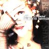
What do You think?
Here are the icons, the challenges they match, and the scores. Comments below the cut.
Entry 11

firefly_lims - Challenge 1: International Serentity Poster -1 votes
Other Entries The Outcome
Entry 42

fandom_lims - Challenge 1: Veronica Mars 7
Other Entries The Outcome
Entry 11

actor_lims - Challenge 1: Brad Pitt 4 -1
Other Entries The Outcome
Entry 7

actress_lims Challenge 1: Keira Knightley - PotC -1
Other Entries The Outcome
(minus signs mean that I recieved a members choice vote if there is only one number with a minus sign it means that I recieved no negative votes :) )
firefly_lims
Your positive comment:
My favourite is 11. I love the focus on Mal and Zoe whereas everyone else went for River. It's very original
That was sort of the point. I didn't want to do river because she's the focus of the photo. I started to crop for her and didn't like anything I saw. Then I saw mal and zoe framed like that and loved it. I wanted to add more bullet holes but they didn't fit anywhere except for that top corner. So I tried the dotted line thing (yeah I know, is sort of annoying). The idea was for it to look sorta like a lasso. ::shrugs::
fandom_lims
42. The pic quality isn't good. It looks like it's been sharpened more than twice. The brushes used aren't the best to have picked.
42: The text placement could be better.
42:It's too sharp, it doesn't look natural anymore and I can see pixels. The purple doesn't seem to have a purpose at all, it doesn't add anything, purple doesn't even look pretty with black and white, it should have been red or a dark shade of blue or orange or anything, anything but this purple. The dashed thingy is cute, but it's fitting for something neat, something clean, not this. Everything just doesn't add up.
42. The text and brushes are overpowering.
42: Color doesn't compliment the screencap and image is too sharp
42. the picture is grainy and the gridline brushes overpowering
I pretty much agree with everything that was said about the brushes on this icon. I generally operate under a resolution that makes everything really tiny so I couldn't see until I changed it how overpowering the brushing really was. I've since (the actress and firefly icons) started changing my resolution to do icons and voila! The same goes with the grainy/sharp look of the picture. The text comments and the colors comments I disagree with completely! But that's just my opinion especially with the color. I don't think it's a combination that suits some peoples tastes, but I don't think it's bad. A general rule about purple and orange... they both look good with black and white, but dominant white with orange and dominant black with purple. That's how I see it anyhow. :) The icon in general was in a style that I don't normally use. If you look closely on the left there's a flipped image of the photo beneath the brushing etc and I have never tried adding color to black and white in that way.
actor_lims
11. Too much is going on in this icon. I feel like the large amount of brushes around him are taking up too much of my focus as I look at this icon.
11; the picture is too dark and dull. Also, the brushes overwhelm the picture.
11 - it's too... busy... there's too much around the edges
11 too dark
So this icon has similar problems to the VM icon above. The brushing is overpowering. The griding should be a lot lighter as should the cheveron pattern. I think that the comments about how dark the icon is are a little misplaced. That's a taste issue. However, I would like the icon better if Brad were a little brighter. I had a hard time choosing an overlay that would reduce the bright bright pink but keep him visable. The "busy" comment is an interesting one. I don't know if I agree or not. There is a /very/ popular icon style right now that takes the picture or pieces of a picture and repeats or changes it a dozen times in a 100x100 space. That is busy to me but right now it's considered pretty and neat. The same with the mask brushes. Some people use them so much that it makes this icon look like a base. It's a matter of perspective in some ways. But the comments to tone down the brushes are taken to heart.
actress_lims
None
I like this icon. It's not great, it's not bad. It reminds me of a Vanity Faire icon I did ages ago. I liked that one better though XD It's just got that same sort of faded color:
What do You think?