animelims - commentary
Well, I believe most of you are unaware that I participated in animelims. And because of that, I've decided to summarize my time there in a nutshell, so you get my personal insights AND free icons. Win-win situation here~
Overall ranking: 2 out of 72
I didn't feel like posting my alternates because they are very embarassing, so you guys get to be treated with the final submissions =D
1
2
3
4
5

6
7
8
9
10

11
12
13
14
15
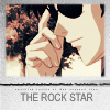

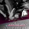

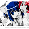
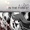
Challenge 01 - Higurashi no Naku koro ni

When I first saw this Rika image I went "yay"! But the problem is, I am known to be teh suck at screencaps. I tried using my coloring technique on this image, but it just didn't work out very well (the image beamse overly saturated and very blue). So I decided to try something new: greyscale! It turns out, this icon got many favorites, I also found myself a newly discovered skill.
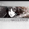
Challenge 02 - Bakumatsu Kikansetsu Irohanihoheto

Good thing: It was a magazine scan
Bad thing: The scan was covered in text
Good thing: I didn't get any negative crits
Bad thing: I pretty much recycled last week's icon style, but I do like the typography...
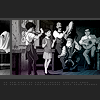
Challenge 04 - Whisper of the Heart

The previous challenge was Ouran High School Host Club, but the screenshots were really really bad (sorry guys!) So I used my skip for that week.
Since this week was a Ghibli challenge, I decided to do something simple and unique with it (inspired by ) However, for this challenge, I made yet another greyscale icon (I wanted to play it safe), most of my negative crits were because my icon design was very different and radical, but because of those qualities, I got catastrophiel's mod's choice! I am very honored.
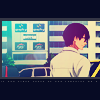
Challenge 05 - Darker than Black

I was happy that the image of Hei worked very well with my coloring style. I also decided to give it a black border to bring the colors and the blue light texture our more. Unfortunately for me, the black didn't take very well with the critiques. *sob* I really liked this icon.
Challenge 06 - Card Captor Sakura

This challenge was so much fun! I got to use bright colors and my 2D texture style. This icon was not only a breeze to make, but it also got people's choice. And you know what's funny? I was listening to Catch You, Catch Me while making it! XDD Ironic?
Challenge 07 - Paradise Kiss

This challenge featured the screencaps of d00m #2. I decided to go with the image that everyone wouldn't choose, I also used curves with this image to get that soft blue color. I also like my light texture use (77words FTW). And of course, return of the black border of d00m. I'm positively convinced that the people of animelims HATE black.
Challenge 08 - Galaxy Angel

I tried of go for the dull look as well as the simple look. I don't have much to say about this icon, but it outshined the rest of the icons. By outshined I actually mean: it looked so DIFFERENT people just HAD to negative crit it.
Challenge 09 - Prince of Tennis

I hated this challenge ;_; It was struggle to add magenta to the blueish image and to find an interesting crop, and I did cheap texture work. Booo...
Challenge 10 - CODE GEASS

I decided to go back to my style from the first two weeks. I honestly have nothing relatively interesting to say about this icon except it was good enough to keep me alive.
Challenge 11- FLCL

This week was no texture and no brushes week. It was good for me because I'm good with simple =D I decided to make the image greyscale with a bright background to give it more contrast. Then I added the square blocks because the background looked empty. I randomly added the border for an experiment and it worked out quite well. Oh yeah, I won people's choice.
Challenge 12 - X/1999

This was a horrible week, I ended up doing the icon withing the hour of the deadline because my computer crashed and wasn't fixed until the day submissions were due. The contest was lyrical so the first X/1999 screencap that popped up and went well with 1 line of the lyrics was this image. Whoo. This icon kept me alive.
Challenge 13 - Jigoku Shoujo

This icon had in interesting story. It was pretty much the product of experiementing with different crops and light textures. I really like this icon, although it had a very simple design, but the kimono just completed the entire icon and everything. I was expecting to be voted off, but the didn't and I made it to the final 2. O_O
Challenge 14a - Ghost in the Shell

I was not sure what to do when I saw the image. It was just so dark and... weird? But I played around with textures and I got this nice basic layout. And I added interesting typography into an icon I'm quite happy with.
Challenge 14b - ARIA

Honestly, this was the hardest icon to make. It was a lyrical hush. I was really tired that week and was fresh out of ideas. I wanted to try something unique and cute, but I only got 1 favorite out of 15 votes. Oh well, it was nice knowing ya animelims...
Challenge 14c - Free Choice (Nurse Wicth Komugi-chan

I was proud of this baby~ I tired something different yet simple, and it was nearly tied with the other icon. Although I lost the final round, I was really proud of myself for getting nearly half of the favorites of this third of the challenge.
THINGS I LEARNED
-Screencaps need to be sharpened to just the right amount
-Grainy textures are overused, but when used properly, work very well with the image
-BLACK IS EVIL
-People like rich, bright colors that don't blind the eyes
-Simple is good, but it depends who you're talking to
-Being different gets you negative crits
Well there you have it. If any of you have any questions, please feel free to ask (I won't bite) and also, please do snag this icons. =D
And just so you know, Round 2 has started. Please go and support them! <3
Overall ranking: 2 out of 72
I didn't feel like posting my alternates because they are very embarassing, so you guys get to be treated with the final submissions =D
1
2
3
4
5
6
7
8
9
10
11
12
13
14
15
Challenge 01 - Higurashi no Naku koro ni
When I first saw this Rika image I went "yay"! But the problem is, I am known to be teh suck at screencaps. I tried using my coloring technique on this image, but it just didn't work out very well (the image beamse overly saturated and very blue). So I decided to try something new: greyscale! It turns out, this icon got many favorites, I also found myself a newly discovered skill.
Challenge 02 - Bakumatsu Kikansetsu Irohanihoheto
Good thing: It was a magazine scan
Bad thing: The scan was covered in text
Good thing: I didn't get any negative crits
Bad thing: I pretty much recycled last week's icon style, but I do like the typography...
Challenge 04 - Whisper of the Heart
The previous challenge was Ouran High School Host Club, but the screenshots were really really bad (sorry guys!) So I used my skip for that week.
Since this week was a Ghibli challenge, I decided to do something simple and unique with it (inspired by ) However, for this challenge, I made yet another greyscale icon (I wanted to play it safe), most of my negative crits were because my icon design was very different and radical, but because of those qualities, I got catastrophiel's mod's choice! I am very honored.
Challenge 05 - Darker than Black
I was happy that the image of Hei worked very well with my coloring style. I also decided to give it a black border to bring the colors and the blue light texture our more. Unfortunately for me, the black didn't take very well with the critiques. *sob* I really liked this icon.
Challenge 06 - Card Captor Sakura
This challenge was so much fun! I got to use bright colors and my 2D texture style. This icon was not only a breeze to make, but it also got people's choice. And you know what's funny? I was listening to Catch You, Catch Me while making it! XDD Ironic?
Challenge 07 - Paradise Kiss
This challenge featured the screencaps of d00m #2. I decided to go with the image that everyone wouldn't choose, I also used curves with this image to get that soft blue color. I also like my light texture use (77words FTW). And of course, return of the black border of d00m. I'm positively convinced that the people of animelims HATE black.
Challenge 08 - Galaxy Angel
I tried of go for the dull look as well as the simple look. I don't have much to say about this icon, but it outshined the rest of the icons. By outshined I actually mean: it looked so DIFFERENT people just HAD to negative crit it.
Challenge 09 - Prince of Tennis
I hated this challenge ;_; It was struggle to add magenta to the blueish image and to find an interesting crop, and I did cheap texture work. Booo...
Challenge 10 - CODE GEASS
I decided to go back to my style from the first two weeks. I honestly have nothing relatively interesting to say about this icon except it was good enough to keep me alive.
Challenge 11- FLCL
This week was no texture and no brushes week. It was good for me because I'm good with simple =D I decided to make the image greyscale with a bright background to give it more contrast. Then I added the square blocks because the background looked empty. I randomly added the border for an experiment and it worked out quite well. Oh yeah, I won people's choice.
Challenge 12 - X/1999
This was a horrible week, I ended up doing the icon withing the hour of the deadline because my computer crashed and wasn't fixed until the day submissions were due. The contest was lyrical so the first X/1999 screencap that popped up and went well with 1 line of the lyrics was this image. Whoo. This icon kept me alive.
Challenge 13 - Jigoku Shoujo
This icon had in interesting story. It was pretty much the product of experiementing with different crops and light textures. I really like this icon, although it had a very simple design, but the kimono just completed the entire icon and everything. I was expecting to be voted off, but the didn't and I made it to the final 2. O_O
Challenge 14a - Ghost in the Shell
I was not sure what to do when I saw the image. It was just so dark and... weird? But I played around with textures and I got this nice basic layout. And I added interesting typography into an icon I'm quite happy with.
Challenge 14b - ARIA
Honestly, this was the hardest icon to make. It was a lyrical hush. I was really tired that week and was fresh out of ideas. I wanted to try something unique and cute, but I only got 1 favorite out of 15 votes. Oh well, it was nice knowing ya animelims...
Challenge 14c - Free Choice (Nurse Wicth Komugi-chan
I was proud of this baby~ I tired something different yet simple, and it was nearly tied with the other icon. Although I lost the final round, I was really proud of myself for getting nearly half of the favorites of this third of the challenge.
THINGS I LEARNED
-Screencaps need to be sharpened to just the right amount
-Grainy textures are overused, but when used properly, work very well with the image
-BLACK IS EVIL
-People like rich, bright colors that don't blind the eyes
-Simple is good, but it depends who you're talking to
-Being different gets you negative crits
Well there you have it. If any of you have any questions, please feel free to ask (I won't bite) and also, please do snag this icons. =D
And just so you know, Round 2 has started. Please go and support them! <3