Results, Week 8
Final challenge will be up soon. Congrats to the three finalists!
Elimination
Spectators' Choice
blooming_cosmo
Critique
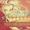
1 - This icon is very graceful, but would be better had there been a little bit more than just red and pink in it. The pictures are sharp and I'm not sure if the cursive font is meant to be read or not, because I can't read it. Had there been more going on, perhaps a stronger light texture, I would have liked this a lot more.
1 - The thing that really irks me about this is the cursive text. I can tell there's a "W" but that's pretty much it.
1. I like the idea behind this, but the top line of text is really hard to read and the color of the whole icon is a little odd. I think it might be that she looks so PALE. I like the subtle use of light texture, though.
2-The texture is too noisy; looks really harsh on the eye.
02 - I really love how the icon is put together, but I must say it looks a bit too brown, and the texture used doesn't fit(grunge effect?). Other than that, gorgeous icon, I really hate to vote for it.
02- The color chose is not flattering. It would be good if there was some sharpening here.
02. Although I like what you did with the desaturated image, the red on the bottom left corner seems of a really bad quality and is very distracting. And also text could use a little more originality.
#2 - the colours are too desaturated and the top right corner is odd
2 - I don't like the textur-y feel of the icon. It seems too dark and grungy.
2. the colors on this one are strange; they seem a little too...brown, I think. I don't like the color of the bar behind the text, either, or the desaturated double image. the texture's odd, as well; it looks a little too grainy for my tastes.
2. I like the font in this icon, but that's about it. I don't like the texture in the background, it looks funny. I also don't like how Sakura came out in this image. The really red parts look bad.
4 - The light pink/red color that seems to dominate the icon doesn't really fit the mood. Especially because in the second picture it's like "grrrcoolhaku".
04 > image quality could be better and the dotted texture is distracting.
04- I don't like the text used. The image is also unclear.
#4 - the top image used seems lower quality than the bottom (although I really doubt that's the case but put on top of the manga image it seems not as sharp)
4 - I dislike the difference in images. The top one is officially colored, and the bottom looks like it was fan-colored, so the difference in styles throws you off a bit.
4. The image looks fuzzy, if it was sharpened a bit I would have liked it more
4 - This icon seems somewhat washed out. I think if one of the images was a bit more vibrant, it would create a visually interesting contrast.
5-The lightning texture rendered it boring, and made the picture quality really poor.
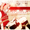
5 - In comparison to the other contenders, this icon is weak. The text doesn't really suit the feeling of the images, and I find the coloring to be a little odd. Different borders between the pictures and different text would have done so much for the general emotion. But I love the idea for the icon.
05 > i'm not a huge fan of the colouring, as it makes it the images really washed out. Also, i feel the border around the text makes it stand out too much.
05 - Way too dark in my opinion. The colors are pretty, but the dark effect ruins it.
05- It's too dark and fuzzy. I'm also not much of a fan of the text placement.
05. The colouring of the icon is very bright in contrast to the dark texture (/colour overlay) you've used. It may have been better to make the icon a bright one or change the colouring to a duller colour.
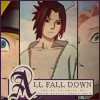
#5 - The image cropping isn't the greatest and the lines doesn't flatter the images.
5 - It seems a little dark and dull. I don't like the three way image and the cropping; Sasuke takes up too much of the image, so Naruto and Sakura are cut off in strange places. The large, decorative 'A' also draws too much attention. And Sasuke is a little fuzzy around the edges.
5. I don't like the way Sasuke dominates the icon. there's not really enough of Sakura and Naruto's faces to give the effect I think you were looking for. I also don't like the colors of the text/border and the box; they don't seem to match the rest of the icon.
5. The image is too dark. It needs to lighten up. (Even if it has Sasuke on it.) Also the contrast isn't that great, and Naruto and Sakura are not placed on the image nicely.
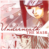
6- I can't really understand what's happening in the icon, I mean, is that Haku's mask? It's really very messy..
6 - I'm not really sure what's going on in the right side of the picture. The text is also a little difficult to read.
6 - It took me a long time to figure out what was going on in this icon. It's difficult to tell what's going on, and the text positioning doesn't help any.
06 > i feel like putting naruto in the icon ( and emphasizing him ) was unnecessary and confusing.
06 - Honestly, it took me a while to figure out what this was. ^^;; I love how the text was placed, and the coloring as well - it's a pretty icon in general, but it just seems.. unfocused. It's hard to tell what it is.
06. It's very hard to see what the left side of the icon is. And although I like the colour theme you've chosen, the orange seems too vibrant, it may have been better to lower its opacity.
Elimination
Spectators' Choice
blooming_cosmo
Critique
1 - This icon is very graceful, but would be better had there been a little bit more than just red and pink in it. The pictures are sharp and I'm not sure if the cursive font is meant to be read or not, because I can't read it. Had there been more going on, perhaps a stronger light texture, I would have liked this a lot more.
1 - The thing that really irks me about this is the cursive text. I can tell there's a "W" but that's pretty much it.
1. I like the idea behind this, but the top line of text is really hard to read and the color of the whole icon is a little odd. I think it might be that she looks so PALE. I like the subtle use of light texture, though.
2-The texture is too noisy; looks really harsh on the eye.
02 - I really love how the icon is put together, but I must say it looks a bit too brown, and the texture used doesn't fit(grunge effect?). Other than that, gorgeous icon, I really hate to vote for it.
02- The color chose is not flattering. It would be good if there was some sharpening here.
02. Although I like what you did with the desaturated image, the red on the bottom left corner seems of a really bad quality and is very distracting. And also text could use a little more originality.
#2 - the colours are too desaturated and the top right corner is odd
2 - I don't like the textur-y feel of the icon. It seems too dark and grungy.
2. the colors on this one are strange; they seem a little too...brown, I think. I don't like the color of the bar behind the text, either, or the desaturated double image. the texture's odd, as well; it looks a little too grainy for my tastes.
2. I like the font in this icon, but that's about it. I don't like the texture in the background, it looks funny. I also don't like how Sakura came out in this image. The really red parts look bad.
4 - The light pink/red color that seems to dominate the icon doesn't really fit the mood. Especially because in the second picture it's like "grrrcoolhaku".
04 > image quality could be better and the dotted texture is distracting.
04- I don't like the text used. The image is also unclear.
#4 - the top image used seems lower quality than the bottom (although I really doubt that's the case but put on top of the manga image it seems not as sharp)
4 - I dislike the difference in images. The top one is officially colored, and the bottom looks like it was fan-colored, so the difference in styles throws you off a bit.
4. The image looks fuzzy, if it was sharpened a bit I would have liked it more
4 - This icon seems somewhat washed out. I think if one of the images was a bit more vibrant, it would create a visually interesting contrast.
5-The lightning texture rendered it boring, and made the picture quality really poor.
5 - In comparison to the other contenders, this icon is weak. The text doesn't really suit the feeling of the images, and I find the coloring to be a little odd. Different borders between the pictures and different text would have done so much for the general emotion. But I love the idea for the icon.
05 > i'm not a huge fan of the colouring, as it makes it the images really washed out. Also, i feel the border around the text makes it stand out too much.
05 - Way too dark in my opinion. The colors are pretty, but the dark effect ruins it.
05- It's too dark and fuzzy. I'm also not much of a fan of the text placement.
05. The colouring of the icon is very bright in contrast to the dark texture (/colour overlay) you've used. It may have been better to make the icon a bright one or change the colouring to a duller colour.
#5 - The image cropping isn't the greatest and the lines doesn't flatter the images.
5 - It seems a little dark and dull. I don't like the three way image and the cropping; Sasuke takes up too much of the image, so Naruto and Sakura are cut off in strange places. The large, decorative 'A' also draws too much attention. And Sasuke is a little fuzzy around the edges.
5. I don't like the way Sasuke dominates the icon. there's not really enough of Sakura and Naruto's faces to give the effect I think you were looking for. I also don't like the colors of the text/border and the box; they don't seem to match the rest of the icon.
5. The image is too dark. It needs to lighten up. (Even if it has Sasuke on it.) Also the contrast isn't that great, and Naruto and Sakura are not placed on the image nicely.
6- I can't really understand what's happening in the icon, I mean, is that Haku's mask? It's really very messy..
6 - I'm not really sure what's going on in the right side of the picture. The text is also a little difficult to read.
6 - It took me a long time to figure out what was going on in this icon. It's difficult to tell what's going on, and the text positioning doesn't help any.
06 > i feel like putting naruto in the icon ( and emphasizing him ) was unnecessary and confusing.
06 - Honestly, it took me a while to figure out what this was. ^^;; I love how the text was placed, and the coloring as well - it's a pretty icon in general, but it just seems.. unfocused. It's hard to tell what it is.
06. It's very hard to see what the left side of the icon is. And although I like the colour theme you've chosen, the orange seems too vibrant, it may have been better to lower its opacity.