Challenge.082 :: Theme
I don't know how long I can come up with technical challenges... Suggestions, please! :3
Challenge.082 :: Theme - Solid Fill
Our current theme refers to filling a certain part of your icon with one color and one color only. It usually gives your icon a "smooth" feel because this time, we do not need textures on your icons (or that grimy, grungy feel that had always been the trick of the trade).
One restriction or rule you'd have to check when making your submissions is to ask yourself whether that one color already fills at least a third going to a half of your icon. If so, it fits the theme.
You can also use two color blocks in your icons, or three, or even more. Just check how much that color occupies, and then it's all good. :3
Assuming that it helps to show examples, here are some:
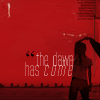


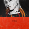
In the first two, notice how much the red and the orange filled the icon. In the NiSaki icon, it's actually a picture of an orange wall edited to make it look more solid.


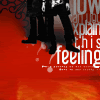
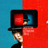
Filling the remaining space of the icon with black is a good way in fulfilling the Solid Fill theme. It is the easiest way to achieve smoothness and contrast in the icon, as shown in guitarmy's works.
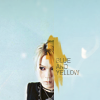
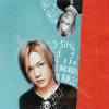

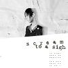
And then look at how insanance used color blocks in her icons. The use of two colors in spreads with composition and technique gave her icons a fresher look.
In context, you might have to apply the same techniques of extracting and the like from the previous themes, although you can cut or crop dramatically and support it with solid color. It all goes to your creativity, as usual. :3
You can submit up to five (5) icons.
Submission Format:
http://img.photobucket.com/albums/v710/rhapsody404/icontests/c17b50cb.gif
DEADLINE: Saturday, June 28, 2008 - 12:00 MN GMT (UTC)
Challenge.082 :: Theme - Solid Fill
Our current theme refers to filling a certain part of your icon with one color and one color only. It usually gives your icon a "smooth" feel because this time, we do not need textures on your icons (or that grimy, grungy feel that had always been the trick of the trade).
One restriction or rule you'd have to check when making your submissions is to ask yourself whether that one color already fills at least a third going to a half of your icon. If so, it fits the theme.
You can also use two color blocks in your icons, or three, or even more. Just check how much that color occupies, and then it's all good. :3
Assuming that it helps to show examples, here are some:
In the first two, notice how much the red and the orange filled the icon. In the NiSaki icon, it's actually a picture of an orange wall edited to make it look more solid.
Filling the remaining space of the icon with black is a good way in fulfilling the Solid Fill theme. It is the easiest way to achieve smoothness and contrast in the icon, as shown in guitarmy's works.
And then look at how insanance used color blocks in her icons. The use of two colors in spreads with composition and technique gave her icons a fresher look.
In context, you might have to apply the same techniques of extracting and the like from the previous themes, although you can cut or crop dramatically and support it with solid color. It all goes to your creativity, as usual. :3
You can submit up to five (5) icons.
Submission Format:
http://img.photobucket.com/albums/v710/rhapsody404/icontests/c17b50cb.gif
DEADLINE: Saturday, June 28, 2008 - 12:00 MN GMT (UTC)