More suncatchers!
See also here.
So here are some more suncatchers I've dug up.
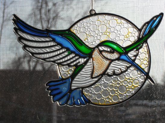
This is undoubtedly either one of the first two suncatchers I ever did or (more likely?) a suncatcher that someone else (Mom?) did. Either way, it's faded from long years of hanging in a window, but you can still see how beautiful it must have been to begin with. The textures make it so much prettier.
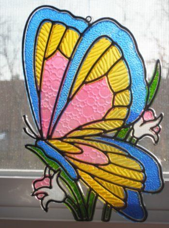
I'm much more confident that I had a hand in this one. Again the textures bring out the beauty of the piece and make it look more artsy, more painstaking, less like something that might have been plucked out of a bargain bin on a whim. Here we see that, even at a young age, I preferred realism in my art, as (1) the stems and grass are all green and (2) the butterfly is not. Green does not belong on butterflies. Luna moths are the exception that proves the rule, as they flutter around at night and so have a chance to stand out and look pretty because they are not competing with the surrounding vegetation.

This is more recent, which is to say it's still pretty old -- probably from the era of the dog and slipper, a little while after the cardinal. Mechanically, it didn't turn out very well. There are a lot of bubbles, and I didn't use enough paint. But I still like the way the use of color turned out, despite the orange blurring together with the brown a bit. I thought I remembered using a little glitter paint on this one, but I can't see any signs of it . . . but there might have been a little in the bandana.
One year, my brother and I divided up some Christmas ornaments to color. I was pretty satisfied with the ones I got.
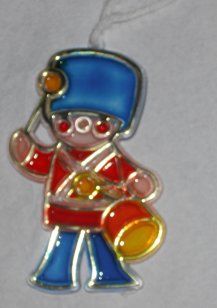
This was the exception, but I don't remember there being much of anything better. I've never cared for the song, especially the standard rendition; the TV production is depressing; and drums simply do not have anything to do with Christmas in my head. I do like the way this one came out. I feel like it's nothing special, but it works. I'm not sure where the pink came from. That's not a standard suncatcher paint color! Did the set of ornaments come with pink? That seems likely.
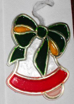
On the other hand, bells and Christmas resonate for me. Silver bells, Carol of the bells, and the old bell ornaments that I was very fond of hanging on the tree. So I'm sure I was very happy to get to color this one. I like the frosty white look. The plain opaque white worked better on the cross upthread, I think, but if you're going to make a suncatcher color opaque, you may as well do something interesting with it, right? This is very Christmassy, with the orange brightening the ribbon up a bit and the pink contrasting with the red while still matching the red and white.
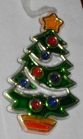
I suspect that, when it came time to divide up who got what, I pounced on this immediately. Sure, most of it's going to end up green, but look at all those other bits! They could be any old color, without having to match each other! As you see, I didn't go too wild with it, but I seem to remember having fun dividing up which colors went on which ornaments. Having a frosty white garland, of course, allows the garland to contrast with the ornaments and pretty much everything else. It might have been nice to have the ornaments a lighter color, but having them match each other in luminosity is a good idea . . . and being able to position the thing in front of a light renders the concern moot.


Making her dress green probably wasn't the best idea for hanging on a Christmas tree, but she just looked like she should have a green dress, you know? I'm not sure how I managed the two oranges, but I assume I used a set of paint that came with the ornaments and another set that was lying around. The color arrangement really doesn't look very good unless there's plenty of light shining on or through it, as here . . . in which case the shoddy job with the blue wings becomes obvious. Oh well. The way the flash caught her mouth and eyes here is unfortunate.
So here are some more suncatchers I've dug up.

This is undoubtedly either one of the first two suncatchers I ever did or (more likely?) a suncatcher that someone else (Mom?) did. Either way, it's faded from long years of hanging in a window, but you can still see how beautiful it must have been to begin with. The textures make it so much prettier.

I'm much more confident that I had a hand in this one. Again the textures bring out the beauty of the piece and make it look more artsy, more painstaking, less like something that might have been plucked out of a bargain bin on a whim. Here we see that, even at a young age, I preferred realism in my art, as (1) the stems and grass are all green and (2) the butterfly is not. Green does not belong on butterflies. Luna moths are the exception that proves the rule, as they flutter around at night and so have a chance to stand out and look pretty because they are not competing with the surrounding vegetation.

This is more recent, which is to say it's still pretty old -- probably from the era of the dog and slipper, a little while after the cardinal. Mechanically, it didn't turn out very well. There are a lot of bubbles, and I didn't use enough paint. But I still like the way the use of color turned out, despite the orange blurring together with the brown a bit. I thought I remembered using a little glitter paint on this one, but I can't see any signs of it . . . but there might have been a little in the bandana.
One year, my brother and I divided up some Christmas ornaments to color. I was pretty satisfied with the ones I got.

This was the exception, but I don't remember there being much of anything better. I've never cared for the song, especially the standard rendition; the TV production is depressing; and drums simply do not have anything to do with Christmas in my head. I do like the way this one came out. I feel like it's nothing special, but it works. I'm not sure where the pink came from. That's not a standard suncatcher paint color! Did the set of ornaments come with pink? That seems likely.

On the other hand, bells and Christmas resonate for me. Silver bells, Carol of the bells, and the old bell ornaments that I was very fond of hanging on the tree. So I'm sure I was very happy to get to color this one. I like the frosty white look. The plain opaque white worked better on the cross upthread, I think, but if you're going to make a suncatcher color opaque, you may as well do something interesting with it, right? This is very Christmassy, with the orange brightening the ribbon up a bit and the pink contrasting with the red while still matching the red and white.

I suspect that, when it came time to divide up who got what, I pounced on this immediately. Sure, most of it's going to end up green, but look at all those other bits! They could be any old color, without having to match each other! As you see, I didn't go too wild with it, but I seem to remember having fun dividing up which colors went on which ornaments. Having a frosty white garland, of course, allows the garland to contrast with the ornaments and pretty much everything else. It might have been nice to have the ornaments a lighter color, but having them match each other in luminosity is a good idea . . . and being able to position the thing in front of a light renders the concern moot.


Making her dress green probably wasn't the best idea for hanging on a Christmas tree, but she just looked like she should have a green dress, you know? I'm not sure how I managed the two oranges, but I assume I used a set of paint that came with the ornaments and another set that was lying around. The color arrangement really doesn't look very good unless there's plenty of light shining on or through it, as here . . . in which case the shoddy job with the blue wings becomes obvious. Oh well. The way the flash caught her mouth and eyes here is unfortunate.