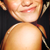
#012, Emilie Coloring
From

To

OR

Translatable, Optional Selective Color ..
Requested By sienna_nights From this Batch
Open your picture, Crop it & lighten it if it's too DARK ..

We want to give the picture a yellow-ish looks esp the Lights & Dark part so we are gonna use Color Balance..
Shadows: +22, 0, -21
Highlights: -39, -25, -52

I want to give the icon some shadows and a center foucs light .. so I used these textures :

By: ???, Set it to Lighten


By: ???, Set it to Screen


By: ???, Set it to Softlight

As you can see the icon will turn out too bright so I used Brightness/Contrast:
B:-33, C:+20

the coloring is fadded and pale so this time using the curves:
RGB: 1st point: input: 43, Output: 68
2nd point: input: 187, Output: 189
Red: 1st point: input: 29, Output: 29
2nd point: input: 175, Output: 172
Green: 1st point: input: 150, Output: 152
Blue: 1st point: input: 94, Output: 101
2nd point: input: 161, Output: 165
3rd point: input: 240, Output: 231

there's so much yellow in the coloring so I want to give it a little blueness in in the light parts so add new Layer fill it with #21205d set it to Softlight and change the Opacity to 20% .. ..

now the last step, I want to give her skin more helthey look I used Color Balance:
Midtones: 0, 0, 0
Shadows: -9, -6, -6
Highlights: +7, -6, +12
Optional Step : to give the picture more shadwos if it needs I sometimes add a last Selective Color step :
Reds:0, 0, 0, +44
Whites:0, 0, 0, -42
Blacks:0, 0, 0, +100
I always leave the sharpen part to the end .. so go to your basic and duplicate it and sharpen it .. play with the opacity anf fill if it gets oversharpend ..
PSD, incase there's something wrong ..
http://www.mediafire.com/?jtenrcgyokn
Other Examples: