#55; A Question and 2 Tutorial
Do you have a routine or steps you usually use when you're making icons?
I don't have anything specific, but I try to let the icon looks as natural as i could and leaving the base untouched .. plus I always Sharpen the icon as a last step, since some make the icon seems sharpened one [the step explained in the end of the 2nd tutorial] .. ^^
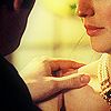
From

To

Curves | Color Layer | Brightness/Contrast | Gradient Map | Vibrance
1. I usually open the pic I want to icon and re-size it to 500 width ..

2. we'll lighten the picture using curves ..
RGB: First point : O:185 I:95


3. create a new layer fill it with #706325 set it to Pin Light and change the opacity to 48%

4. add more contrast by using Brightness/Contrast:
B: -9 C:61

5. another Curve layer:
Red: move the point at the left corner: O:0 I:15


6. add a gradient map with these setting and set it to Softlight.


7. add vibrance: +64.

8. more contarst: B:0 C:+26

9. since it's dark we'll need to lighten it, so Duplicate your base bring it to the top and change the opacity to 60%

10. add a new layer fill it with a dark color I fill mine with #140900 set it to softlight change the opacity to 60%, then take a light color mine #f8fdcd and with a round soft brush paint the places you want them to look lighter.


Layers box should looks like this

if you play with the coloring choice in steps #3, 6 & 10 you could get different results ..
E X A M P L E S
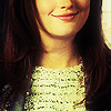
From

To

Gradient Map | Brightness/Contrast | Vibrance | Selective Color
1. I usually open the pic I want to icon and resize it to 500 width ..

2. it's a bit dark so to duplicate it set it to screen and play with the opacity, in here I set iy to 56% .. * I usually leave this step to last since some of the coloring do the lighten job ..

3. I add a Gradient Map with this setting


set it to Softlight

4. increase the contrast using Brightness/Contrast
set the contrast to 100

5. it's a bit pale so using the Vibrance
set the vibrance to 100

6. last step for the coloring, Selective Color:
Reds: -24, 0, -28, 0
Whites: 0, +28, +27, -12

Layers box should looks like this

Sharpening
1. for the sharpening; click Ctrl+Alt+Shife+E to merge the layers in a new layer the sharpen it

2. Click Ctrl+Alt+Shife+E again, go to filter -> Blur -> Gaussian Blur put the radius to 10, the chang the Opacity; 67%. Fill:29% .

->

3. lastly; i crop the merge it all and sharpen it again

->