tutorial
TUTORIAL 01
hello, i was asked by talented
navras_rheya about how to get this coloring, so I thought I should make a tutorial.
this is what we are doing:
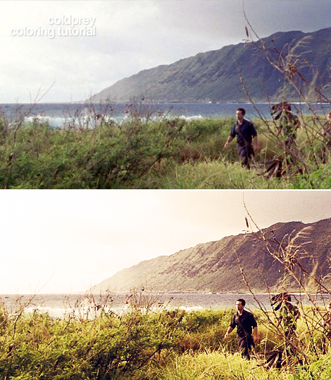
I choose another cap this time. This from lost-media.com.
.1
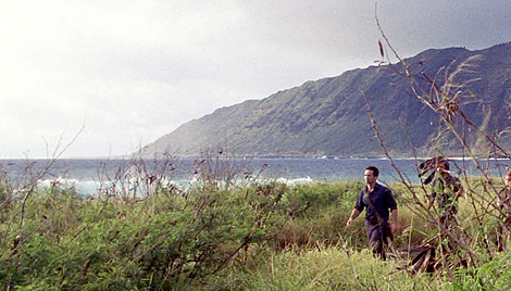
Crop the cap and sharpen it. I use "unsharp mask" with the settings.
Amount : 150-200
Radius: 0,2-0,4
Treshold: 0
Then you should duplicate the layer. Set it to SCREEN. Opacity 20%-30%.
.2
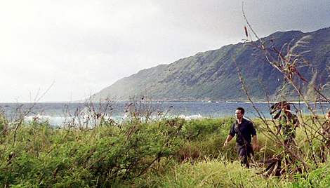
Now add a color balance layer. I only edit the MIDTONES.
Cyan/Red: 0
Magenta/Green: +43
Yellow/Blue: -58
This may not look the same for you cap, so just edit the way you want it,
Now, set this layer to SOFT LIGHT, and about 45-55% opacity.
This will make the colors more "green-yellowish".
.3
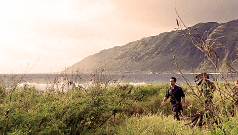
We are going to make the colors more brownish.
So, add a 'photofilter' layer.
Color: #bd7b29. 77%
.4
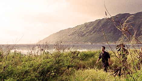
The cap looks good now, but we are not done yet.
'Brightness/Contrast'.
Set contrast +27
.5
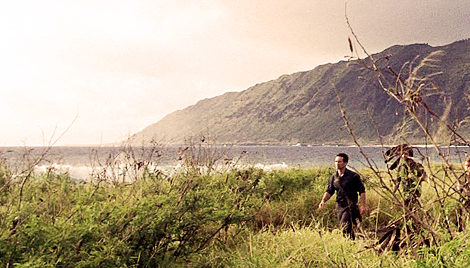
'Hue/sat'
+20 sat.
Set it to SCREEN.
Opacity: 20-30%
.6
I know, its no big different. But it will look better. Just do all the steps. :)
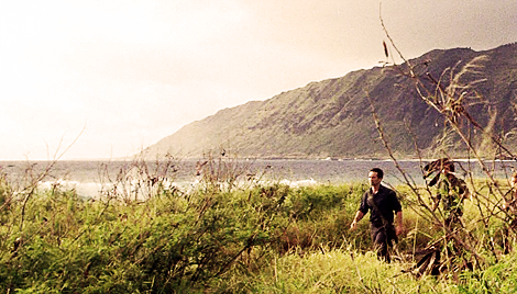
Another 'colorbalance'.
cyan/red: +33
magenta/green: +18
yellow/blue: -17
Set this one to OVERLAY.
Opacity 30%.
.7
This is a different step. I don't use this tool very much.
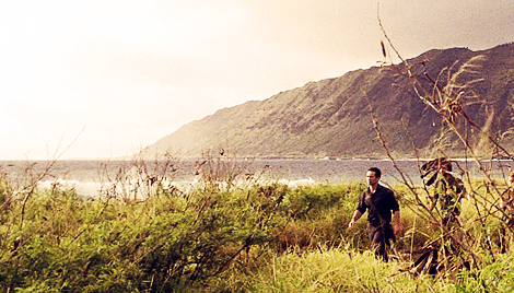
Add a Gradient Map layer. And choose this gradient
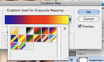
Set it to SCREEN/SOFTLIGHT, or whatever you think looks good. Lower the opacity to about 10-20%
.8
We are done soon!!!
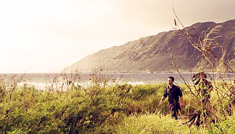
Add a new layer.
Fill it with : #949494
Set it to SOFT LIGHT
.9
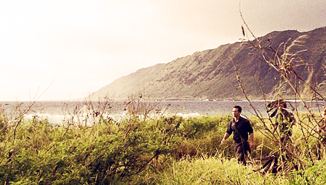
Black and White layer
Set it to OVERLAY.
Opacity: 14-20%
.10
This is the final step.
Brightness/contrast.
Brghtness +6
Contrast + 39
Opacity 40%
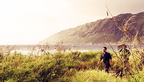
I uploaded some more examples so you can see how this works for other caps as well.
ONE MORE THING.
REMEMBER, IF MY SETTINGS DOES NOT WORK OUT FOR YOUR CAP.
CHANGE THE OPACITY OR TRY SOME DIFFERENT SETTING.
IT ALSO HELPS TO SKIP SOME OF THE STEPS. (STEP 6, IS THE ONE I GOT TROUBLE WITH IN DIFFERENT CAPS)
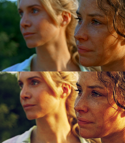
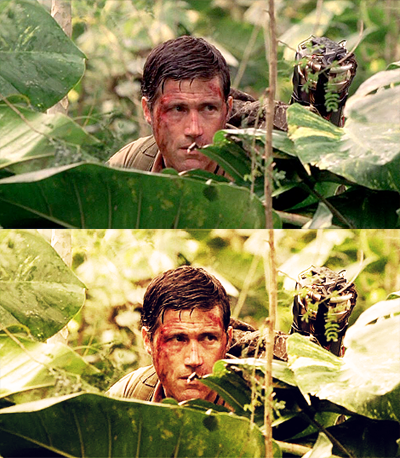
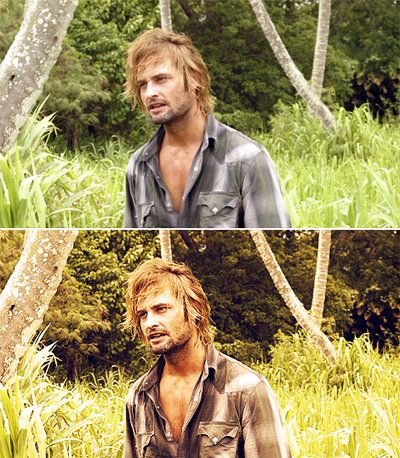
If you got any questions. Please leave a comment.
Here's a link for the psd: http://www.box.net/shared/cndsqrdaid
hello, i was asked by talented
navras_rheya about how to get this coloring, so I thought I should make a tutorial.
this is what we are doing:

I choose another cap this time. This from lost-media.com.
.1
Crop the cap and sharpen it. I use "unsharp mask" with the settings.
Amount : 150-200
Radius: 0,2-0,4
Treshold: 0
Then you should duplicate the layer. Set it to SCREEN. Opacity 20%-30%.

.2
Now add a color balance layer. I only edit the MIDTONES.
Cyan/Red: 0
Magenta/Green: +43
Yellow/Blue: -58
This may not look the same for you cap, so just edit the way you want it,
Now, set this layer to SOFT LIGHT, and about 45-55% opacity.
This will make the colors more "green-yellowish".

.3
We are going to make the colors more brownish.
So, add a 'photofilter' layer.
Color: #bd7b29. 77%

.4
The cap looks good now, but we are not done yet.
'Brightness/Contrast'.
Set contrast +27

.5
'Hue/sat'
+20 sat.
Set it to SCREEN.
Opacity: 20-30%

.6
I know, its no big different. But it will look better. Just do all the steps. :)
Another 'colorbalance'.
cyan/red: +33
magenta/green: +18
yellow/blue: -17
Set this one to OVERLAY.
Opacity 30%.

.7
This is a different step. I don't use this tool very much.
Add a Gradient Map layer. And choose this gradient

Set it to SCREEN/SOFTLIGHT, or whatever you think looks good. Lower the opacity to about 10-20%

.8
We are done soon!!!
Add a new layer.
Fill it with : #949494
Set it to SOFT LIGHT

.9
Black and White layer
Set it to OVERLAY.
Opacity: 14-20%

.10
This is the final step.
Brightness/contrast.
Brghtness +6
Contrast + 39
Opacity 40%

I uploaded some more examples so you can see how this works for other caps as well.
ONE MORE THING.
REMEMBER, IF MY SETTINGS DOES NOT WORK OUT FOR YOUR CAP.
CHANGE THE OPACITY OR TRY SOME DIFFERENT SETTING.
IT ALSO HELPS TO SKIP SOME OF THE STEPS. (STEP 6, IS THE ONE I GOT TROUBLE WITH IN DIFFERENT CAPS)


If you got any questions. Please leave a comment.
Here's a link for the psd: http://www.box.net/shared/cndsqrdaid