Bloom Tutorial...
Okay! This is my second tutorial, so I vaguely know what I'm doing. However, this icon might be hard to reproduce so I hope this tut isn't convuluded! I used Photoshop CS and close to no brushes!
This is the icons in question, this the image that I used, and this is where I got it. It won first place here at ff_eye_candy
Unlike most tutorials, this one is very icon specific. You could probably use component of it for other icons but as I whole I'm not sure it would work. If you'd like to try it step by step with other images, I'd love to see what you come up with.
And lastly, if you use this to make other icons and plan to post them anywhere please credit mubee and comment that you are doing so.
And on with the show!
Step 1: The first thing I did was get rid of the background. I kept the image at it's original size, zoomed into at about 600%, and added a layer mask. I takes sometime, especially if you want the edges to look well done but it's worth it when the use of textures and background comes in. Layer > Add Layer Mask > Reveal All
Step 2: Then I cropped it and resized it. To make the cropping easier for you I devised a quick way to get the same result without having to sit and stare blankly at the screen for several minutes.
Go to Image > Canvas Size and type in the following:
Width: 414
Height: 578
Make sure your width and hieght are in pixels. Also, keep the box labeled 'relative' unchecked. Then, for 'anchor' click the top left box. To resize the image go to Image > Image Size and make the height 100px! Et viola!
Make a new image at 100 x 100 and drag the re-sized Rikku onto it!
You should have this:

Step 3: Now we need the flower! I goolge-imaged "Flowers" and found this. Firs, before anything else, I flipped it horizantally and then cropped it.
This is what I got:
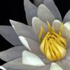
Then duplicate the layer twice and set both top layers to screen. Click the top layer and then go to Image > Adjustments > Colour Balance and set Cyan at -100. Flatten the image, get rid of the black background with a layer mask, and then drag it underneath the Rikku image.
This is what you end up with:
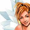
Step 4: The next step is full of colouring and duplcating, so I'm going to make a list.
-duplicate Rikku and set it to screen.
-go to Layer > New Adjustment Layer > Colour Balance Midtones: -50, +10, +10
-go to Layer > New Adjustment Layer > Colour Balance again. Midtones: -70, -30, 0
-go to Layer > New Fill Layer > Solid Colour #F5989D, Colour Burn, 67% Opacity
-go to Layer > New Fill Layer > Solid Colour again. #010521, Exclusion, 100% Opacity
-go to Layer > New Adjustment Layer > Levels Input Levels: 0, 1.34, 255
This is the result:
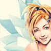
Step 4: Wow, that took a while! The next step is easy. Grab this texture by yumei_k and duplciate it twice. Set both to Hard Light and then merge the layers. Drag it underneath both the Rikku and Flower layers. Still underneath those layers but on top of the texture, go to Layer > New Adjustment Layer > Colour Balance and set Midtones to -77, 0, 0
You should have this:
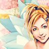
Step 5: For the text background I just grabbed a random brush for some white. I used a bracket brush beside the text. And for the text I wrote "bloom" in Centruy Gothic at 11pts.
And there you go:
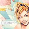
So tell me what you think!
And for some shameless promoting:
ffx_songstress *We need active members!
This is the icons in question, this the image that I used, and this is where I got it. It won first place here at ff_eye_candy
Unlike most tutorials, this one is very icon specific. You could probably use component of it for other icons but as I whole I'm not sure it would work. If you'd like to try it step by step with other images, I'd love to see what you come up with.
And lastly, if you use this to make other icons and plan to post them anywhere please credit mubee and comment that you are doing so.
And on with the show!
Step 1: The first thing I did was get rid of the background. I kept the image at it's original size, zoomed into at about 600%, and added a layer mask. I takes sometime, especially if you want the edges to look well done but it's worth it when the use of textures and background comes in. Layer > Add Layer Mask > Reveal All
Step 2: Then I cropped it and resized it. To make the cropping easier for you I devised a quick way to get the same result without having to sit and stare blankly at the screen for several minutes.
Go to Image > Canvas Size and type in the following:
Width: 414
Height: 578
Make sure your width and hieght are in pixels. Also, keep the box labeled 'relative' unchecked. Then, for 'anchor' click the top left box. To resize the image go to Image > Image Size and make the height 100px! Et viola!
Make a new image at 100 x 100 and drag the re-sized Rikku onto it!
You should have this:

Step 3: Now we need the flower! I goolge-imaged "Flowers" and found this. Firs, before anything else, I flipped it horizantally and then cropped it.
This is what I got:

Then duplicate the layer twice and set both top layers to screen. Click the top layer and then go to Image > Adjustments > Colour Balance and set Cyan at -100. Flatten the image, get rid of the black background with a layer mask, and then drag it underneath the Rikku image.
This is what you end up with:

Step 4: The next step is full of colouring and duplcating, so I'm going to make a list.
-duplicate Rikku and set it to screen.
-go to Layer > New Adjustment Layer > Colour Balance Midtones: -50, +10, +10
-go to Layer > New Adjustment Layer > Colour Balance again. Midtones: -70, -30, 0
-go to Layer > New Fill Layer > Solid Colour #F5989D, Colour Burn, 67% Opacity
-go to Layer > New Fill Layer > Solid Colour again. #010521, Exclusion, 100% Opacity
-go to Layer > New Adjustment Layer > Levels Input Levels: 0, 1.34, 255
This is the result:

Step 4: Wow, that took a while! The next step is easy. Grab this texture by yumei_k and duplciate it twice. Set both to Hard Light and then merge the layers. Drag it underneath both the Rikku and Flower layers. Still underneath those layers but on top of the texture, go to Layer > New Adjustment Layer > Colour Balance and set Midtones to -77, 0, 0
You should have this:

Step 5: For the text background I just grabbed a random brush for some white. I used a bracket brush beside the text. And for the text I wrote "bloom" in Centruy Gothic at 11pts.
And there you go:

So tell me what you think!
And for some shameless promoting:
ffx_songstress *We need active members!