Icons! Tutorial #7 - Breakfast at Tiffany's
I was working on the requests and really liked the way this one turned out, so I decided to post it.
Please don't copy this step-by-step. Tutorials teach you something, recreating it down to the last detail is being a copy-cat and it's lame. Use some of the steps in your own iconning process to try new things.
I also don't give out exact numbers for selective colouring because they won't work on any other image so there's no point. Experimenting is your friend!
I hope people find this useful!
Made with CS2.
Go from this

to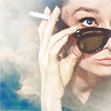
or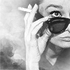
01) Resized and cropped base.
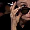
02) Duplicated, set to screen, sharpened (edit --> fade sharpen if necessary).
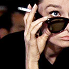
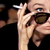
03) Gradient map, set to soft light. Gradient maps are AMAZING. They can lighten/darken an icon AND colour at the same time. With some fiddling and the right colour combos you can acheive the same sort of selective colouring technique. There's just SO MUCH you can do with gradient maps. I can't explain the science of them but with some experimentation, opacity fiddling and good old trial and error you can give your icon GORGEOUS colouring. If you use them enough you know what colours will work well just by looking at them and the modes you want to use.
I used the one I did here because the screened duplicate turned out to be a little bluer than I like. The gradient map just warmed it up a little without altering the overall lightness very much, if at all.

-->
04) Selective colouring layer. I used the red, yellow and black levels. I adjusted each VERY slightly, enough to give her face a little more colour. With the black level I pushed the red a little and reduced the black just enough to brighten the overall icon just a bit. The difference is so slight that it probably wasn't even necessary in the end, but I did it.
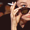
05) Brightness/contrast layer. I reduced both brightness and contrast slightly. I usually push the contrast UP on an icon because I heart definition but on this one there was already so much black that it wasn't necessary. Again, moderation is key.

06) The icon was pretty boring for me then and I wasn't sure what I wanted it to look like so I turned to my saved resources. I found a texture by rainharbour, flipped it horizontally and set it to screen.
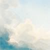
Then I added a mask layer to the texture (on your layers palette it's the rectangle with a circle in it). The beauty of mask layers (as lostt1 told me awhile ago when I was confused about them) is that you can erase the crap you don't want by selecting a black brush and erasing on the mask BUT if you go too far or or just want something back in you switch to a WHITE brush and put it back! Give it a try!
Anyway, I ended up using a 65-ish pt (I think) round brush with soft edges on a way reduced opacity so what I was erasing wouldn't look obvious that it was erased and it would blend into the clouds of the texture. Doing it this way means going over and over the areas you want gone because it's a lower opacity but I find that easier because it's controlled and subtle that way. I erased the texture over Audrey's face, some of her hand and down her neck.
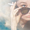
07) I duplicated the texture layer. The mask layer will come with it, with the erased bits included. I picked up from there and erased some more because it was still too cloudy over her. You can also use the white brush on the duplicated mask and put the texture back in, if you want it. I took out a lot more from the second mask layer but there's still a lot on her face, as you can see.
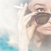
08) Instead of erasing even more and fiddling with the way the texture fades into her face and whatnot, I duplicated my base, dragged it to the top and set it to soft light. It added some definition to her face and features and it made the colours of the texture (the blue in the corner) pop.
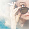
09) I duplicated my soft light layer of the base. This REALLY made her face stand out.

10) I used another selective colour layer here, but only the blue level. My aim was to try and pick up on the blue of her eye, but it only affected the texture, which was fine. Adjusting the blues in selective colouring shouldn't make your subjects look like they have radioactive eyes and anime-coloured hair. /PSA
Final result: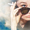
That's the colour version. I went a couple steps further and made a b&w copy, as well.
11) I flood filled a new layer with black and set it to colour. I find this a MUCH better way to make b&w icons, rather than gray scaling. The detail is sharper to me.
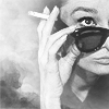
12) Finally, I added another brightness/contrast layer because, again, I'm all for detail, sharpness and definition.
Final result:
I save a lot of my psds so I can recreate tutorials. If there's any icons you'd like to see tutorials of, just leave a comment.
For the other tutorials I've done see my post guide.
Please don't copy this step-by-step. Tutorials teach you something, recreating it down to the last detail is being a copy-cat and it's lame. Use some of the steps in your own iconning process to try new things.
I also don't give out exact numbers for selective colouring because they won't work on any other image so there's no point. Experimenting is your friend!
I hope people find this useful!
Made with CS2.
Go from this

to
or
01) Resized and cropped base.

02) Duplicated, set to screen, sharpened (edit --> fade sharpen if necessary).

03) Gradient map, set to soft light. Gradient maps are AMAZING. They can lighten/darken an icon AND colour at the same time. With some fiddling and the right colour combos you can acheive the same sort of selective colouring technique. There's just SO MUCH you can do with gradient maps. I can't explain the science of them but with some experimentation, opacity fiddling and good old trial and error you can give your icon GORGEOUS colouring. If you use them enough you know what colours will work well just by looking at them and the modes you want to use.
I used the one I did here because the screened duplicate turned out to be a little bluer than I like. The gradient map just warmed it up a little without altering the overall lightness very much, if at all.

-->

04) Selective colouring layer. I used the red, yellow and black levels. I adjusted each VERY slightly, enough to give her face a little more colour. With the black level I pushed the red a little and reduced the black just enough to brighten the overall icon just a bit. The difference is so slight that it probably wasn't even necessary in the end, but I did it.

05) Brightness/contrast layer. I reduced both brightness and contrast slightly. I usually push the contrast UP on an icon because I heart definition but on this one there was already so much black that it wasn't necessary. Again, moderation is key.

06) The icon was pretty boring for me then and I wasn't sure what I wanted it to look like so I turned to my saved resources. I found a texture by rainharbour, flipped it horizontally and set it to screen.

Then I added a mask layer to the texture (on your layers palette it's the rectangle with a circle in it). The beauty of mask layers (as lostt1 told me awhile ago when I was confused about them) is that you can erase the crap you don't want by selecting a black brush and erasing on the mask BUT if you go too far or or just want something back in you switch to a WHITE brush and put it back! Give it a try!
Anyway, I ended up using a 65-ish pt (I think) round brush with soft edges on a way reduced opacity so what I was erasing wouldn't look obvious that it was erased and it would blend into the clouds of the texture. Doing it this way means going over and over the areas you want gone because it's a lower opacity but I find that easier because it's controlled and subtle that way. I erased the texture over Audrey's face, some of her hand and down her neck.

07) I duplicated the texture layer. The mask layer will come with it, with the erased bits included. I picked up from there and erased some more because it was still too cloudy over her. You can also use the white brush on the duplicated mask and put the texture back in, if you want it. I took out a lot more from the second mask layer but there's still a lot on her face, as you can see.

08) Instead of erasing even more and fiddling with the way the texture fades into her face and whatnot, I duplicated my base, dragged it to the top and set it to soft light. It added some definition to her face and features and it made the colours of the texture (the blue in the corner) pop.

09) I duplicated my soft light layer of the base. This REALLY made her face stand out.

10) I used another selective colour layer here, but only the blue level. My aim was to try and pick up on the blue of her eye, but it only affected the texture, which was fine. Adjusting the blues in selective colouring shouldn't make your subjects look like they have radioactive eyes and anime-coloured hair. /PSA
Final result:

That's the colour version. I went a couple steps further and made a b&w copy, as well.
11) I flood filled a new layer with black and set it to colour. I find this a MUCH better way to make b&w icons, rather than gray scaling. The detail is sharper to me.

12) Finally, I added another brightness/contrast layer because, again, I'm all for detail, sharpness and definition.
Final result:

I save a lot of my psds so I can recreate tutorials. If there's any icons you'd like to see tutorials of, just leave a comment.
For the other tutorials I've done see my post guide.