Icons! Tutorial #14 - Scarlett Johansson
library_of_sex asked for a tutorial for this a couple months ago and now I'm finally getting around to it. My bad.

I can't remember exactly what I did with it and I didn't save the psd so I'm winging this!
Also, I notice how absolutely shitty I've been with replying to comments. Sorry about that. It's something I'm going to try to keep on top of, although I can't guarantee anything. I'm easily distracted. But I AM appreciative of everyone who looks, takes and comments on the posts here!
If anyone has any requests for tutorials or general icon making posts or whatever they'd like to see, or if anyone wants to ask specific questions, please do! I promise I'll try to answer to the best of my ability.
Please don't copy this tutorial step-by-step on the same image. I've already made this icon, why would you want to re-make it? Use the info to make your own awesome icon!
Created in CS3
Easy to medium difficulty
Could be translatable? Has anyone worked the selective colouring issue around with PSP?
From
to
I started out with this image of Scarlett and resized it, smaller than 100px wide. Because the background is plain, without any details to fuss with, it'll be easy to create more space around her. I used the smudge tool for this. I kept the brush tip small and hard edged, rather than softer. Sometimes I'll use softer if there are other colours kind of blended in but this colour is basically the same.
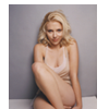
Just smooth out from the edges of the sides. Easy peasy. At the bottom there's a line where she's sitting but you just smooth that out as straight as you can (or I do, anyway). It's so small that no one will likely notice if it's a little uneven anyhow.

-- >
02) I duplicated the base layer a few times. I set them to screen, multiply and soft light in that order on top of the base layer. I sharpened the multiply layer. No particular reason, really. Sometimes I find that sharpening the soft light layer, depending on the contrast of the image, can make it look OVER sharpened. But that's true of sharpening ANY top layer, which is why it's sometimes safer to sharpen the one underneath instead.

-->
-->
03) Next I added a gradient map set on soft light. I've said this before but I'll say it again, I keep meaning to make a gradient map tutorial sort of thing but it's SO daunting. I don't even know how to explain why/how I use them. After all this time I just kind of KNOW. I'll see what I can come up with. I hope.
ANYWAY. I used that gradient map because it did what I've come to expect from it in all the times I've used it. It added some depth and subtly changed the colour of everything without being extreme or unnatural.

-->
04) I added a second gradient map set to soft light which took away some of the definition I added with the first gradient map but it kept the blue-y colour that the original icon had and that was my aim.

-->
05) I'm 98% certain I didn't use selective colouring on the first icon but I'll be damned if I can remember what the hell I did to it so I used it this time. To try and get some of the blue that was in the first one I edited the white level in the selective colour window. I turned up the blue and cyan and that's it. Then I used a soft edged round brush and used the layer mask, handily added to the selective colour layer for your convenience already, and went over Scarlett and the floor she's sitting on.
Blue people are not attractive. When they're tinged blue/green/yellow they look sick and it's obvious you've used selective colour. That's why I erased it over her. She's supposed to stand out in this icon, not blend in with the background.

-->
06) I added two textures next, but then went back and added a brightness & contrast layer under them and on top of all the colouring layers. If you've ever read any of my other tuts you know I LOVE contrast. I turned up the contrast just a bit on this but because it's already a pretty bright image in the lighter spots I turned the brightness down a bit, as well, so the brighter bits wouldn't be radioactive against the darker parts. Darker images can get away with more contrast without much, if any, brightness fiddling but already-bright images have to be careful or else too much contrast will obliterate any detail in the brightest bits.

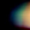
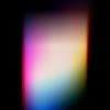
07) I can't remember what texture I used the first time around (of course) so I used two textures by tihana. The first one I flipped around and set to screen. But it was too pink so instead of trying to find another one in its place, I added a second on top, also set to screen. I moved it down and over so it wasn't in the middle and it blended pretty well with the first one.
-->
-->
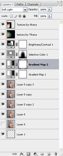
If it helps people see what I did in the order I did it I also included a screenshot of my layers.


I can't remember exactly what I did with it and I didn't save the psd so I'm winging this!
Also, I notice how absolutely shitty I've been with replying to comments. Sorry about that. It's something I'm going to try to keep on top of, although I can't guarantee anything. I'm easily distracted. But I AM appreciative of everyone who looks, takes and comments on the posts here!
If anyone has any requests for tutorials or general icon making posts or whatever they'd like to see, or if anyone wants to ask specific questions, please do! I promise I'll try to answer to the best of my ability.
Please don't copy this tutorial step-by-step on the same image. I've already made this icon, why would you want to re-make it? Use the info to make your own awesome icon!
Created in CS3
Easy to medium difficulty
Could be translatable? Has anyone worked the selective colouring issue around with PSP?
From

to

I started out with this image of Scarlett and resized it, smaller than 100px wide. Because the background is plain, without any details to fuss with, it'll be easy to create more space around her. I used the smudge tool for this. I kept the brush tip small and hard edged, rather than softer. Sometimes I'll use softer if there are other colours kind of blended in but this colour is basically the same.

Just smooth out from the edges of the sides. Easy peasy. At the bottom there's a line where she's sitting but you just smooth that out as straight as you can (or I do, anyway). It's so small that no one will likely notice if it's a little uneven anyhow.

-- >

02) I duplicated the base layer a few times. I set them to screen, multiply and soft light in that order on top of the base layer. I sharpened the multiply layer. No particular reason, really. Sometimes I find that sharpening the soft light layer, depending on the contrast of the image, can make it look OVER sharpened. But that's true of sharpening ANY top layer, which is why it's sometimes safer to sharpen the one underneath instead.

-->

-->

03) Next I added a gradient map set on soft light. I've said this before but I'll say it again, I keep meaning to make a gradient map tutorial sort of thing but it's SO daunting. I don't even know how to explain why/how I use them. After all this time I just kind of KNOW. I'll see what I can come up with. I hope.
ANYWAY. I used that gradient map because it did what I've come to expect from it in all the times I've used it. It added some depth and subtly changed the colour of everything without being extreme or unnatural.

-->

04) I added a second gradient map set to soft light which took away some of the definition I added with the first gradient map but it kept the blue-y colour that the original icon had and that was my aim.

-->

05) I'm 98% certain I didn't use selective colouring on the first icon but I'll be damned if I can remember what the hell I did to it so I used it this time. To try and get some of the blue that was in the first one I edited the white level in the selective colour window. I turned up the blue and cyan and that's it. Then I used a soft edged round brush and used the layer mask, handily added to the selective colour layer for your convenience already, and went over Scarlett and the floor she's sitting on.
Blue people are not attractive. When they're tinged blue/green/yellow they look sick and it's obvious you've used selective colour. That's why I erased it over her. She's supposed to stand out in this icon, not blend in with the background.

-->

06) I added two textures next, but then went back and added a brightness & contrast layer under them and on top of all the colouring layers. If you've ever read any of my other tuts you know I LOVE contrast. I turned up the contrast just a bit on this but because it's already a pretty bright image in the lighter spots I turned the brightness down a bit, as well, so the brighter bits wouldn't be radioactive against the darker parts. Darker images can get away with more contrast without much, if any, brightness fiddling but already-bright images have to be careful or else too much contrast will obliterate any detail in the brightest bits.

07) I can't remember what texture I used the first time around (of course) so I used two textures by tihana. The first one I flipped around and set to screen. But it was too pink so instead of trying to find another one in its place, I added a second on top, also set to screen. I moved it down and over so it wasn't in the middle and it blended pretty well with the first one.

-->


-->

If it helps people see what I did in the order I did it I also included a screenshot of my layers.
