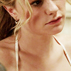
Icons! Tutorial #12 & 13 - Dean from Supernatural & Sookie from True Blood
These are two tutorials that use no selective colouring. They do use gradient maps, however, so CS is still essential. I keep meaning to do a tutorial on gradient maps in general but I'm kind of daunted on how to go about setting it up altogether, especially since I don't understand the mechanics of how it works. I just know that certain colours on various modes are going to do different things and, after this long, I can kind of look at a gradient and just know if it'll work or not. I might take a stab at a tutorial and then beg for questions because I know I won't get everything right. Anyway.
If anyone wants to see a tutorial from any icon in particular I'll do my best to re-create it if I haven't saved the psd for it.
On psds: Since I've written out each step of these icons I will not give out a psd. The best icons often come from happy mistakes in iconing when you experiment so take these steps and interpret them to your own style, don't copy them because that sucks and also, they won't look the exact same on any other image.
Go from
to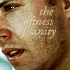
01) I resized and positioned the image. I can't remember for sure but I think I resized to about 185px high.
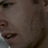
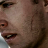
02) Duplicated the base twice, set each level to screen. Then I duplicated the base again and set it to soft light and put that layer between the two screened layers. Then I sharpened the topmost screened layer.
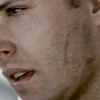
-->
-->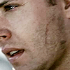
(screen --> soft light --> screen)
03) I added a brightness/contrast layer next but this is purely a preferential step. I prefer more contrast so I upped the brightness a little and the contrast a bit more. A little goes a long way with this tool, so use with some discretion.
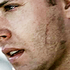
04) I added a yellow to green gradient map next, set to soft light. It warmed the icon up and added some more natural colouring to Dean's face.

-->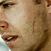
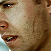
05) I added another gradient map, brown to blue next, set on soft light. It made the skin tone a bit too yellow/green but I like how it added some shadows on Dean's cheek and angles of his face in general.

-->
06) I added another brightness/contrast layer but this time I didn't adjust the brightness hardly at all and leaned more on the contrast level. There's quite a bit more contrast with this layer now, more than I even go for usually.
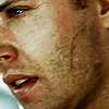
07) I liked the icon when I was finished, it's a bit more saturated than I usually go for but it worked for this one. However, after looking at it for so long with the text on it (I did a textless and a text version but have been using the text version) I do like the way it softens the saturation of the icon. I added the text "the softness of sanity" (I think from a song?) in a light yellow/beige colour, then reduced both the opacity and the fill by only about 13% each, just to take the harsh edge off it. The text was still a little glow-y, though, and a bit hard to read so I added a stroke to the text at 1pt in a darker colour picked up from the icon and reduced the opacity of that to about 30%. This step depends on the colour of your text against your icon and the colour of the stroke. I really liked the effect on this icon, the way it IS soft against Dean's face and how it sort of fades into his skin.

And now for the second tut.

to
01) Resized and positioned the image. I resized to about 150px height.
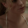
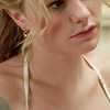
02) Duplicated the base twice and set each layer to screen. I sharpened the topmost screened layer.
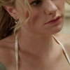
-->
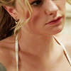
03) I added a brightness/contrast layer next and didn't adjust the brightness at all because it's already a pretty light icon. I did up the contrast significantly. It not only added definitions to the features of the icon (hair, face, the straps against Sookie's collarbone) but it also brought out the natural colour of the icon.
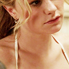
04) I added a lighter gradient map set on soft light. This made the icon a bit lighter while keeping the skin-tone colour.

-->
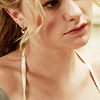
05) Another gradient map, this time a grey-blue one to dull some of the reddish colour. I liked the more natural reddish tones in the image but it was a little too red for me. This evened it out a bit.

-->
06) I added another brightness/contrast layer, this time I reduced the brightness and upped the contrast some. Again, the contrast brought back some of the colouring (I know, didn't I just take it away?!) but lowering the brightness didn't make it radioactive reddish.

If anyone wants to see a tutorial from any icon in particular I'll do my best to re-create it if I haven't saved the psd for it.
On psds: Since I've written out each step of these icons I will not give out a psd. The best icons often come from happy mistakes in iconing when you experiment so take these steps and interpret them to your own style, don't copy them because that sucks and also, they won't look the exact same on any other image.
Go from

to

01) I resized and positioned the image. I can't remember for sure but I think I resized to about 185px high.

02) Duplicated the base twice, set each level to screen. Then I duplicated the base again and set it to soft light and put that layer between the two screened layers. Then I sharpened the topmost screened layer.

-->

-->

(screen --> soft light --> screen)
03) I added a brightness/contrast layer next but this is purely a preferential step. I prefer more contrast so I upped the brightness a little and the contrast a bit more. A little goes a long way with this tool, so use with some discretion.

04) I added a yellow to green gradient map next, set to soft light. It warmed the icon up and added some more natural colouring to Dean's face.

-->

05) I added another gradient map, brown to blue next, set on soft light. It made the skin tone a bit too yellow/green but I like how it added some shadows on Dean's cheek and angles of his face in general.

-->

06) I added another brightness/contrast layer but this time I didn't adjust the brightness hardly at all and leaned more on the contrast level. There's quite a bit more contrast with this layer now, more than I even go for usually.

07) I liked the icon when I was finished, it's a bit more saturated than I usually go for but it worked for this one. However, after looking at it for so long with the text on it (I did a textless and a text version but have been using the text version) I do like the way it softens the saturation of the icon. I added the text "the softness of sanity" (I think from a song?) in a light yellow/beige colour, then reduced both the opacity and the fill by only about 13% each, just to take the harsh edge off it. The text was still a little glow-y, though, and a bit hard to read so I added a stroke to the text at 1pt in a darker colour picked up from the icon and reduced the opacity of that to about 30%. This step depends on the colour of your text against your icon and the colour of the stroke. I really liked the effect on this icon, the way it IS soft against Dean's face and how it sort of fades into his skin.

And now for the second tut.

to

01) Resized and positioned the image. I resized to about 150px height.

02) Duplicated the base twice and set each layer to screen. I sharpened the topmost screened layer.

-->

03) I added a brightness/contrast layer next and didn't adjust the brightness at all because it's already a pretty light icon. I did up the contrast significantly. It not only added definitions to the features of the icon (hair, face, the straps against Sookie's collarbone) but it also brought out the natural colour of the icon.

04) I added a lighter gradient map set on soft light. This made the icon a bit lighter while keeping the skin-tone colour.

-->

05) Another gradient map, this time a grey-blue one to dull some of the reddish colour. I liked the more natural reddish tones in the image but it was a little too red for me. This evened it out a bit.

-->

06) I added another brightness/contrast layer, this time I reduced the brightness and upped the contrast some. Again, the contrast brought back some of the colouring (I know, didn't I just take it away?!) but lowering the brightness didn't make it radioactive reddish.
