Icons galore!
I’ve been getting requests to post icons, and I’ve made a good amount that have just been sitting here, so I’m gonna share them.
35 in total
-16 X-Men
- 3 Harry Potter
- 4 Misc (a Luis Royo art and Elijah Wood)
- 3 Firefly
- 10 Star Wars
These are in absolutely no particular order. Basically just going through the icon folders. I don’t think it’s even chronological or reverse chronological. Totally random. So have fun with that. This is purely an icon dump.
X-Men
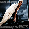
1.
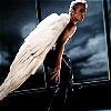
2.
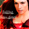
3.
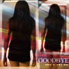
4.
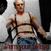
5.
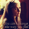
6.
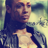
7.
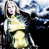
8.
9.
10.
11.
12.
13.
14.
15.
16.
Harry Potter
17.
18.
19.
*17- art by ericahpfa. Some art has very adult content, so be warned.
Misc
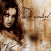
20.
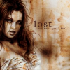
21.
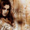
22.
23.
*art by Luis Royo (nicole9514 made some incredible icons from his art, I just found this picture to be so striking I had to make a few myself)
*22- I found her to look so much like Mimi from Rent that I couldn’t resist.
Firefly
24.
25.
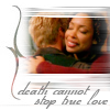
26.
*24-lyrics from So She Dances by Josh Groban
Star Wars
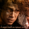
25.
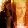
26.
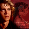
27.
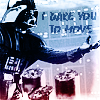
28.
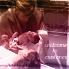
29.
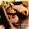
30.
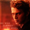
31.
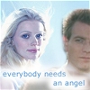
32.
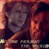
33.
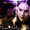
34.
35.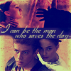
*These are all from various icontests, rather old, as I haven’t done an icontest in a while, and almost all have song lyrics. If you wanna know what song, just comment with the number. Because I’m lazy and don’t feel like typing them all out. Plus, it’ll be fun to see if you guess right.
Ok, now that these are all posted, I’m extending a question. Can anyone give me any tips on how to make my text look better? I look at my icons and I can’t stand how out of place my text looks. Any suggestions? I feel pretty confident with making hush icons (no text) but I like icons with text better. So yeah. Thanks ahead of time to anyone who can help me out.
I’m working on a new layout, so that’s why some of my old one went away. I was looking at colors and everything got reverted in the process. Stupid LJ. Oh well, it should be done soon, so that’s good.
35 in total
-16 X-Men
- 3 Harry Potter
- 4 Misc (a Luis Royo art and Elijah Wood)
- 3 Firefly
- 10 Star Wars
These are in absolutely no particular order. Basically just going through the icon folders. I don’t think it’s even chronological or reverse chronological. Totally random. So have fun with that. This is purely an icon dump.
X-Men
1.

2.

3.

4.

5.

6.

7.

8.

9.

10.

11.

12.

13.

14.

15.

16.

Harry Potter
17.

18.

19.

*17- art by ericahpfa. Some art has very adult content, so be warned.
Misc
20.

21.

22.

23.

*art by Luis Royo (nicole9514 made some incredible icons from his art, I just found this picture to be so striking I had to make a few myself)
*22- I found her to look so much like Mimi from Rent that I couldn’t resist.
Firefly
24.

25.

26.

*24-lyrics from So She Dances by Josh Groban
Star Wars
25.

26.

27.

28.

29.

30.

31.

32.

33.

34.

35.

*These are all from various icontests, rather old, as I haven’t done an icontest in a while, and almost all have song lyrics. If you wanna know what song, just comment with the number. Because I’m lazy and don’t feel like typing them all out. Plus, it’ll be fun to see if you guess right.
Ok, now that these are all posted, I’m extending a question. Can anyone give me any tips on how to make my text look better? I look at my icons and I can’t stand how out of place my text looks. Any suggestions? I feel pretty confident with making hush icons (no text) but I like icons with text better. So yeah. Thanks ahead of time to anyone who can help me out.
I’m working on a new layout, so that’s why some of my old one went away. I was looking at colors and everything got reverted in the process. Stupid LJ. Oh well, it should be done soon, so that’s good.