Photoshop Icons post. Includes Twilight and SGA icons
This isn't either an iconpost or a Twilight post as much as it is a Photoshop post. (Even if most of these are Twilight icons) I made all these icons in Photoshop as opposed to all previous icons, which were done in Paint Shop Pro. First icons in PS, ever!
These icons are mostly a show of how you can lighten up and color and extremely dark screencap - and a reminder for me for later dates. I used Curves, Color Balance, Levels and Selective Color (this last isn't necessary to clear up a cap, it's merely a perk of PS). The settings differ with each image - what works for one image, doesn't for the other.
There's also a bit of play on texture, too, which I tend to forget it's there when I iconize. >_<
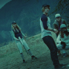
Icons on the left are the raw icon, the raw screencap: dark, non processed, NOT SHINY.
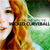
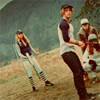
Icons on the right are the finished product, and snaggable!
(If you want to snag the icons on the left, go ahead. I don't know why you would, though. If you simply want the screencap, ask me and I'll give it to you)
Samples:
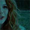
->
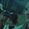
->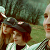
The baseball scene was so fun to iconize. ^__^ A thunderstorm was above them, so it's supposed to be dark and blue-y, but I still wanted the warm tones skin and hair are supposed to have. (Victoria's hair was a graphical pleasure to bring back to normal colors. Hair that gorgeous shouldn't be hidden under a blue filter. It's lovely!)


(the right, non-Victoria side of the icon has a Crosshatch Filter effect)
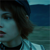
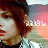
(Red blob on the right is a grad set to Screen. I then duplicated the layer to make it more noticeable)
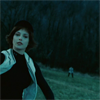
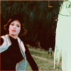
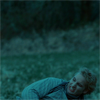
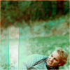
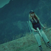
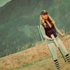


First color correction ever made in PS. I don't like it, but I'm posting anyway. It's still too cyan-y, and Bella's hair is darker than I'd like
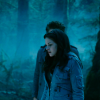
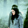
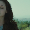
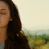
The blue on this scene is less pronounced - Bella's out in the Phoenix sun, so it's notably less dark. It was still too blue for my liking, so I made Kristen's skin look human again. XD
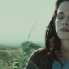
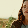
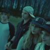
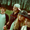
The cafeteria scene (the first time we see the Cullens) was notably blue, at least in caps. I liked the idea of having each couple in an icon, but the color tones were too cold (even if they are vampires). Rosalie should be blond, and the Cullens are supposed to be able to blend among humans, so I wanted warmer tones. I played a lot with Curves and Color Balance in this cap, favoring reds and yellows while keeping the luminosity.
The area around each couple has been reproduced (clone tool) to fill the icon up to the top and the blurred, leaving only the couple in detail.
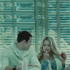
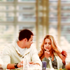
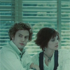
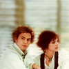
Same as before (sans the cloning and blurring, of course), although here I went for more greens and brows.
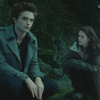
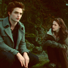
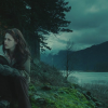
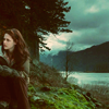
This one takes the prize for darkest screencap in history. In the original screencap you can barely see John's expression, and if I hadn't known beforehand that was Rodney, I never would've known there was the Canadian flag near the bottom of the image. I played with Curves and Levels here, and it still isn't perfect. Because the cap is so dark (and not exactly HD), you'll never get a perfect, flawless image. Still, John's skin is back to normal human colors, and the Canadian flag regained its reds, so I call it a win.
Also made while playing with learning to us PS:
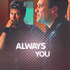
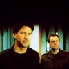
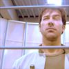
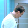
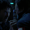
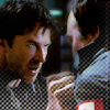
#1 I adore to the point of uploading it to my LJ, probably. #3 and #4 are, of course, from 'Aurora' where everything in the virtual reality environment is as blue as it can get. Since John & Rodney aren't blue-skinned I like correcting the colors. John looks better in whites and brows, it's such a far cry from his usual black.
I'm in love with Photoshop. If anyone has suggestions (or questions!) please, comment. I've barely skimmed the surface of what PS can do.
Credit moodymuse19 if you take. Leave feedback!
These icons are mostly a show of how you can lighten up and color and extremely dark screencap - and a reminder for me for later dates. I used Curves, Color Balance, Levels and Selective Color (this last isn't necessary to clear up a cap, it's merely a perk of PS). The settings differ with each image - what works for one image, doesn't for the other.
There's also a bit of play on texture, too, which I tend to forget it's there when I iconize. >_<
Icons on the left are the raw icon, the raw screencap: dark, non processed, NOT SHINY.
Icons on the right are the finished product, and snaggable!
(If you want to snag the icons on the left, go ahead. I don't know why you would, though. If you simply want the screencap, ask me and I'll give it to you)
Samples:
->
->
The baseball scene was so fun to iconize. ^__^ A thunderstorm was above them, so it's supposed to be dark and blue-y, but I still wanted the warm tones skin and hair are supposed to have. (Victoria's hair was a graphical pleasure to bring back to normal colors. Hair that gorgeous shouldn't be hidden under a blue filter. It's lovely!)
(the right, non-Victoria side of the icon has a Crosshatch Filter effect)
(Red blob on the right is a grad set to Screen. I then duplicated the layer to make it more noticeable)
First color correction ever made in PS. I don't like it, but I'm posting anyway. It's still too cyan-y, and Bella's hair is darker than I'd like
The blue on this scene is less pronounced - Bella's out in the Phoenix sun, so it's notably less dark. It was still too blue for my liking, so I made Kristen's skin look human again. XD
The cafeteria scene (the first time we see the Cullens) was notably blue, at least in caps. I liked the idea of having each couple in an icon, but the color tones were too cold (even if they are vampires). Rosalie should be blond, and the Cullens are supposed to be able to blend among humans, so I wanted warmer tones. I played a lot with Curves and Color Balance in this cap, favoring reds and yellows while keeping the luminosity.
The area around each couple has been reproduced (clone tool) to fill the icon up to the top and the blurred, leaving only the couple in detail.
Same as before (sans the cloning and blurring, of course), although here I went for more greens and brows.
This one takes the prize for darkest screencap in history. In the original screencap you can barely see John's expression, and if I hadn't known beforehand that was Rodney, I never would've known there was the Canadian flag near the bottom of the image. I played with Curves and Levels here, and it still isn't perfect. Because the cap is so dark (and not exactly HD), you'll never get a perfect, flawless image. Still, John's skin is back to normal human colors, and the Canadian flag regained its reds, so I call it a win.
Also made while playing with learning to us PS:
#1 I adore to the point of uploading it to my LJ, probably. #3 and #4 are, of course, from 'Aurora' where everything in the virtual reality environment is as blue as it can get. Since John & Rodney aren't blue-skinned I like correcting the colors. John looks better in whites and brows, it's such a far cry from his usual black.
I'm in love with Photoshop. If anyone has suggestions (or questions!) please, comment. I've barely skimmed the surface of what PS can do.
Credit moodymuse19 if you take. Leave feedback!