Tutorials: #5 and #6, Dean from 2x14 and Sam and Dean from 1x22
tehuberfangirl requested a tutorial for the first icon but since it was so few steps and I didn't really do anything I decided to do another one, as well. If you ever want a tutorial from any of the icons I post, just ask and if I've saved the .psd I can definitely post it.
Please don't copy either of these tutorials step-by-step. A lot of the gradients, textures and colouring will only look the way it does on these icons with the exact same caps and it's lame to re-create something someone's already made. Use these tutorials as a way to learn new ways of doing things and to try something new, instead.
Both of these were made using and are for Photoshop CS.
How to go from this:
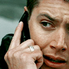
to this:
01. I opened my image and resized it, then dragged it to a new 100x100 image and fiddled with the placement until I liked the positioning.
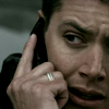
02. I duplicated the base image once and set it to screen. Then I sharpened it. I have skipped the soft light layer because I've been finding that, at least with Supernatural caps, it makes the angles a little too harsh for my liking too quickly. The screen layer is enough to brighten the icon without being overwhelming. Sometimes if it's TOO bright, I'll duplicate the image again and set it to multiply under the screened layer, with varying opacity, but I didn't feel it needed such a layer here so I went with just the one screened layer.
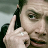
03. Next up was a selective colour layer. I don't like to give exact numbers because they won't work on any other image than this one so what's the point? I upped the red to the max and fiddled with the other colours under the red a little as well, and also in the yellow and a LITTLE in the neutral. I wanted to bring some colour to Dean's face naturally, without making him look day-glo.
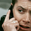
04. I added another selective colour layer here but only played with the reds for the most part. I upped the cyan just a SMIDGE in the neutrals, to bring out the colour of whatever is behind Dean's head in the icon. I'm really BIG on colours so I like to enhance whatever I can to make things pop.
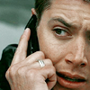
05. The next and last step was to add a brightness/contrast layer. I didn't go over board, I only set my contrast on 8 and the brightness on -3 but it really made the details of the icon stand out- the wrinkles in Dean's forehead, the creases around his eyes, the shadow on the back of his hand... it's like an instant sharpen feature without the ugly crunchiness.
And that's that!
This icon was made for an icon_crack submission, I think. Or maybe for thefocusgroup.
From this:
to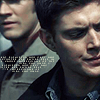
01. Again, I resized my original image and dragged it to the new open image, rearranged it until I was satisfied with the positioning.
02. This is an example of where I duplicated the image and set it to screen, found it too light and washed out, and put a multiply layer between the base and the screen layer. So I would have duplicated the base and set it to screen, found it too light for my tastes and then duplicated the base again under the screen layer and set it to multiply. I'm all about angles and details now and the sharp contrast between light and dark. The screened layer was fine on its own but I really wanted something a bit deeper. Play around and see what you like, it's easy enough to go back when you're done and add or delete a layer, after all.
So, to simplify: base
+ dup base on multiply
+ dup base on screen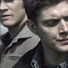
=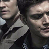
03. I sharpened the screened layer. I think sometimes when you sharpen a lighter layer it will show the cruchiness more than a darker layer, so that could also be a reason behind why I use the multiplied layer, but who knows? Sharpen what you want, depending on what you think looks best.
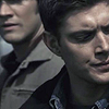
04. I added a gradient map here, set to soft light. I use blue-ish gradients sometimes that go dark to light because it gives the icons a kind of... skin tone colouring to them without washing them out. That make sense?

-->
05. I used another gradient map here, set to soft light. I'm very boring with my colouring modes but I like the look this gives. It brightens the icon, gives it some colour and keeps the contrast-y details I was talking about. It also, however, makes the icon look kind of beige. Blech. :|
-->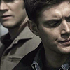
06. So then I break out the selective colouring. Again, I upped the reds, quite a bit. I also tinkered with the yellows (upping the red, playing with the green and blue, as well), the green (cyan to the max to enhance the colour of Sam's jacket, some magenta), and the neutrals just a smidge. With these types of icons/caps it's harder to play with the reds and lighter, warmer colours, without delving into orange skin/blue hair territory. It's definitely a balancing act.
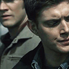
07. Another selective colour layer, more tinkering with the reds but mostly just in the red and yellow colours. The neutral I only touched a little with the red, green and yellow.

08. I added a brightness/contrast layer here but only adjusted the contrast a little bit, to enhance the edges.

09. Another gradient map, another mode set on soft light. It darkened the image more and also took out some of the more yellow-y look Sam and Dean were taking. I have a big vendetta against yellow-looking skin, even if it's not that bad. I'm trying to break myself of that and to learn to be satisfied with an icon as it is.
-->
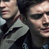
10. GUESS WHAT? Another gradient map, set to soft light (Are you getting sick of these, yet?). This one gives the icon a cooler feel and really makes the icon a bit darker, and takes out that yellow I was talking about. Blue is such a default colour to fall back on and is used as a crutch, but sometimes it can really make angles and details pop.

-->
11. OKAY, OKAY. This is the LAST ONE, I swear. Another gradient map, set to soft light. This one gives the look kind of like that of an exclusion layer but doesn't flatten the colours and make them look dull. I like the exclusion layer on certain icons but a lot of the time it really makes an icon flat and dull. But here, I like the way it worked, even if it was just another gradient map set to soft light.

-->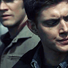
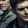
12. Then I added a text brush by colorfilter, I believe set to normal in something close to this colour: hex #c2c8b5. It was still a little too light for me so I duplicated the layer with the same settings.
-->

I'm STILL working on the BUaBS icons that I started eons ago. I've never iconned an episode like this before so I really want to finish to where I feel I'm done and I'm almost there. Hopefully I'll post icons soon.
Please don't copy either of these tutorials step-by-step. A lot of the gradients, textures and colouring will only look the way it does on these icons with the exact same caps and it's lame to re-create something someone's already made. Use these tutorials as a way to learn new ways of doing things and to try something new, instead.
Both of these were made using and are for Photoshop CS.
How to go from this:

to this:

01. I opened my image and resized it, then dragged it to a new 100x100 image and fiddled with the placement until I liked the positioning.

02. I duplicated the base image once and set it to screen. Then I sharpened it. I have skipped the soft light layer because I've been finding that, at least with Supernatural caps, it makes the angles a little too harsh for my liking too quickly. The screen layer is enough to brighten the icon without being overwhelming. Sometimes if it's TOO bright, I'll duplicate the image again and set it to multiply under the screened layer, with varying opacity, but I didn't feel it needed such a layer here so I went with just the one screened layer.

03. Next up was a selective colour layer. I don't like to give exact numbers because they won't work on any other image than this one so what's the point? I upped the red to the max and fiddled with the other colours under the red a little as well, and also in the yellow and a LITTLE in the neutral. I wanted to bring some colour to Dean's face naturally, without making him look day-glo.

04. I added another selective colour layer here but only played with the reds for the most part. I upped the cyan just a SMIDGE in the neutrals, to bring out the colour of whatever is behind Dean's head in the icon. I'm really BIG on colours so I like to enhance whatever I can to make things pop.

05. The next and last step was to add a brightness/contrast layer. I didn't go over board, I only set my contrast on 8 and the brightness on -3 but it really made the details of the icon stand out- the wrinkles in Dean's forehead, the creases around his eyes, the shadow on the back of his hand... it's like an instant sharpen feature without the ugly crunchiness.

And that's that!
This icon was made for an icon_crack submission, I think. Or maybe for thefocusgroup.
From this:

to

01. Again, I resized my original image and dragged it to the new open image, rearranged it until I was satisfied with the positioning.

02. This is an example of where I duplicated the image and set it to screen, found it too light and washed out, and put a multiply layer between the base and the screen layer. So I would have duplicated the base and set it to screen, found it too light for my tastes and then duplicated the base again under the screen layer and set it to multiply. I'm all about angles and details now and the sharp contrast between light and dark. The screened layer was fine on its own but I really wanted something a bit deeper. Play around and see what you like, it's easy enough to go back when you're done and add or delete a layer, after all.
So, to simplify: base

+ dup base on multiply

+ dup base on screen

=

03. I sharpened the screened layer. I think sometimes when you sharpen a lighter layer it will show the cruchiness more than a darker layer, so that could also be a reason behind why I use the multiplied layer, but who knows? Sharpen what you want, depending on what you think looks best.
04. I added a gradient map here, set to soft light. I use blue-ish gradients sometimes that go dark to light because it gives the icons a kind of... skin tone colouring to them without washing them out. That make sense?

-->

05. I used another gradient map here, set to soft light. I'm very boring with my colouring modes but I like the look this gives. It brightens the icon, gives it some colour and keeps the contrast-y details I was talking about. It also, however, makes the icon look kind of beige. Blech. :|

-->

06. So then I break out the selective colouring. Again, I upped the reds, quite a bit. I also tinkered with the yellows (upping the red, playing with the green and blue, as well), the green (cyan to the max to enhance the colour of Sam's jacket, some magenta), and the neutrals just a smidge. With these types of icons/caps it's harder to play with the reds and lighter, warmer colours, without delving into orange skin/blue hair territory. It's definitely a balancing act.

07. Another selective colour layer, more tinkering with the reds but mostly just in the red and yellow colours. The neutral I only touched a little with the red, green and yellow.

08. I added a brightness/contrast layer here but only adjusted the contrast a little bit, to enhance the edges.

09. Another gradient map, another mode set on soft light. It darkened the image more and also took out some of the more yellow-y look Sam and Dean were taking. I have a big vendetta against yellow-looking skin, even if it's not that bad. I'm trying to break myself of that and to learn to be satisfied with an icon as it is.

-->

10. GUESS WHAT? Another gradient map, set to soft light (Are you getting sick of these, yet?). This one gives the icon a cooler feel and really makes the icon a bit darker, and takes out that yellow I was talking about. Blue is such a default colour to fall back on and is used as a crutch, but sometimes it can really make angles and details pop.

-->

11. OKAY, OKAY. This is the LAST ONE, I swear. Another gradient map, set to soft light. This one gives the look kind of like that of an exclusion layer but doesn't flatten the colours and make them look dull. I like the exclusion layer on certain icons but a lot of the time it really makes an icon flat and dull. But here, I like the way it worked, even if it was just another gradient map set to soft light.

-->

12. Then I added a text brush by colorfilter, I believe set to normal in something close to this colour: hex #c2c8b5. It was still a little too light for me so I duplicated the layer with the same settings.

-->

I'm STILL working on the BUaBS icons that I started eons ago. I've never iconned an episode like this before so I really want to finish to where I feel I'm done and I'm almost there. Hopefully I'll post icons soon.