Tutorial: Mary from Supernatural 1x01
This is the fourth tutorial I've done over here in my icon journal. Click the tag to find the others.
Note: Please do not copy this tutorial step-by-step. It probably won't translate the same way to any other image so it won't look the same, anyway. Use this as a guide to learn new techniques or to get ideas to use in your own icons. Copying icons step-by-step is lame and why would you want to make an icon that looks exactly like someone else's anyway?
This tutorial is for CS2 and probably isn't translateable.
Today we'll be figuring out how to go from:

to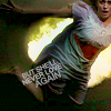
I capped the pilot some months ago but then I had to RE-cap it because I'm an anal sort of freak and needed to for uniformity or something. I didn't get this cap the same the second time around and I loved it SO MUCH I had to save it and waited for a good time to use it.
1) I resized the big image and played around with it until I found the right positioning. I rarely ever crop the main image anymore. I just resize and drag it onto a new 100x100 base and play with it from there. Sometimes as soon as I drag it to the image the positioning is perfect the way it is.
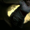
2) I duplicated my base image three times. Actually, I would have duplicated it once and set it to screen, then duplicated again and set it under the screened layer on multiply and then, finding it too dark, duplicated the screen layer again on top of the first one. So, for those that have no idea what I'm talking about (and that includes me) I went base --> multiply --> screen --> screen. It obviously depends on your image and how dark/light it is to begin with. This one is very dark so I felt it needed to be lightened more. Play around with your image to get the best light you feel you need and remember you can go back and futz with it later.
I always sharpen the top layer, usually the screened one. That's me. Other people have different ways of perparing their base and what looks best to them. I like it this way because it's not the base image so it doesn't look too sharp and it can be faded in PS, if necessary.
After three dups and a sharpen this is what I have:

3) I'm all for the subtle differences, even if no one else can see what I do. I added a curves layer here. Sometimes I go in and play with the levels and stuff and see what I can come up with but often times I open a new curves layer and hit "auto" and see what the computer comes up with to make the image more balanced. Sometimes it works, sometimes it doesn't. I added it to this image and it didn't change the image THAT much but it worked for me at the time. You could probably skip this step, unless you find it helps your image a lot.
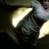
4) I added a purple-ish gradient map here, set on soft light. I HEART soft light gradient maps because it brightens and changes the colours on an icon subtley, without losing a lot of the original colour, depending on how you're using it. Depending on what light to dark fade you get you can really bring out the shadows on an icon and make it look more contrasted than you thought.

-->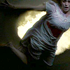
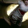
5) I put another gradient map set to soft light on here, Again, it brightened the icon without distorting the colouring too badly. The flames behind Mary's body are still workable and her face is now visible.

-->
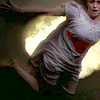
6) I added a selective colouring layer here. I don't see the point in telling people what numbers I used so they can copy exactly because they won't work on any other image but this one. I love bright and bold colours so I played around with the red, especially, and upped it to the max. I also played with the green quite a bit because I wanted to try and bring out the colour of the flames behind her body, but not necessarily the yellow so I didn't play with that one as much.
7) I added another selective colour layer to define the colours a little more. I played with the greens more and the yellows a bit, as well, to bring out more of the green. I didn't play with the reds much more, though, because I wanted them to pop but not look dayglo. Red skin/blue hair is bad, yo.
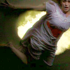
8) I have fallen in love with the brightness/contrast function. I LOVE seeing an icon with good light and shadows on it now. I upped both just a little. Enough to make the icon a little brighter but also to make the folds of her night gown and the angle of her leg slightly more pronounced.
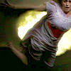
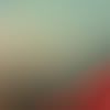
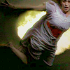
9) I apparently added a hue/saturation layer here at -5 saturation but even I can't see a difference in the images so let's just move on. Fiddle with saturation if you want. Then I used a texture from my resources folder. I LOVE these textures but, alas, I cannot say exactly who made them. My image folder goes back to before I kept a good resource list of creators with links to their stuff. If you know who made this texture, please let me know so I can credit them within the tutorial. I know it's someone on the list, just not who exactly. Anyway.
I added this texture set on darken and it mainly added a little more colour and toned down the brightness of the fire behind Mary.
-->
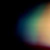
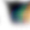
10) I added this texture by tihana next. I LOVE this set of textures by her- they're just gorgeous. I set it to soft light and erased the bits that made the image too dark for my liking until I ended up with a quarter of the original image, put right over Mary. I just love the colours on her now, the blues and greens mixed with the reds and purples. It darkened the image but enriched the colours already there.
-->
-->
11) I added another brightness/contrast layer, to clear the image up a little and enhance the folds and details in her nightdress, again. I also used the dodge brush and used it around her leg/foot area just a little because I noticed it looked a bit too over-saturated when used against brighter backgrounds.
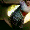
12) Then I added some text in 8pt arial in caps set on strong; "again" is set on 10, I think. I probably wouldn't have added text to this icon had it only been for me but it was a challenge for spnlims that required more than four consecutive words from some pre-determined song lyrics. So this is what I slapped on there, free transformed it a little and then duplicated all the text layers and then decreased the opacity/fill a little on the dups because while they looked blurry without more definition it was too over powering to have all the layers on 100% strong.

And there you have it!
Note: Please do not copy this tutorial step-by-step. It probably won't translate the same way to any other image so it won't look the same, anyway. Use this as a guide to learn new techniques or to get ideas to use in your own icons. Copying icons step-by-step is lame and why would you want to make an icon that looks exactly like someone else's anyway?
This tutorial is for CS2 and probably isn't translateable.
Today we'll be figuring out how to go from:

to

I capped the pilot some months ago but then I had to RE-cap it because I'm an anal sort of freak and needed to for uniformity or something. I didn't get this cap the same the second time around and I loved it SO MUCH I had to save it and waited for a good time to use it.
1) I resized the big image and played around with it until I found the right positioning. I rarely ever crop the main image anymore. I just resize and drag it onto a new 100x100 base and play with it from there. Sometimes as soon as I drag it to the image the positioning is perfect the way it is.

2) I duplicated my base image three times. Actually, I would have duplicated it once and set it to screen, then duplicated again and set it under the screened layer on multiply and then, finding it too dark, duplicated the screen layer again on top of the first one. So, for those that have no idea what I'm talking about (and that includes me) I went base --> multiply --> screen --> screen. It obviously depends on your image and how dark/light it is to begin with. This one is very dark so I felt it needed to be lightened more. Play around with your image to get the best light you feel you need and remember you can go back and futz with it later.
I always sharpen the top layer, usually the screened one. That's me. Other people have different ways of perparing their base and what looks best to them. I like it this way because it's not the base image so it doesn't look too sharp and it can be faded in PS, if necessary.
After three dups and a sharpen this is what I have:

3) I'm all for the subtle differences, even if no one else can see what I do. I added a curves layer here. Sometimes I go in and play with the levels and stuff and see what I can come up with but often times I open a new curves layer and hit "auto" and see what the computer comes up with to make the image more balanced. Sometimes it works, sometimes it doesn't. I added it to this image and it didn't change the image THAT much but it worked for me at the time. You could probably skip this step, unless you find it helps your image a lot.

4) I added a purple-ish gradient map here, set on soft light. I HEART soft light gradient maps because it brightens and changes the colours on an icon subtley, without losing a lot of the original colour, depending on how you're using it. Depending on what light to dark fade you get you can really bring out the shadows on an icon and make it look more contrasted than you thought.

-->

5) I put another gradient map set to soft light on here, Again, it brightened the icon without distorting the colouring too badly. The flames behind Mary's body are still workable and her face is now visible.

-->

6) I added a selective colouring layer here. I don't see the point in telling people what numbers I used so they can copy exactly because they won't work on any other image but this one. I love bright and bold colours so I played around with the red, especially, and upped it to the max. I also played with the green quite a bit because I wanted to try and bring out the colour of the flames behind her body, but not necessarily the yellow so I didn't play with that one as much.

7) I added another selective colour layer to define the colours a little more. I played with the greens more and the yellows a bit, as well, to bring out more of the green. I didn't play with the reds much more, though, because I wanted them to pop but not look dayglo. Red skin/blue hair is bad, yo.

8) I have fallen in love with the brightness/contrast function. I LOVE seeing an icon with good light and shadows on it now. I upped both just a little. Enough to make the icon a little brighter but also to make the folds of her night gown and the angle of her leg slightly more pronounced.

9) I apparently added a hue/saturation layer here at -5 saturation but even I can't see a difference in the images so let's just move on. Fiddle with saturation if you want. Then I used a texture from my resources folder. I LOVE these textures but, alas, I cannot say exactly who made them. My image folder goes back to before I kept a good resource list of creators with links to their stuff. If you know who made this texture, please let me know so I can credit them within the tutorial. I know it's someone on the list, just not who exactly. Anyway.
I added this texture set on darken and it mainly added a little more colour and toned down the brightness of the fire behind Mary.

-->

10) I added this texture by tihana next. I LOVE this set of textures by her- they're just gorgeous. I set it to soft light and erased the bits that made the image too dark for my liking until I ended up with a quarter of the original image, put right over Mary. I just love the colours on her now, the blues and greens mixed with the reds and purples. It darkened the image but enriched the colours already there.

-->

-->

11) I added another brightness/contrast layer, to clear the image up a little and enhance the folds and details in her nightdress, again. I also used the dodge brush and used it around her leg/foot area just a little because I noticed it looked a bit too over-saturated when used against brighter backgrounds.

12) Then I added some text in 8pt arial in caps set on strong; "again" is set on 10, I think. I probably wouldn't have added text to this icon had it only been for me but it was a challenge for spnlims that required more than four consecutive words from some pre-determined song lyrics. So this is what I slapped on there, free transformed it a little and then duplicated all the text layers and then decreased the opacity/fill a little on the dups because while they looked blurry without more definition it was too over powering to have all the layers on 100% strong.

And there you have it!