(no subject)
I'm doing a shitload of tutorials for the sake of doing them. Plus, some of them were requested. I'm doing these and a few stock icon tutorials a little later. Also, I am going to fix some of my old tutorials seeing as some of them are kinda wrong.
All of these were made in Photoshop CS2. Sorry to say I really don't think any of them can be translated into PSP. Soooooooo sorry. I know how much of a pain that is. I just recently got PS myself, so I know what it's like to be stuck with a program where you can't do half of the tutorials you see. So Sorry. :(
Also, because I am new to PS, my way of navigating the program might be weird and/or a little naive. Please excues my stupidity. Lol. I hope they are understandable.
Anywho, on with the tuts! :)
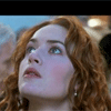
to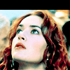
We start out with our base. Image from the movie "Titanic."

Duplicate the base once and set it to Screen 100% Opacity - 100% Fill
(Also have to bring up that I'm not sure what this Opacity and Fill things is all about. I lower the Fill alot in these tutorials because it works better than lowering the Opacity for some reason. If your program only has opacity, I would guess you should just lower the opacity and ignore the Fill nonsense. Again, please excuse my naive stupidity.)
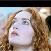
I don't like the color of her skin and I want the icon to be a little more orange so I add some Levels.
Layer-->New Adjustment Layer-->Levels
RGB - Input Levels: 0 1.11 255
Red - Input Levels: 0 1.41 255
Green - Input Levels: 0 1.14 255
Blue - Input Levels: 0 0.73 255
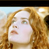
Much better. A much warmer coloring.
Now we shall add some selective coloring.
Layers-->New Adjustment Layer-->Selective Color
Red- Cyan: -100
Magneta: 0
Yellow: +100
Black: 0
Yellow- Cyan: +100
Magneta: 0
Yellow: -100
Black: 0
Neutrals - Cyan: +100
Magneta: 0
Yellow: -50
Black: 0
Selective Coloring courtesy of brasaremean

Lol. Ew. Lets make it look a little more interesting eh?
Duplicate the base and bring it on top of everything. Then duplicate that duplication so that you have 2 copies of the base above everything.
Set the first one to screen 100% fill and opacity. Set the second one on top of it to color burn 100% opacity and 60% fill.
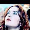
Better, but I still hate the color of her skin. Some color balance could do the trick.
Layers-->New Adjustment Layer-->Color Balance
Shadows - Cyan/Red: +24
Magneta/Green: 0
Yellow/Blue: -64
Midtones - Cyan/Red: +32
Magneta/Green: 10
Yellow/Blue: -62
Highlights - Cyan/Red: +13
Magneta/Green: 10
Yellow/Blue: -2
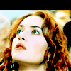
Ooooooooooo prety. but how about a token selective coloring for luck. Duplicate the last selective coloring and bring it all the way to the top.
Set it to 100% Opacity - 50% Fill
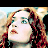
It looks ok. Lets make it a little darker though. Copy merged.
Select-->All
Edit-->Copy Merged
Edit-->Paste
Set the copied icon to multiply.

Yay! All done. :)
to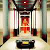
Our base from the first season of Alias.

The first thing we want to accomplish is getting rid of the dark blue coloring of the base. to do this we shall use Variations.
Image-->Adjustments-->Variations
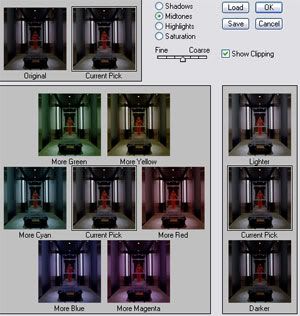
Hopefully you got something like that.
Click More red and More yellow. To your right we have lighter, current pick and darker. Click Lighter 4 times and then click ok.

-->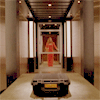
Check that out! That's a useful ass tool there.
Lets take our new deblued base and duplicate it. Set it to 100% opacity - 50% Fill.
After that, add some selective coloring.
Red-
Cyan: -100
Magneta: 0
Yellow: +100
Black: 0
Yellow-
Cyan: +100
Magneta: 0
Yellow: -55
Black: 0
Neutrals-
Cyan: +100
Magneta: 0
Yellow: -40
Black: 0
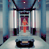
I wanna make it a little warmer. More orange and yellow is needed. So I add some curves.
Layer-->New Adjustment Layer-->Curves
RGB ~ RED ~ GREEN ~ BLUE
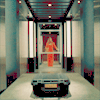
A little better. I wasn't sure what else to do, so I just started to mess around. I added some levels.
Layers-->New Adjustment Layers-->Levels
RGB - Input Levels: 0 0.95 255
Red - Input Levels: 0 1.21 255
Green - Input Levels: 0 1.14 255
Blue - Input Levels: 0 0.23 255
I also duplicated that levels layer. I set it to Colorburn and set the opacity to 100% and the fill to 14%.
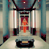
To give it a little more contrast, I turned to brightness/contrast.
Layers-->New Adjustment Layers-->Brightness/Contrast
Brightness: -17
Contrast: +23
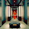
Yup.
Now we shall duplicate our base twice and bring both duplications all the way to the top. Set them both to screen 100% opacity - 50% Fill.
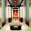
Alomst done. All we're gonna do now is copy the whole thing and set it to softlight.
Select-->All
Edit-->Copy Merged
Edit-->Paste
Set the copied icon to softlight.

Tada!
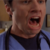
to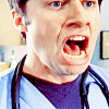
We start with our base from Scrubs.

Duplicate it twice. Set both duplications to Screen at 100% Opacity - 100% Fill.
I'm not sure what I was trying to accomplish, but I made a new cruves layer.
Layers-->New adjustment Layer-->Curves
RGB ~ RED ~ GREEN ~ BLUE
It's going to look weird. Set it to softlight Opacity 100% - Fill 55%.
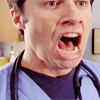
Really not sure what that accomplished, but there ya go. Lol. Moving along.
Lets add a Selective Color Layer.
Layers-->New Adjustment Layer-->Selective Color
Red-
Cyan: -100
Magneta: 0
Yellow: +100
Black: 0
Yellow-
Cyan: +100
Magneta: 0
Yellow: -55
Black: 0
Neutrals-
Cyan: +100
Magneta: 0
Yellow: -40
Black: 0
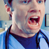
Yeah, no. I want to make some of his skin color come out. To do that, we have to screen the base a little more.
I duplicate the base, bring it to the top and duplicate that duplication 2 more times. I now have 3 copies of the base on top of all of the layers.
Set all of those copies to Screen at 100% Opacity - 100% Fill.
His skin turned out far too pink after doing that, so I added this orange to make his skin color look a little more normal.

Softlight 100% opacity - 34% fill
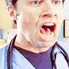
To make it darker and such, I copy all merged layers.
Select-->All
Edit-->Copy Merged
Edit-->Paste
Color burn the copied layer. 100% Opacity - 21% Fill
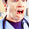
Duplicate the selective coloring and bring it to the top with 100% opacity and 25% fill.
Now I add a black and white gradient simply for contrast purposes. I want to make some of his faces darker than other parts and such. Black and white gradients are useful in that way.
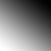
Of course I erased some of it and just played around with the gradient. My end product is this.

Oh and also, sharpen some of the screen layers in there. That way your icon doesn't turn out looking too soft.
And we're done.
to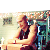
This one's easy. Start with our base. Weevil from Veronica Mars.

I'm going to go ahead and duplicate this 7 times. Set all seven duplications to Screen.
100% Opacity - 100% Fill
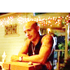
EWWWWWWWWWWWWWW! Why so bright? Ugly bright yellow. Not pretty. Lets bring down the saturation shall we.
Desaturate the last 2 screened copies of the base.
Image-->Adjustments-->Desaturate
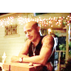
That's better. Wouldn't you say?
Moving along. Of course. The token selective color. It's a pain in the ass I know.
Red-
Cyan: -100
Magneta: 0
Yellow: +100
Black: 0
Yellow-
Cyan: +100
Magneta: 0
Yellow: -55
Black: 0
Neutrals-
Cyan: +100
Magneta: 0
Yellow: -40
Black: 0
Set the opacity of that selective color layer to Opacity 70% - Fill 60%. Then duplicate the selective layer once.
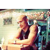
Yup. See. Easy.
Also, sometimes I get tired of of a boring line at the top so I put in brushes.

made by me
I just put that brush on there.

And there you go!
Also, I sharpen some of the screen layers. That's why mine may look sharper than yours. Just sharpen some of the screen layers and you're all good.
to
Starting with our base. Season 1 Veronica Mars.

Decided to apply the selective coloring way early this time.
Red-
Cyan: -100
Magneta: 0
Yellow: +100
Black: 0
Yellow-
Cyan: +100
Magneta: 0
Yellow: -55
Black: 0
Neutrals-
Cyan: +100
Magneta: 0
Yellow: -40
Black: 0
Put that selective color layer to 78% Opacity - 100% Fill.
Copy Merged.
Select-->All
Edit-->Copy Merged
Edit-->Paste
Set that to screen opacity 100% - fill 100%
OMG. Too blue! Curves.
Layers-->New Adjustment Layer-->Curves
RGB ~ RED ~ GREEN ~ BLUE
I'll explain more on the curves in Red and Blue seeing as there are multiple points.
Red:
Point One - Input: 83 Output: 165
Point Two - Input: 142 Output: 219
Blue:
Point One - Input: 125 Output: 67
Point Two - Input: 172 Output: 86
Point Three - Input: 205 Output: 159
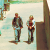
Far better.
Duplicate that 'blue layer'
This:

And duplicate it twice. Bring both copied layers to the top of all the layers. Set the first one to screen and the one above it to Colorburn with 100% Opacity and 38% Fill.
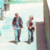
Weeeeeeeeeee!
Duplicate the orginal base and bring it to the top. Set it to softlight.
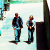
Again we add a black and white gradient.
Erase some bits and blah blah.
I also added a brush because that black thing on the side was getting on my nerves.
Also by me

Glorious!
Ok these are getting pointless. This is going to be the last one for now.
to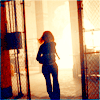
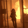
So this one is also super easy. Lets start with our base.

Duplicate that base 3 times and set them all to screen at 100% everything.
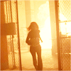
Good. But i don't want the end product to be overly yellow/orangish. I could use several methods, but I decide to use some selective coloring. I know. Ew.
Layers-->New Adjustment Layer-->Selective Color
Red-
Cyan: -100
Magneta: 0
Yellow: +100
Black: 0
Yellow-
Cyan: +100
Magneta: 0
Yellow: -55
Black: 0
Neutrals-
Cyan: +100
Magneta: 0
Yellow: -40
Black: 0
Duplicate that selective color one tme.
]
I'm not sure what I was trying to do by doing this, but I duplicated the selective color layer one more time and set it to color burn 100% Opacity - 54% Fill.
Copy the whole thing.
Select-->All
Edit-->Copy Merged
Edit-->Paste
Set that copied layer to Color burn Opacity 100% - Fill 80%.

That's it. See easy. And pointless. Yup.
I hope they weren't confusing or incorrect. I know that the curves may be a little cooky. You have to kind of play around and try to make something that looks similar.
If you have any questions or concerns, please give them to me. I'll try to reply and/or help as best as I can. I do the best I can, but sometimes I just don't know what's going wrong. But I promise I will try.
Um, Enjoy! :)
All of these were made in Photoshop CS2. Sorry to say I really don't think any of them can be translated into PSP. Soooooooo sorry. I know how much of a pain that is. I just recently got PS myself, so I know what it's like to be stuck with a program where you can't do half of the tutorials you see. So Sorry. :(
Also, because I am new to PS, my way of navigating the program might be weird and/or a little naive. Please excues my stupidity. Lol. I hope they are understandable.
Anywho, on with the tuts! :)

to

We start out with our base. Image from the movie "Titanic."

Duplicate the base once and set it to Screen 100% Opacity - 100% Fill
(Also have to bring up that I'm not sure what this Opacity and Fill things is all about. I lower the Fill alot in these tutorials because it works better than lowering the Opacity for some reason. If your program only has opacity, I would guess you should just lower the opacity and ignore the Fill nonsense. Again, please excuse my naive stupidity.)

I don't like the color of her skin and I want the icon to be a little more orange so I add some Levels.
Layer-->New Adjustment Layer-->Levels
RGB - Input Levels: 0 1.11 255
Red - Input Levels: 0 1.41 255
Green - Input Levels: 0 1.14 255
Blue - Input Levels: 0 0.73 255

Much better. A much warmer coloring.
Now we shall add some selective coloring.
Layers-->New Adjustment Layer-->Selective Color
Red- Cyan: -100
Magneta: 0
Yellow: +100
Black: 0
Yellow- Cyan: +100
Magneta: 0
Yellow: -100
Black: 0
Neutrals - Cyan: +100
Magneta: 0
Yellow: -50
Black: 0
Selective Coloring courtesy of brasaremean

Lol. Ew. Lets make it look a little more interesting eh?
Duplicate the base and bring it on top of everything. Then duplicate that duplication so that you have 2 copies of the base above everything.
Set the first one to screen 100% fill and opacity. Set the second one on top of it to color burn 100% opacity and 60% fill.

Better, but I still hate the color of her skin. Some color balance could do the trick.
Layers-->New Adjustment Layer-->Color Balance
Shadows - Cyan/Red: +24
Magneta/Green: 0
Yellow/Blue: -64
Midtones - Cyan/Red: +32
Magneta/Green: 10
Yellow/Blue: -62
Highlights - Cyan/Red: +13
Magneta/Green: 10
Yellow/Blue: -2

Ooooooooooo prety. but how about a token selective coloring for luck. Duplicate the last selective coloring and bring it all the way to the top.
Set it to 100% Opacity - 50% Fill

It looks ok. Lets make it a little darker though. Copy merged.
Select-->All
Edit-->Copy Merged
Edit-->Paste
Set the copied icon to multiply.

Yay! All done. :)

to

Our base from the first season of Alias.

The first thing we want to accomplish is getting rid of the dark blue coloring of the base. to do this we shall use Variations.
Image-->Adjustments-->Variations

Hopefully you got something like that.
Click More red and More yellow. To your right we have lighter, current pick and darker. Click Lighter 4 times and then click ok.

-->

Check that out! That's a useful ass tool there.
Lets take our new deblued base and duplicate it. Set it to 100% opacity - 50% Fill.
After that, add some selective coloring.
Red-
Cyan: -100
Magneta: 0
Yellow: +100
Black: 0
Yellow-
Cyan: +100
Magneta: 0
Yellow: -55
Black: 0
Neutrals-
Cyan: +100
Magneta: 0
Yellow: -40
Black: 0

I wanna make it a little warmer. More orange and yellow is needed. So I add some curves.
Layer-->New Adjustment Layer-->Curves
RGB ~ RED ~ GREEN ~ BLUE

A little better. I wasn't sure what else to do, so I just started to mess around. I added some levels.
Layers-->New Adjustment Layers-->Levels
RGB - Input Levels: 0 0.95 255
Red - Input Levels: 0 1.21 255
Green - Input Levels: 0 1.14 255
Blue - Input Levels: 0 0.23 255
I also duplicated that levels layer. I set it to Colorburn and set the opacity to 100% and the fill to 14%.

To give it a little more contrast, I turned to brightness/contrast.
Layers-->New Adjustment Layers-->Brightness/Contrast
Brightness: -17
Contrast: +23

Yup.
Now we shall duplicate our base twice and bring both duplications all the way to the top. Set them both to screen 100% opacity - 50% Fill.

Alomst done. All we're gonna do now is copy the whole thing and set it to softlight.
Select-->All
Edit-->Copy Merged
Edit-->Paste
Set the copied icon to softlight.

Tada!

to

We start with our base from Scrubs.

Duplicate it twice. Set both duplications to Screen at 100% Opacity - 100% Fill.
I'm not sure what I was trying to accomplish, but I made a new cruves layer.
Layers-->New adjustment Layer-->Curves
RGB ~ RED ~ GREEN ~ BLUE
It's going to look weird. Set it to softlight Opacity 100% - Fill 55%.

Really not sure what that accomplished, but there ya go. Lol. Moving along.
Lets add a Selective Color Layer.
Layers-->New Adjustment Layer-->Selective Color
Red-
Cyan: -100
Magneta: 0
Yellow: +100
Black: 0
Yellow-
Cyan: +100
Magneta: 0
Yellow: -55
Black: 0
Neutrals-
Cyan: +100
Magneta: 0
Yellow: -40
Black: 0

Yeah, no. I want to make some of his skin color come out. To do that, we have to screen the base a little more.
I duplicate the base, bring it to the top and duplicate that duplication 2 more times. I now have 3 copies of the base on top of all of the layers.
Set all of those copies to Screen at 100% Opacity - 100% Fill.
His skin turned out far too pink after doing that, so I added this orange to make his skin color look a little more normal.

Softlight 100% opacity - 34% fill

To make it darker and such, I copy all merged layers.
Select-->All
Edit-->Copy Merged
Edit-->Paste
Color burn the copied layer. 100% Opacity - 21% Fill

Duplicate the selective coloring and bring it to the top with 100% opacity and 25% fill.
Now I add a black and white gradient simply for contrast purposes. I want to make some of his faces darker than other parts and such. Black and white gradients are useful in that way.

Of course I erased some of it and just played around with the gradient. My end product is this.

Oh and also, sharpen some of the screen layers in there. That way your icon doesn't turn out looking too soft.
And we're done.

to

This one's easy. Start with our base. Weevil from Veronica Mars.

I'm going to go ahead and duplicate this 7 times. Set all seven duplications to Screen.
100% Opacity - 100% Fill

EWWWWWWWWWWWWWW! Why so bright? Ugly bright yellow. Not pretty. Lets bring down the saturation shall we.
Desaturate the last 2 screened copies of the base.
Image-->Adjustments-->Desaturate

That's better. Wouldn't you say?
Moving along. Of course. The token selective color. It's a pain in the ass I know.
Red-
Cyan: -100
Magneta: 0
Yellow: +100
Black: 0
Yellow-
Cyan: +100
Magneta: 0
Yellow: -55
Black: 0
Neutrals-
Cyan: +100
Magneta: 0
Yellow: -40
Black: 0
Set the opacity of that selective color layer to Opacity 70% - Fill 60%. Then duplicate the selective layer once.

Yup. See. Easy.
Also, sometimes I get tired of of a boring line at the top so I put in brushes.

made by me
I just put that brush on there.

And there you go!
Also, I sharpen some of the screen layers. That's why mine may look sharper than yours. Just sharpen some of the screen layers and you're all good.

to

Starting with our base. Season 1 Veronica Mars.

Decided to apply the selective coloring way early this time.
Red-
Cyan: -100
Magneta: 0
Yellow: +100
Black: 0
Yellow-
Cyan: +100
Magneta: 0
Yellow: -55
Black: 0
Neutrals-
Cyan: +100
Magneta: 0
Yellow: -40
Black: 0
Put that selective color layer to 78% Opacity - 100% Fill.

Copy Merged.
Select-->All
Edit-->Copy Merged
Edit-->Paste
Set that to screen opacity 100% - fill 100%

OMG. Too blue! Curves.
Layers-->New Adjustment Layer-->Curves
RGB ~ RED ~ GREEN ~ BLUE
I'll explain more on the curves in Red and Blue seeing as there are multiple points.
Red:
Point One - Input: 83 Output: 165
Point Two - Input: 142 Output: 219
Blue:
Point One - Input: 125 Output: 67
Point Two - Input: 172 Output: 86
Point Three - Input: 205 Output: 159

Far better.
Duplicate that 'blue layer'
This:

And duplicate it twice. Bring both copied layers to the top of all the layers. Set the first one to screen and the one above it to Colorburn with 100% Opacity and 38% Fill.

Weeeeeeeeeee!
Duplicate the orginal base and bring it to the top. Set it to softlight.

Again we add a black and white gradient.

Erase some bits and blah blah.
I also added a brush because that black thing on the side was getting on my nerves.

Also by me

Glorious!
Ok these are getting pointless. This is going to be the last one for now.

to

So this one is also super easy. Lets start with our base.

Duplicate that base 3 times and set them all to screen at 100% everything.

Good. But i don't want the end product to be overly yellow/orangish. I could use several methods, but I decide to use some selective coloring. I know. Ew.
Layers-->New Adjustment Layer-->Selective Color
Red-
Cyan: -100
Magneta: 0
Yellow: +100
Black: 0
Yellow-
Cyan: +100
Magneta: 0
Yellow: -55
Black: 0
Neutrals-
Cyan: +100
Magneta: 0
Yellow: -40
Black: 0
Duplicate that selective color one tme.

]
I'm not sure what I was trying to do by doing this, but I duplicated the selective color layer one more time and set it to color burn 100% Opacity - 54% Fill.
Copy the whole thing.
Select-->All
Edit-->Copy Merged
Edit-->Paste
Set that copied layer to Color burn Opacity 100% - Fill 80%.

That's it. See easy. And pointless. Yup.
I hope they weren't confusing or incorrect. I know that the curves may be a little cooky. You have to kind of play around and try to make something that looks similar.
If you have any questions or concerns, please give them to me. I'll try to reply and/or help as best as I can. I do the best I can, but sometimes I just don't know what's going wrong. But I promise I will try.
Um, Enjoy! :)