Banner Tutorial 12 out of 25
O_O I swear, time is flying. I could've sworn I updated this month, but I guess I didn't!! ;~; Sorry. I will make it up to you guys somehow!
If you haven't voted for the banners you want me to show you go here.
Go from this to this:
.
CREDIT TO: cynni for the icon.
THIS IS NOT MY ICON. If the creator has a problem with me using their icon, please contact me! :)
So you'll end up with all the following information: (copied from custom_banners)
icon:
http://i44.photobucket.com/albums/f1/xoamortentiaox/Tutorials/Tutorial%2021/cynni.jpg
series/character: Mokona / (n/a)
placement: Third Place
icontest community: soel_larg_itest
week number: 4
theme: Spring
link to winning post: [too lazy to get a link]
lj name you want on banner: cynni
font used: n/a
brush credits: n/a
file format: any
Additional comments? none

So basically you just place it in the middle of the 300x100 canvas... Then make it invisible for the next step. :D
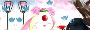
Now look for the original image somewhere. I used google and searched through mokona pictures. original image. Copy and paste the image to the banner canvas. Filter>Sharpen>Sharpen twice. As you notice the image is slightly smaller than the banner needed, so I duplicated the banner. Then horizontally flip the duplicated layer. After duplicating, align the sides with the lamp post together and flatten (Layer>Merge Visible).
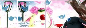
Now make your image visible again. Align the images together.
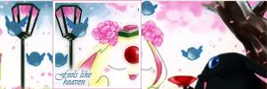
Duplicate the flattened layer and set the top one to Multiply 75% in order to have it match the icon better.
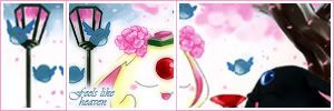
Time for a few strokes. Make a new layer for this below the icon layer. Let's do the right side first. Select from the bottom right corner and drag until you have selected all the right side including the pink line of the icon. Now go to Edit>Stroke and put in #FFFFFF at 3px "Inside". DO NOT deselect the image. Repeat the step but this time include #F49ECD at 1 px "Inside". You will get a perfect double colored line this way. Do the same to the left side.
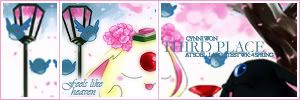
Add the appropriate text from above.

To show off the "placement" better. Right click the layer that says "Third Place" and click blending options. Now check the box that says drop shadow. [you can play with it as you wish]. Push "Ok" and now we're done!
THIS TYPE OF BANNER MAKING IS GOOD FOR: Those who are quick to look up photos and like aligning banners. Also, this works if the original image is too tiny to work with.
If you haven't voted for the banners you want me to show you go here.
Go from this to this:

.
CREDIT TO: cynni for the icon.
THIS IS NOT MY ICON. If the creator has a problem with me using their icon, please contact me! :)
So you'll end up with all the following information: (copied from custom_banners)
icon:

http://i44.photobucket.com/albums/f1/xoamortentiaox/Tutorials/Tutorial%2021/cynni.jpg
series/character: Mokona / (n/a)
placement: Third Place
icontest community: soel_larg_itest
week number: 4
theme: Spring
link to winning post: [too lazy to get a link]
lj name you want on banner: cynni
font used: n/a
brush credits: n/a
file format: any
Additional comments? none

So basically you just place it in the middle of the 300x100 canvas... Then make it invisible for the next step. :D

Now look for the original image somewhere. I used google and searched through mokona pictures. original image. Copy and paste the image to the banner canvas. Filter>Sharpen>Sharpen twice. As you notice the image is slightly smaller than the banner needed, so I duplicated the banner. Then horizontally flip the duplicated layer. After duplicating, align the sides with the lamp post together and flatten (Layer>Merge Visible).

Now make your image visible again. Align the images together.

Duplicate the flattened layer and set the top one to Multiply 75% in order to have it match the icon better.

Time for a few strokes. Make a new layer for this below the icon layer. Let's do the right side first. Select from the bottom right corner and drag until you have selected all the right side including the pink line of the icon. Now go to Edit>Stroke and put in #FFFFFF at 3px "Inside". DO NOT deselect the image. Repeat the step but this time include #F49ECD at 1 px "Inside". You will get a perfect double colored line this way. Do the same to the left side.

Add the appropriate text from above.

To show off the "placement" better. Right click the layer that says "Third Place" and click blending options. Now check the box that says drop shadow. [you can play with it as you wish]. Push "Ok" and now we're done!
THIS TYPE OF BANNER MAKING IS GOOD FOR: Those who are quick to look up photos and like aligning banners. Also, this works if the original image is too tiny to work with.