Round #8 - Challenge #1 - Results
Results were posted a bit late due to the fact that I worked 11 hours today unexpectedly! Challenge will be posted shortly.
Sadly we are saying goodbye to 1 icon maker tonight:

by setentpet with 4 votes
I hope you had fun and will continue to be active in the community. :).
Community's Choice (tied with 2 votes):

by stam_fan17 &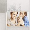
by fisheye.
Jamie's Choice:

by jane948. I adored the crop & the coloring stood out.
Tally
I am not like most LIMS mods who count the total of negative and positive together to determined who gets boots. It's math and I don't do it well. So therefore you are eliminated by the number of negative votes only. - indicts negative, + indicts positive. In case you are wondering I am doing the comments like this from now on to protect voter's identities.
Congrats to whatever_freak & fisheye for no negative votes!!
#1. -3, +1
#2. -4, +0
#3. -1, +0
#4. -1, +2
#5. -2, +0
#6. -1, +1
#7. -0, +1
#8. -3, +0
#9. -2, +1
#10. -0, +2
#11. -1, +1
Negative votes
#1. too many textures.
The backround texture and text is too distracting.
The texture used clashes with the picture.
#2. boring coloring and poor cropping.
doesn't look like there was much of anything done to the original image.
It's a bit basic and simple. Good colouring though.
Unoriginal crop & the coloring could be more interesting either by softening it of saturating it a bit.
#3. the texture used has strange colors that distract your eye from the image. it's also placed in a way that makes it unreadable.
#4. awkward crop and the coloring is too dark making the Olsen twins look like they have a very dark suntan.
#5. a little dark and too red.
the icon appears a little oversharpened. the text is also a bit distracting. it would have been better without the text.
#6. the cropping isn't great and the "twins" font doesn't match the cropping or the picture.
#8. the coloring washes out the Olsen twins and is a bit undersharpened.
The colouring is a bit too light. Good cropping though.
The coloring is too bright.
#9. lighting is good but the isn't light enough.
it's verry foggy, the clarity of the icon is poor.
#11. it is a bit too dark and could use some more contrast. their faces as a bit blurry as well.
Positive votes
#1. Good use of texture and text and brush. Nice colouring too.
#4. the coloring is very nicely done.
the cropping and coloring is very pretty. the icon pops.
#6. love the texture use.
#7. the coloring is good and not too strong. the text is simple and compliments the image.
#9. although simple, excellent cropping and color.
#10. Great use of textures and pretty coloring.
overall it is very unique icon with the texture usage, good crop, the coloring washes them out just a bit.
#11. Good crop, good color & great use of transparent text.
Sadly we are saying goodbye to 1 icon maker tonight:

by setentpet with 4 votes
I hope you had fun and will continue to be active in the community. :).
Community's Choice (tied with 2 votes):

by stam_fan17 &

by fisheye.
Jamie's Choice:

by jane948. I adored the crop & the coloring stood out.
Tally
I am not like most LIMS mods who count the total of negative and positive together to determined who gets boots. It's math and I don't do it well. So therefore you are eliminated by the number of negative votes only. - indicts negative, + indicts positive. In case you are wondering I am doing the comments like this from now on to protect voter's identities.
Congrats to whatever_freak & fisheye for no negative votes!!
#1. -3, +1
#2. -4, +0
#3. -1, +0
#4. -1, +2
#5. -2, +0
#6. -1, +1
#7. -0, +1
#8. -3, +0
#9. -2, +1
#10. -0, +2
#11. -1, +1
Negative votes
#1. too many textures.
The backround texture and text is too distracting.
The texture used clashes with the picture.
#2. boring coloring and poor cropping.
doesn't look like there was much of anything done to the original image.
It's a bit basic and simple. Good colouring though.
Unoriginal crop & the coloring could be more interesting either by softening it of saturating it a bit.
#3. the texture used has strange colors that distract your eye from the image. it's also placed in a way that makes it unreadable.
#4. awkward crop and the coloring is too dark making the Olsen twins look like they have a very dark suntan.
#5. a little dark and too red.
the icon appears a little oversharpened. the text is also a bit distracting. it would have been better without the text.
#6. the cropping isn't great and the "twins" font doesn't match the cropping or the picture.
#8. the coloring washes out the Olsen twins and is a bit undersharpened.
The colouring is a bit too light. Good cropping though.
The coloring is too bright.
#9. lighting is good but the isn't light enough.
it's verry foggy, the clarity of the icon is poor.
#11. it is a bit too dark and could use some more contrast. their faces as a bit blurry as well.
Positive votes
#1. Good use of texture and text and brush. Nice colouring too.
#4. the coloring is very nicely done.
the cropping and coloring is very pretty. the icon pops.
#6. love the texture use.
#7. the coloring is good and not too strong. the text is simple and compliments the image.
#9. although simple, excellent cropping and color.
#10. Great use of textures and pretty coloring.
overall it is very unique icon with the texture usage, good crop, the coloring washes them out just a bit.
#11. Good crop, good color & great use of transparent text.