20 for inspired20in20
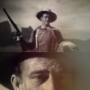
20 icons for inspired20in20. claim: John Ford westerns
Sources: The Searchers, Stagecoach, Rio Bravo (ya know, John Ford did direct westerns without John Wayne in them. just fyi)
Preview:
( Read more... )
Sources: The Searchers, Stagecoach, Rio Bravo (ya know, John Ford did direct westerns without John Wayne in them. just fyi)
Preview:
( Read more... )
Reply
I was trying to challenge myself on subject! wasn't sure if it was a little to 'out there' for people to appreciate.
Reply
Reply
Luckily, I chose John Ford Westerns this round, so most of his movies have been preserved and upgraded to Blue-Ray. I've worked with some terrible caps before, like with The Sentinel tv show, that only has it's first season on DVD or early season Power Rangers caps.
Reply
Ahhh, no wonder those icons look like they're made from good quality caps! The fact that you've ever worked with awful ones before is astounding. I get enough of a headache coloring HQ caps. Low quality ones would probably make me cry!
Reply
The good thing about low quality caps is that they sometimes improve when cropped and shrunk to 100x100.
Reply
Leave a comment